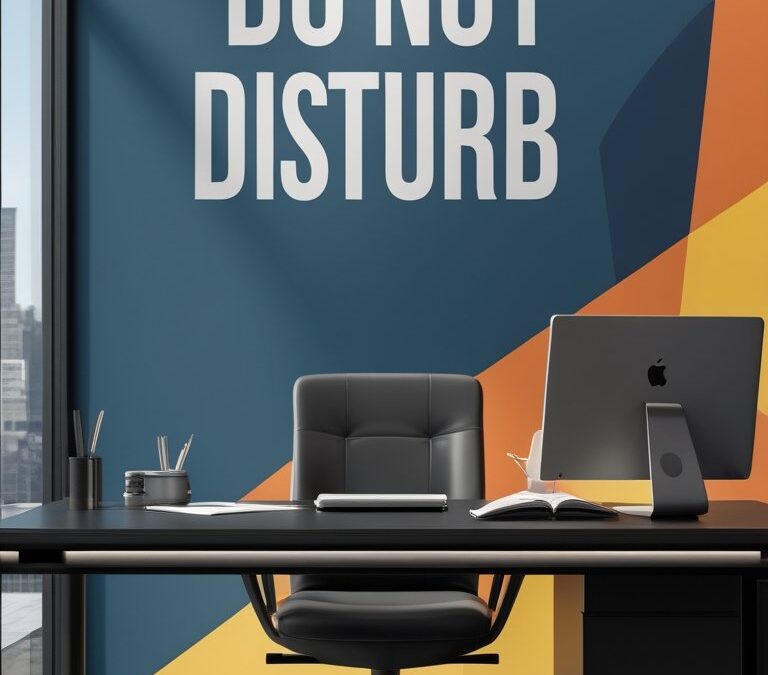
You want an office that tells people to focus without saying a word. These bold “Do Not Disturb” wallpaper ideas help you create high-focus zones by using deep tones, strong contrasts, and subtle textures that reduce visual noise and keep attention on the task.
This article walks you through 30 striking options — from matte charcoals and deep botanicals to textured concretes and velvet-look finishes — so you can pick a look that matches your space and concentration needs. Use the suggestions to shape quiet corners, private booths, or entire rooms that feel intentional and work-ready.
Choose wallpapers that balance boldness with calm to keep your focus steady. Dark, matte colors cut glare and reduce distractions, while low-sheen textures add depth without catching too much light. If you need quiet, look for acoustic-style or textured options that can help dampen sound. For shared spaces, pick patterns with vertical or large-scale elements to guide the eye and avoid busy prints that fragment attention. Test a large sample on the wall at different times of day to see how color shifts with light. Finally, pair bold wallpapers with simple furniture and soft lighting to create a grounded, distraction-free environment that supports long stretches of focused work.
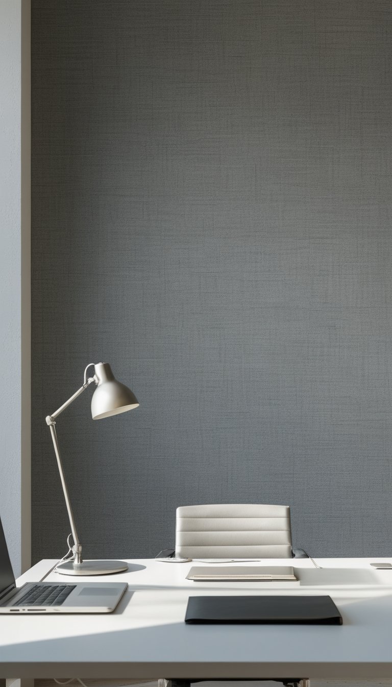
1) Matte Charcoal Geometric Mural
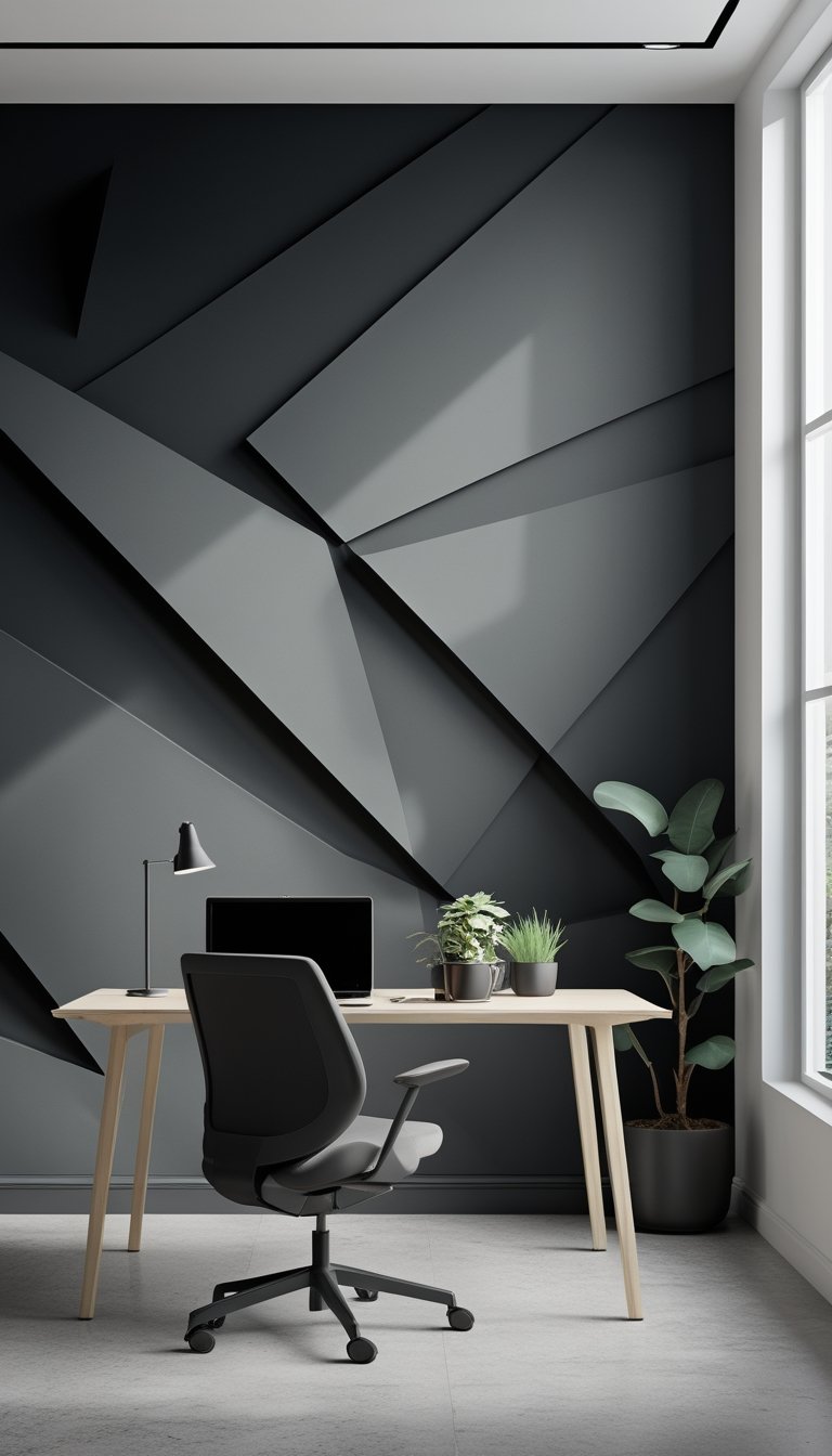
A matte charcoal geometric mural gives your focus zone a calm, serious backdrop. The dark, flat finish cuts glare and keeps light soft, so your eyes feel less tired during long work stretches. Geometric shapes add order without loud color, helping your brain stay on task.
Choose simple patterns with clear lines to avoid visual clutter. Large-scale triangles or hexagons work well because they read from a distance and won’t feel busy up close. Keep the contrast moderate so the shapes are clear but not shouting for attention.
Pair the mural with warm wood or soft fabrics to balance the cool tone. Lighting matters: warm, dimmable fixtures keep the space inviting while maintaining focus. This look suits private offices, meeting rooms, or quiet studio corners.
PRO TIP
When installing a matte charcoal mural, test paint or wallpaper samples on different walls first. You want to see how the tone changes with morning and afternoon light in your space. Use a low-sheen, durable paint or a high-quality, non-reflective wallpaper to avoid scuffs and glare. Add a thin contrasting trim in a softer gray or muted brass to frame the mural without breaking the calm. Keep desk surfaces lighter to prevent the room from feeling too heavy, and add one small plant or textured cushion to bring a touch of life. Finally, position task lighting so it washes the work area, not the mural, to keep your focus where it matters.
2) Deep Navy Botanical Accent Wall
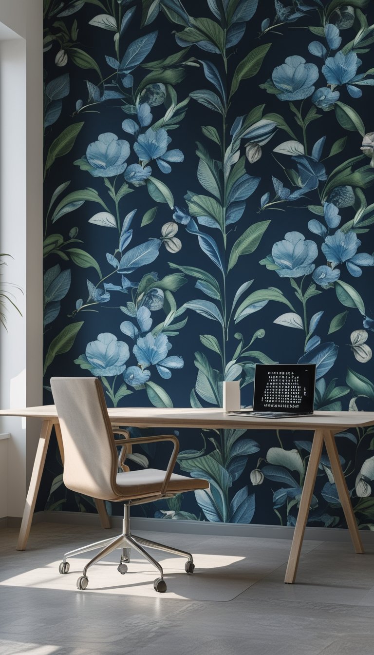
A deep navy botanical wallpaper gives your focus zone a calm, serious feel without being boring. The dark blue base reduces visual noise while the leaf or fern patterns add a soft, natural touch that keeps the space from feeling too stark.
Choose a matte finish to cut glare and keep your screen reflections low. Large-scale botanical prints work best on a single accent wall so the pattern doesn’t overwhelm your workspace.
Pair the wall with simple, light furniture to create contrast and keep the room balanced. Add a few real plants to echo the wallpaper and improve air quality, but keep them low-maintenance so they don’t distract from your tasks.
PRO TIP
When you install deep navy botanical wallpaper, test it in your space at different times of day. Natural and artificial light will change how dark the navy looks and how the pattern reads from your desk. Use a one- or two-panel sample taped to the wall for at least a day before committing. If the room feels too dark, add a slim desk lamp with warm light or a light-colored rug to reflect brightness back into your work area. Also consider a low-sheen paint on the other walls to prevent visual competition with the wallpaper and keep your focus steady.
3) High-Contrast Black & White Stripes
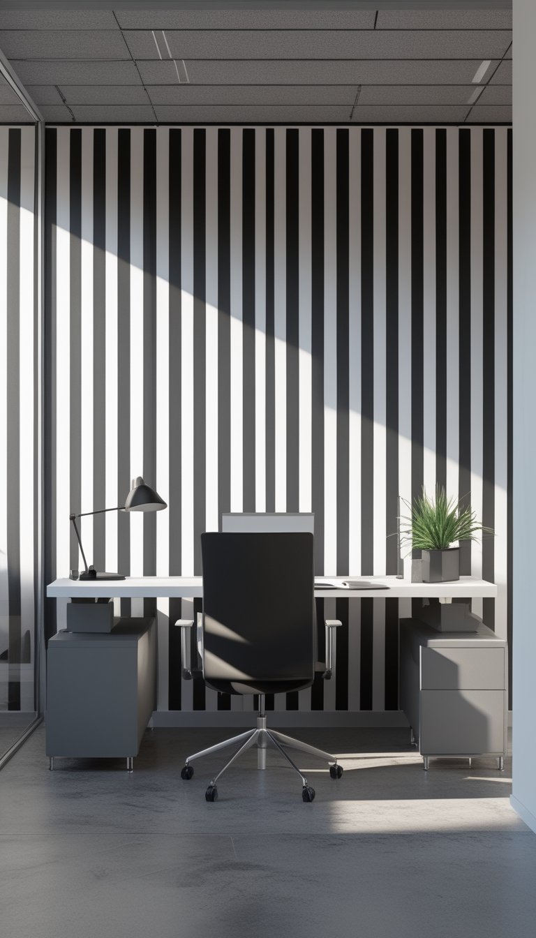
Black and white stripes make a clear, bold statement in a focus area. You will get a sharp visual cue that signals work mode without adding color distractions.
Use wide stripes for a calm, modern look, or narrow stripes for more energy and rhythm. Keep the pattern on one wall so it anchors the space without overwhelming your senses.
Pair the stripes with simple furniture and soft textiles to balance the stark lines. A neutral rug and a few plants soften the room and help you stay comfortable during long tasks.
PRO TIP
When you choose black and white stripes, think about scale and lighting. Large stripes can make a room feel taller or wider, while small stripes add texture without changing proportions much. Test a sample on the wall for a few days to see how it reads in morning and afternoon light. If the pattern feels too intense, paint a thin border or add a muted curtain to break the contrast. Keep decor minimal and use soft accents like cork boards, fabric pinboards, or felt organizers to reduce glare and noise. This way, your high-focus zone stays bold but still easy to work in.
4) Textured Slate Concrete Effect
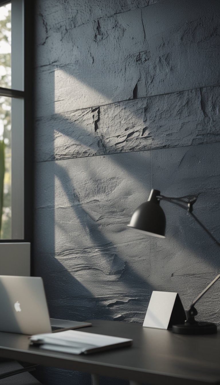
A textured slate concrete wallpaper gives your focus zone a calm, modern look. The cool gray tones cut visual noise without feeling cold, so your eyes rest and you can concentrate.
Choose a pattern with subtle texture to add depth. Light variations and faint veining mimic real concrete and keep the wall from looking flat.
This finish pairs well with simple furniture and warm wood accents. It also works behind screens and whiteboards because it won’t reflect too much light.
PRO TIP
When you pick slate concrete wallpaper, test a sample on the wall at different times of day. Natural and artificial light change how gray and texture read, and a small sample helps you avoid a shade that makes the room feel dim. Pair the wallpaper with pops of warm color—like soft ochre or muted terracotta—to balance the coolness and keep the space from feeling stark. Use matte finishes on nearby surfaces to prevent glare and choose minimal, functional decor to maintain a focused atmosphere. Finally, consider sound-absorbing panels or rugs if the concrete look makes the room feel too echoey; texture helps focus, but soft materials help comfort.
5) Olive Green Calming Foliage Print
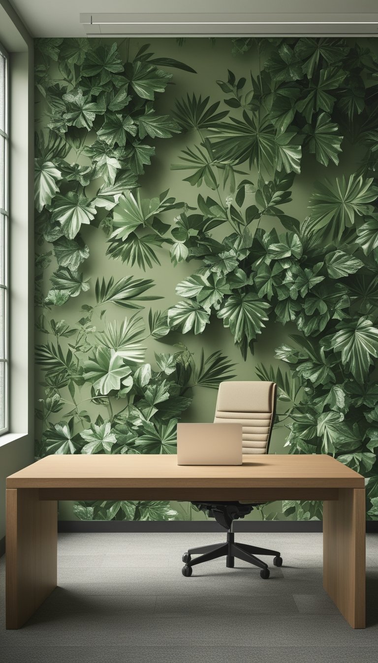
Choose an olive green foliage wallpaper to make your focus zone feel calm and steady. The muted green reduces eye strain and creates a soft background that helps you concentrate without feeling closed in.
Pick a pattern with simple leaves or ferns to avoid busy visuals that can distract. Small, repeating motifs work best for narrow walls; larger leaves suit big feature walls and add gentle depth.
Pair this print with natural wood furniture and warm lighting to keep the mood cozy. You can use a solid-color accent wall nearby to frame the wallpaper and signal a “do not disturb” work area.
PRO TIP
When installing an olive green foliage print, place it behind your primary work area so the pattern stays in your peripheral vision instead of directly behind your screen. This reduces glare and helps your eyes rest between tasks. Choose matte or low-sheen finishes to limit reflections from overhead lights. If the pattern still feels too lively, add a sheer curtain or a removable panel of soft beige or cream that you can slide in to mute the design during intense work sessions. Test a large sample on the wall for a few days before committing, and adjust lighting—warmer bulbs deepen the green, while cooler bulbs make it feel fresher.
6) Navy + Mustard Abstract Brushstrokes
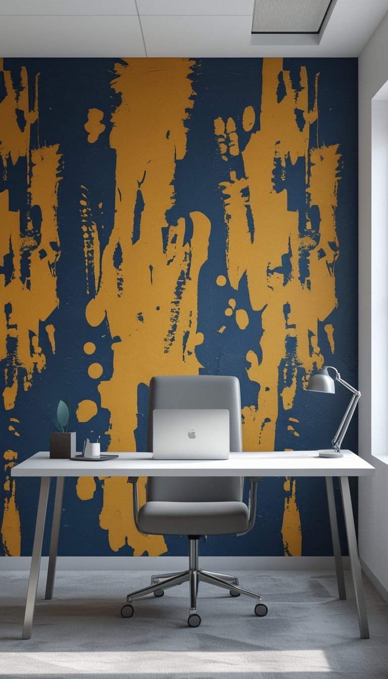
You can use bold navy and mustard brushstrokes to make a calm, focused zone that still feels lively. The deep navy grounds the space and reduces visual noise, while mustard adds energy without being sharp. Together they create balance and a modern look.
Place the wallpaper on a single feature wall behind your desk to keep the room from feeling busy. Pair it with simple furniture and soft lighting so the pattern stays the focal point. Keep other walls neutral to avoid competing colors.
Choose a matte finish to reduce glare from screens and overhead lights. That cuts distractions and helps you keep focus during tasks. Consider scale: larger brushstrokes look calmer at a distance, smaller strokes read as texture up close.
PRO TIP
When you pick navy and mustard abstract brushstrokes, test a large sample on the wall where you work. Lighting changes how colors read, so view the sample in the morning and evening. Use the sample to judge scale and contrast with your furniture and monitor. If the mustard feels too bright, tone it down with a warm beige or soft gray nearby. For a calmer effect, choose brushstrokes with softer edges and more navy. Finally, add a few quiet textiles—like a navy throw or mustard pillow—to tie the room together without adding clutter.
7) Terracotta Warm Clay Paneling
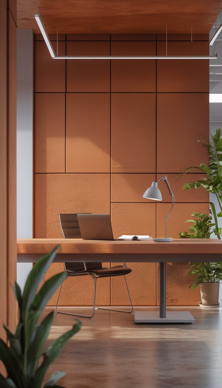
Terracotta clay paneling brings a cozy, grounding feel to high-focus zones. The warm orange-brown tones reduce visual noise and help you settle into focused work.
You can use full-wall panels or a single accent wall behind a desk. Textured clay adds a tactile look that feels intentional without being flashy.
Pair terracotta with soft neutrals and matte black accents for balance. Natural materials like wood and linen complement the earthiness and keep the space calm.
PRO TIP
You can make terracotta paneling work in any office scale by mixing panel sizes and finishes. For small rooms, choose lighter terracotta shades and thinner panels to keep the space from feeling heavy. In larger rooms, go bold with full-height, textured panels or staggered modular tiles to create rhythm and reduce echo. Add a narrow matte-black shelf or a slim metal lamp to introduce contrast without disrupting the warm palette. Consider acoustic-backed panels if noise control matters; they preserve the look while helping you concentrate. Test paint or small sample panels on different walls first to see how natural light shifts the clay tones throughout the day.
8) Monochrome Topographic Map Wallpaper
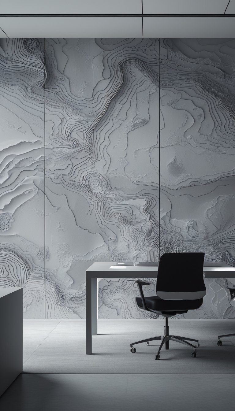
A monochrome topographic map gives your focus zone a clean, deliberate look. The layered contour lines create subtle visual interest without bright colors that can distract you from deep work.
Choose neutral tones like charcoal, slate, or soft gray to keep the mood calm. The map’s patterns add texture that helps reduce glare and breaks up large wall surfaces.
You can scale the pattern so lines sit close together for a quiet, intricate feel or spread them out for a bolder, architectural effect. The design pairs well with simple furniture and muted accents to maintain a high-focus environment.
PRO TIP
When you pick a topographic wallpaper, match the line weight and contrast to your room’s light levels. In bright rooms, use slightly heavier lines so the pattern remains visible but not sharp. In low light, choose thinner lines and higher contrast to avoid a muddled look. Test a 3×3 foot sample on the wall before committing to a full roll. If you want more warmth, add one small accent color in textiles rather than the wallpaper itself. This keeps your space focused while letting you personalize the area without creating visual noise.
9) Midnight Blue Velvet-Look Wallpaper
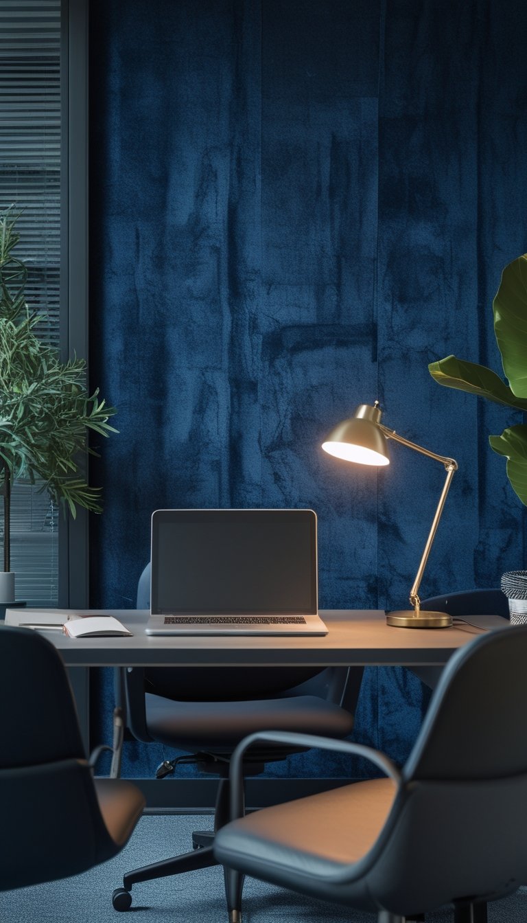
Midnight blue velvet-look wallpaper gives your focus zone a calm, luxurious feel without being flashy. The deep blue soothes the eyes and helps reduce visual noise, which can make it easier for you to concentrate.
This finish reflects light softly, so it adds depth without glare. Use it on a single feature wall behind your desk to create a strong focal point that keeps distractions at bay.
Pair the wallpaper with warm task lighting and simple, light-colored furniture to balance its intensity. You’ll find the space feels both cozy and professional, helping you stay in a focused mindset for longer.
PRO TIP
Choose a velvet-look wallpaper with a subtle texture rather than a high-shine surface to keep reflections low and focus high. Measure the wall and order a little extra to match pattern repeats and avoid visible seams. If your room is small, add a mirror or a slim bookshelf with light-colored items to prevent the dark blue from feeling too heavy. Consider magnetic or fabric pinboards in neutral tones on adjacent walls so you can keep notes visible without cluttering your desk. Finally, test a large sample on your wall at different times of day to see how the blue reads with your lighting before committing.
10) Soft-Muted Forest Wallpaper for Focus
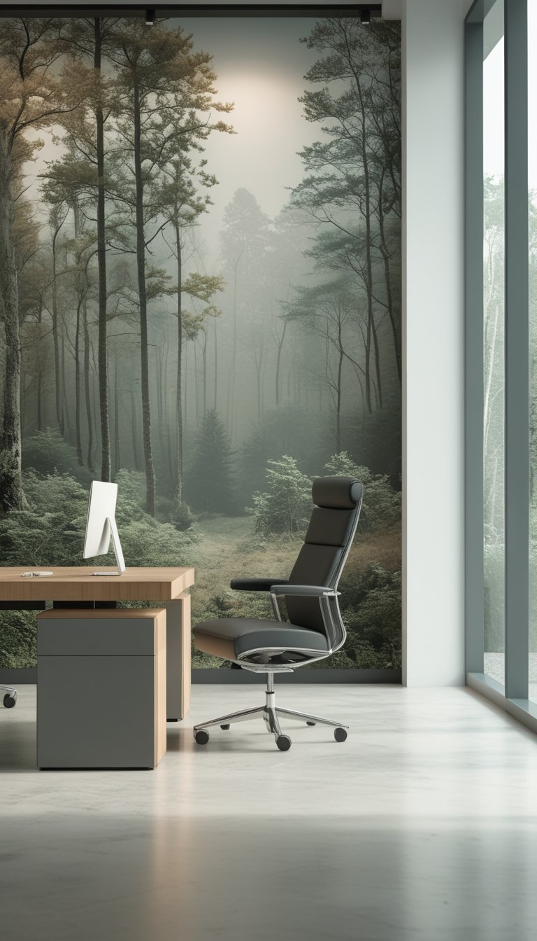
A soft-muted forest wallpaper brings gentle greens and greys that calm your eyes. You will feel less visual noise, which helps you stay on task during long work periods.
Choose images with diffused light and low contrast to avoid sharp details that pull your attention. Subtle textures like mist or soft bokeh keep the scene interesting without being distracting.
Match the wallpaper tone to your office lighting and furniture for a balanced look. Cooler greens work well with neutral desks, while warmer moss tones pair nicely with wood.
PRO TIP
Pick a wallpaper that uses layers of depth, such as distant trees fading into mist. This creates a sense of space without busy patterns, so your brain can relax and focus. Test the image on your most-used screen to check for glare and color shifts in different light. If you have meetings, place the forest image behind your camera at a low-intensity setting to avoid drawing attention. Consider rotating between two similar muted forest images to keep the look fresh while preserving the same calm mood.
11) Bold Graphite Herringbone Pattern
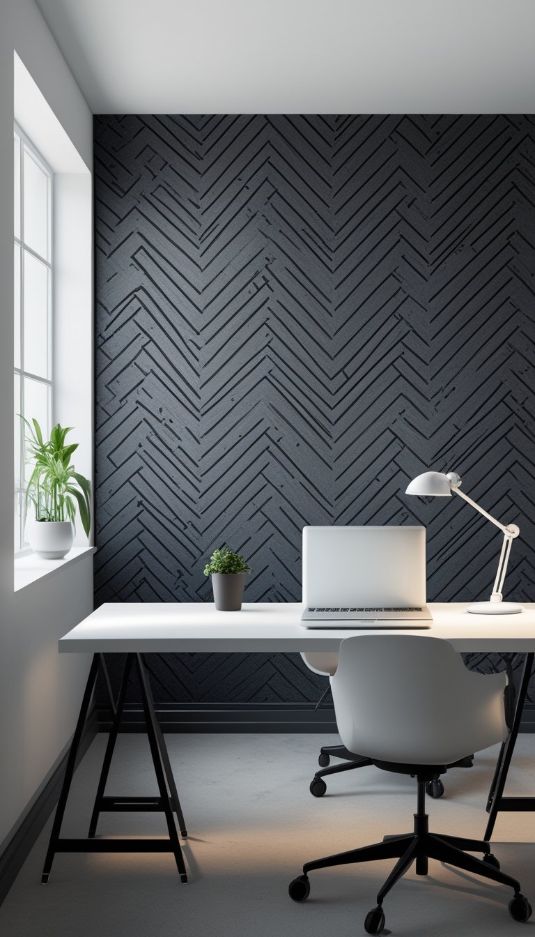
A bold graphite herringbone pattern gives your high-focus zone a calm, structured look. The dark gray tones hide scuffs and marks, so the wall stays neat even in busy areas. The repeating chevron lines add rhythm without shouting, helping you maintain concentration.
Choose a matte finish to reduce glare from overhead lights and screens. You can scale the pattern larger for a modern feel or keep it tight for a subtle texture. Pair it with light furniture and warm wood accents to keep the space from feeling cold.
PRO TIP
When you install a graphite herringbone wall, measure carefully and use a level to keep the chevrons aligned across seams. If you’re painting, prime the wall first so the graphite tone goes on evenly and you avoid streaks. Consider stenciled herringbone if you want a DIY option; stencils save time and create consistent shapes. If you prefer wallpaper, pick a high-quality, strippable paper to make future updates easier. Add soft lighting and plants nearby to soften the dark pattern and keep the room inviting.
12) Vertical Gold Pinstripe on Deep Teal
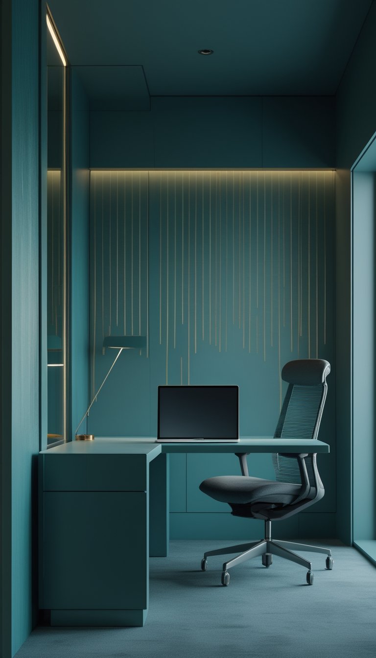
A deep teal wall with thin vertical gold pinstripes creates a calm, focused backdrop for your high-focus zone. The vertical lines draw the eye upward and give a sense of order without being loud or busy. You’ll find it helps keep your mind steady during long work sessions.
Choose matte deep teal to reduce glare and let the gold stripes add just enough warmth. Use narrow stripes spaced evenly so the pattern reads subtle from a distance but reveals detail up close. Keep furniture simple and light to balance the rich color.
PRO TIP
When applying vertical gold pinstripes on deep teal, prep the wall thoroughly for the cleanest lines. Use painter’s tape and a level to mark stripes, and consider metallic paint pens or a steady brush for thin, consistent strokes. Test the gold finish in your room light; some metallics look brighter under warm bulbs and subtler in natural light. If you want a temporary option, use removable gold vinyl tape so you can adjust spacing or remove the stripes later. Pair the wallpaper with neutral textiles and a single plant to soften the space without distracting your focus.
13) Low-Gloss Black Velvet Ceiling Wallpaper

A low-gloss black velvet ceiling wallpaper gives your focus zone a calm, cocoon-like feel. It reduces glare and softens overhead light, so you can work without bright reflections distracting you. The dark, matte surface also helps define the room as a dedicated place for concentration.
You’ll want to pair this ceiling finish with lighter walls and task lighting. That contrast keeps the space from feeling too heavy while letting your eyes rest on the work area. Use warm LED downlights or adjustable desk lamps to create focused pools of light where you need them most.
PRO TIP
When you install low-gloss black velvet wallpaper on the ceiling, plan your lighting and color balance first. A dark ceiling absorbs light, so add layered lighting—ambient, task, and accent—to prevent the room from feeling dim. Keep walls in neutral or soft tones to reflect light back up and reduce visual fatigue. If your room is small, include some glossy metal or glass accents to add subtle sparkle without causing glare. Test a sample on the ceiling before committing to the full roll to check texture and light behavior. Finally, choose removable or peel-and-stick options if you rent or expect to change decor later.
14) Muted Indigo Watercolor Wash
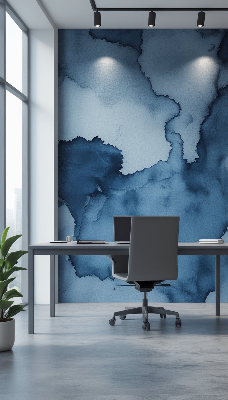
A muted indigo watercolor wash creates a calm, focused feel without being cold. You get soft, layered tones that reduce glare and keep attention on tasks. The subtle texture adds interest without shouting “decor.”
This wash works well behind desks, meeting rooms, or quiet zones. It pairs nicely with light wood, matte black accents, and warm lighting. Add simple signage or a small “Do Not Disturb” plaque to reinforce the quiet intent.
Keep the pattern large and airy so it reads as color from a distance, not busy detail. Use low-VOC paints or removable wallpaper for easy updates. The result is a modern, peaceful backdrop that supports sustained focus.
PRO TIP
When you choose a muted indigo watercolor wash, consider scale and finish carefully to make the most of the effect. A larger, softer application reads calmer and avoids visual clutter, which helps you stay focused during long work sessions. Test samples on different walls and view them at various times of day to see how natural and artificial light change the tone. Pair the wash with neutral furniture and a few contrasting accents—like brass or oak—to prevent the space from feeling too cool. If you need flexibility, opt for removable wallpaper or a panel system so you can replace or reposition the wash without hassle. Finally, add clear but low-key “Do Not Disturb” markers near workstations to set expectations without breaking the serene look.
15) Concrete + Copper Industrial Mural
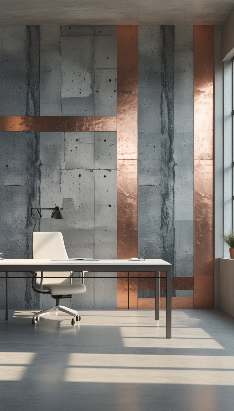
You can use a concrete-texture mural paired with copper accents to create a focused, industrial look. The cool gray of concrete keeps the space calm, while copper adds a warm, eye-catching contrast without being loud.
Place the mural on the wall behind your desk or on a long wall in a meeting room to mark a high-focus zone. The concrete pattern reduces visual clutter and the copper elements guide the eye, helping you maintain attention on work tasks.
Choose matte finishes to avoid glare from lights. You can add subtle copper leaf or painted copper panels for a refined touch that still reads as practical and modern.
PRO TIP
When installing a concrete and copper mural, consider acoustics as well as visuals. Concrete textures can feel cold and echo-prone, so add soft furnishings like rugs, acoustic panels, or fabric-covered furniture to absorb sound. Use copper in thin strips or panels rather than large reflective sheets; this keeps the warm tone without creating hotspots or glare that distract you. For durability, choose faux concrete wallpaper or microcement for easy maintenance, and seal any real copper to prevent tarnish. Test samples in your room light before committing so the gray and copper balance feels right at different times of day.
16) Large-Scale Monstera Leaf in Dark Green
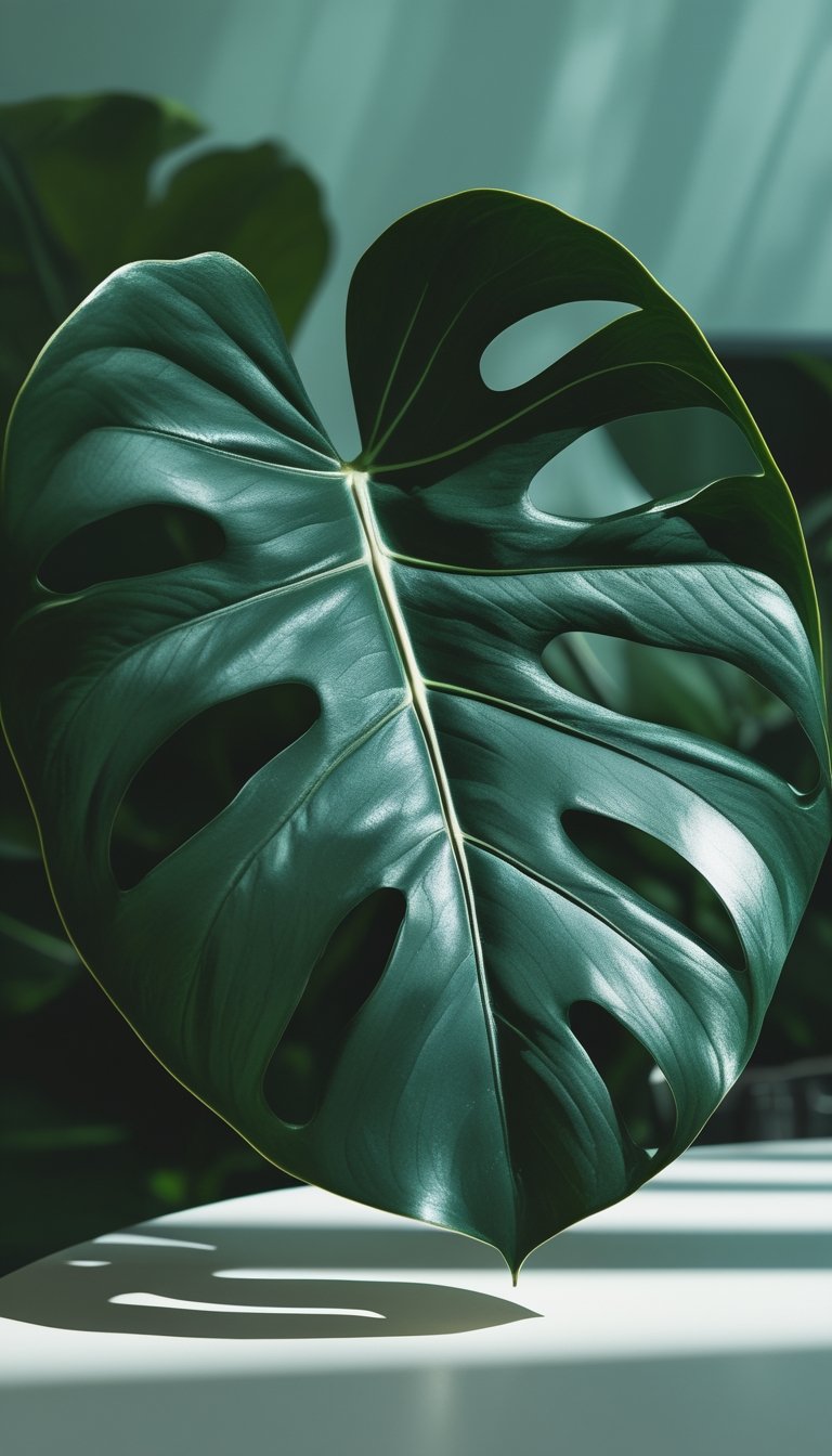
You can use a large-scale Monstera leaf pattern to bring calm and focus to a work nook. The deep green tones anchor the room without bright distractions, helping you stay on task.
Place the wallpaper on one focal wall behind your desk. It creates a visual cue for concentration and separates your high-focus zone from the rest of the office.
Choose a matte finish to reduce glare from overhead lights or monitors. Matte keeps the leaf texture rich and soft, making the space feel grounded and less busy.
Pair the wallpaper with simple furniture and muted accents. Let the Monstera pattern do the work so your eyes rest easier and you can concentrate longer.
PRO TIP
When installing a large-scale Monstera leaf mural, align the pattern so leaves flow naturally across the wall rather than appearing chopped. If possible, center the main leaf behind your desk to create a calm focal point. Use calming, neutral paint on surrounding walls to reduce visual competition and keep eye movement steady. Add a few small potted plants that echo the wallpaper’s shape to build cohesion without clutter. Finally, test a sample patch under your office lighting for several days so you can confirm the color and scale feel right for your space.
17) Charcoal Hexagon Acoustic-Style Wallpaper
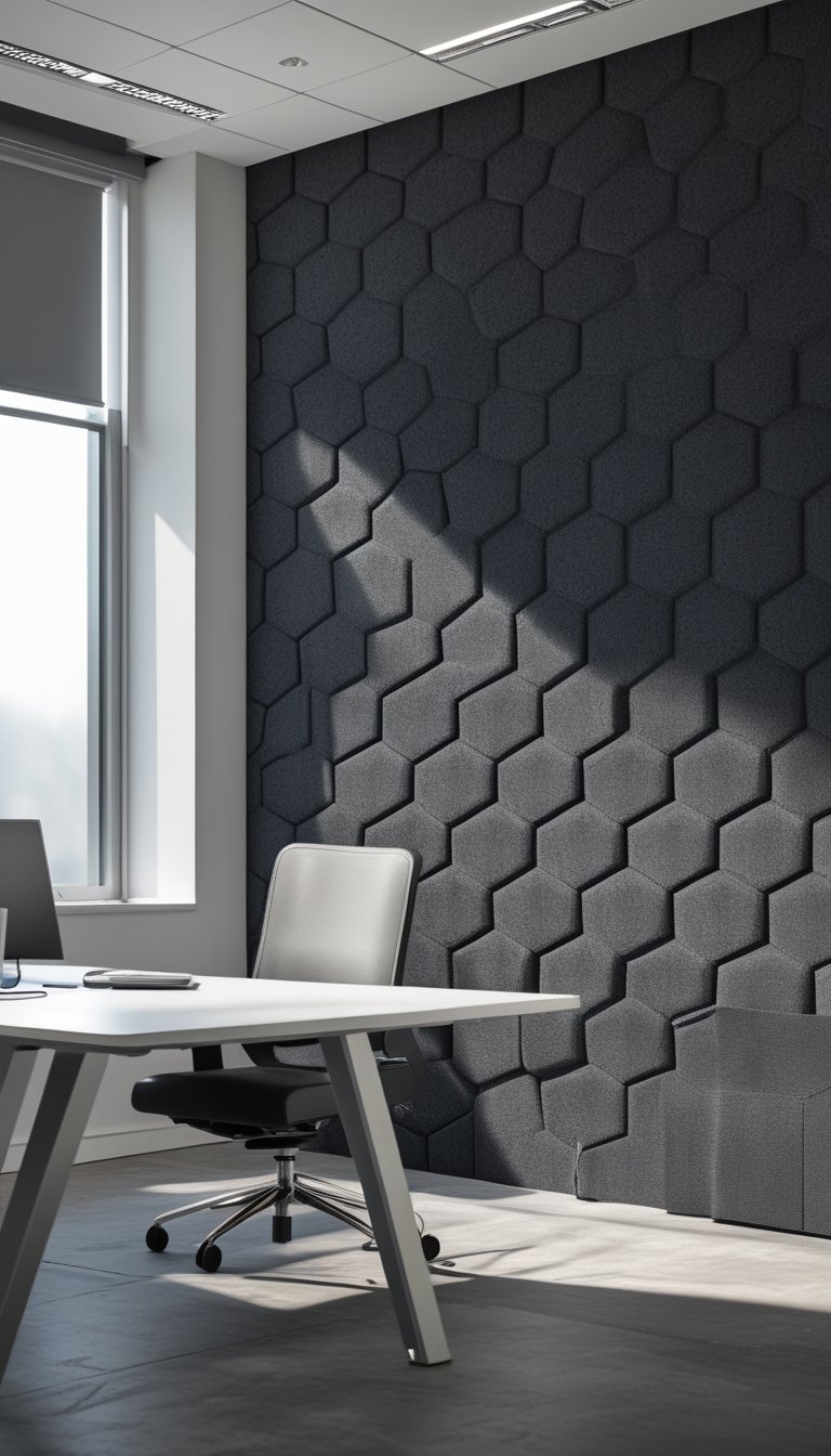
Charcoal hexagon acoustic-style wallpaper gives your high-focus zone a calm, modern look. The dark, muted tone reduces visual noise and helps you stay on task. Hexagon shapes add subtle geometry without being distracting.
You can choose real acoustic panels or wallpaper that mimics the texture and depth. The textured look suggests sound absorption, which helps set an expectation of quiet. Place it behind desks or on a single accent wall to mark the area as a focus zone.
This wallpaper pairs well with warm wood and soft lighting. Keep furniture simple and leave some negative space so the pattern can breathe. Use it where you want people to slow down and concentrate.
PRO TIP
When you pick charcoal hexagon acoustic-style wallpaper, think about both vision and sound. If you can, combine the wallpaper with true acoustic panels in key spots to actually reduce noise. If you must use only wallpaper, choose a high-quality print with subtle texture to avoid glare under overhead lights. Measure your wall and order a little extra for pattern matching and mistakes. Test a sample on the wall before committing; lighting can make charcoal look blue, brown, or nearly black. Finally, add a small sign or floor marker that signals this is a “do not disturb” area so visitors respect the space.
18) Sapphire Blue Matte with Subtle Texture
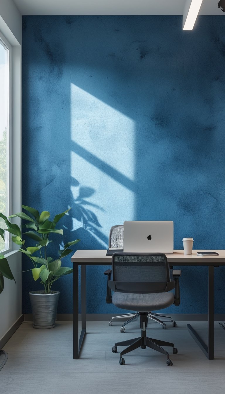
Choose a sapphire blue matte for a calm but focused backdrop in your office. The deep blue helps reduce visual noise and keeps your attention on tasks without feeling dull.
Add a subtle texture to the paint or wallpaper to give the wall depth. You get a tactile look that reads soft from far away and interesting up close. This prevents the color from feeling flat while keeping reflections and glare low.
Pair this shade with light wood or warm metal accents to balance the cool tone. Use simple, uncluttered furniture and a few plants to soften the space. Your high-focus zone will feel intentional, steady, and comfortable without distraction.
PRO TIP
When you pick sapphire blue matte, test samples on different walls at different times of day. Lighting changes the color more than you might expect. Put a 2-foot square sample near your desk and view it in morning, midday, and evening light to see how it reads. If your room gets little natural light, choose a slightly lighter sapphire or add warm task lamps so the space doesn’t feel too gloomy. For texture, try a micro-finish or grasscloth—both hide scuffs and add subtle interest. Keep other colors minimal and use contrast with pale trim or a whiteboard for notes.
19) Vintage Library Wallpaper with Dark Woodgrain
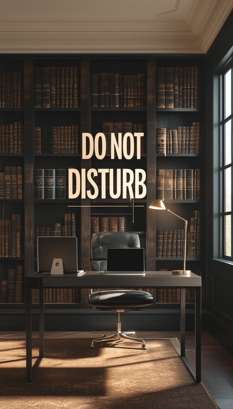
Choose vintage library wallpaper with dark woodgrain to give your office a calm, focused feel. The deep tones reduce visual noise, so your eyes rest and your mind stays on tasks. You get a warm, classic backdrop without bulky shelves or clutter.
Pair the wallpaper with simple lighting and a leather chair to keep the mood serious but cozy. Avoid shiny finishes that reflect and distract. Textured paper or matte vinyl will cut glare and add a subtle tactile look.
Use this style on a single accent wall behind your desk to create a focal point. That keeps the room from feeling too heavy while still signaling “do not disturb” to others. Add one or two brass accents or a vintage clock to complete the library vibe.
PRO TIP
When you pick vintage library wallpaper with dark woodgrain, sample it in your actual workspace before committing. View the sample at different times of day to see how natural and artificial light change the color and grain. Stick with matte or low-sheen materials to cut reflections and help screens stay readable. If your room lacks natural light, add layered lighting—task lamps for focused work and warm ambient lights to keep the space inviting. Finally, balance the dark wall with lighter furniture or a neutral rug so the room feels grounded but not oppressive.
20) Olive & Charcoal Camouflage Pattern
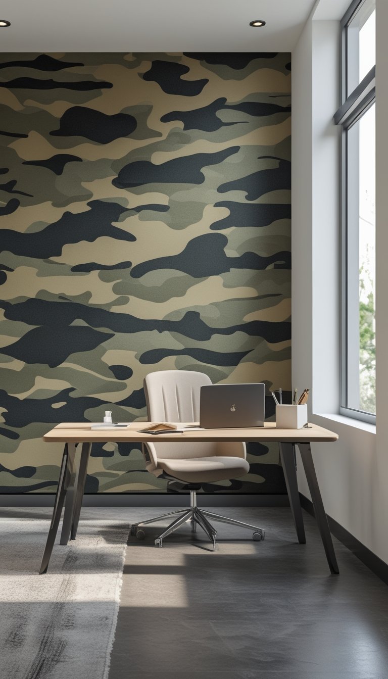
An olive and charcoal camouflage wallpaper gives your office a bold, grounded look. The muted greens and deep grays cut glare and create a calm backdrop for focused work. This pattern feels modern while nodding to classic camo shapes.
Use it on a single accent wall behind your desk to avoid overwhelming the room. Pair it with simple furniture and warm wood tones to keep the space balanced. Small metal or black accents will tie in the charcoal and sharpen the look.
If you want a softer effect, choose a version with more negative space and smaller shapes. That keeps the pattern interesting without pulling attention from your tasks.
PRO TIP
Pick a matte finish to reduce light reflection and help you stay focused during long work sessions. When installing, align pattern repeats so the camo flows naturally across the wall; mismatched seams can distract more than help. If your office gets little natural light, add a desk lamp with warm light to prevent the darker tones from feeling gloomy. For a cohesive scheme, use olive accents in textiles like a throw pillow or rug, and keep larger surfaces neutral. Finally, test a large swatch on the wall for a few days to see how the color and scale affect your mood and concentration before committing.
21) Deep Burgundy Velvet-Texture Accent
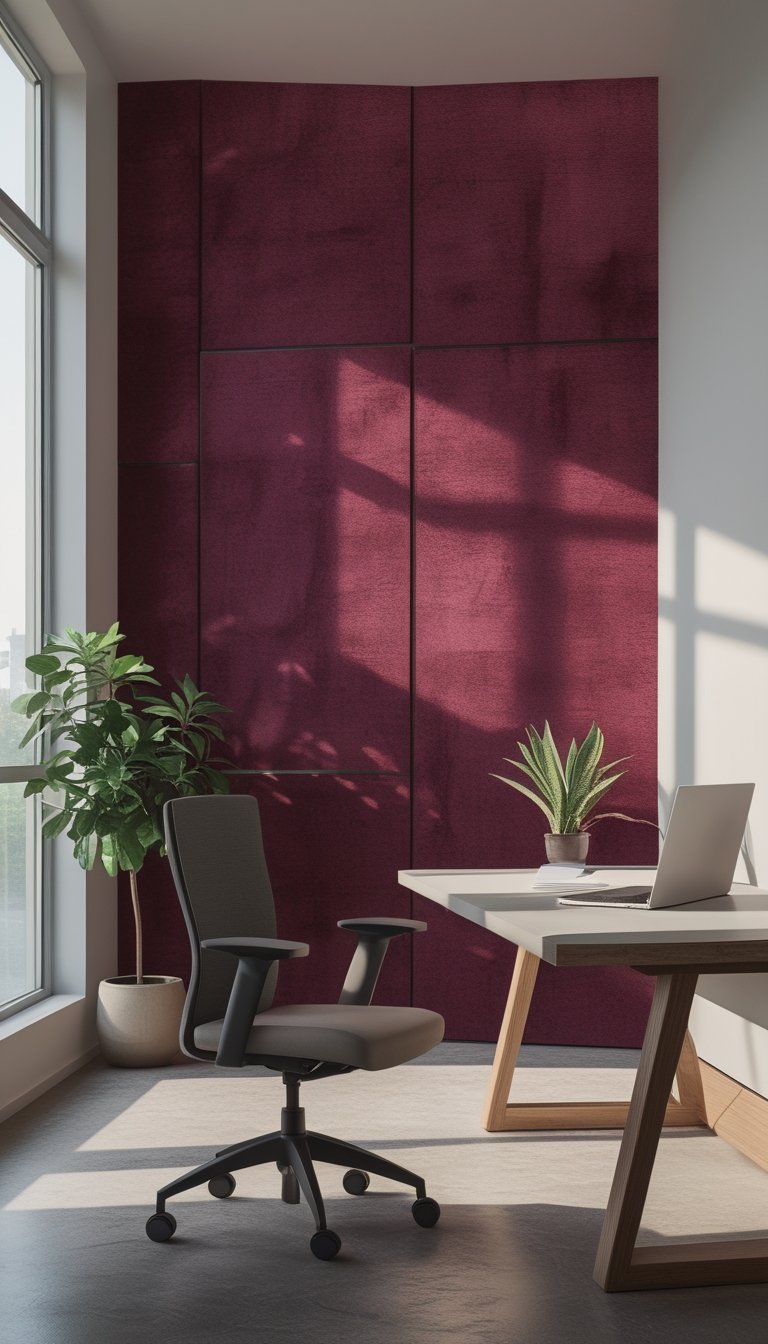
A deep burgundy velvet-look wallpaper adds warmth and focus to your office. The rich color reduces visual noise and helps you stay on task during long work sessions. Velvet texture suggests luxury without being flashy, so your space feels calm and serious.
Place this accent on one wall behind your desk or in a small conference nook. It works best paired with neutral furnishings like light wood or soft gray to keep the room balanced. Add simple brass or matte black hardware for a refined, steady look.
PRO TIP
Choose a wallpaper with a subtle, tactile velvet effect rather than a glossy finish to avoid glare from office lights. Test a 2×2-foot sample on the wall where you plan to install it. Observe the sample at different times of day to see how the color shifts under natural and artificial light. Combine the burgundy with sound-absorbing textiles, such as a wool rug or upholstered chair, to support focus in high-concentration areas. Keep accessories minimal: one or two framed prints and a single desk lamp help maintain a tidy, disciplined vibe.
22) High-Contrast Chevron in Slate and Cream
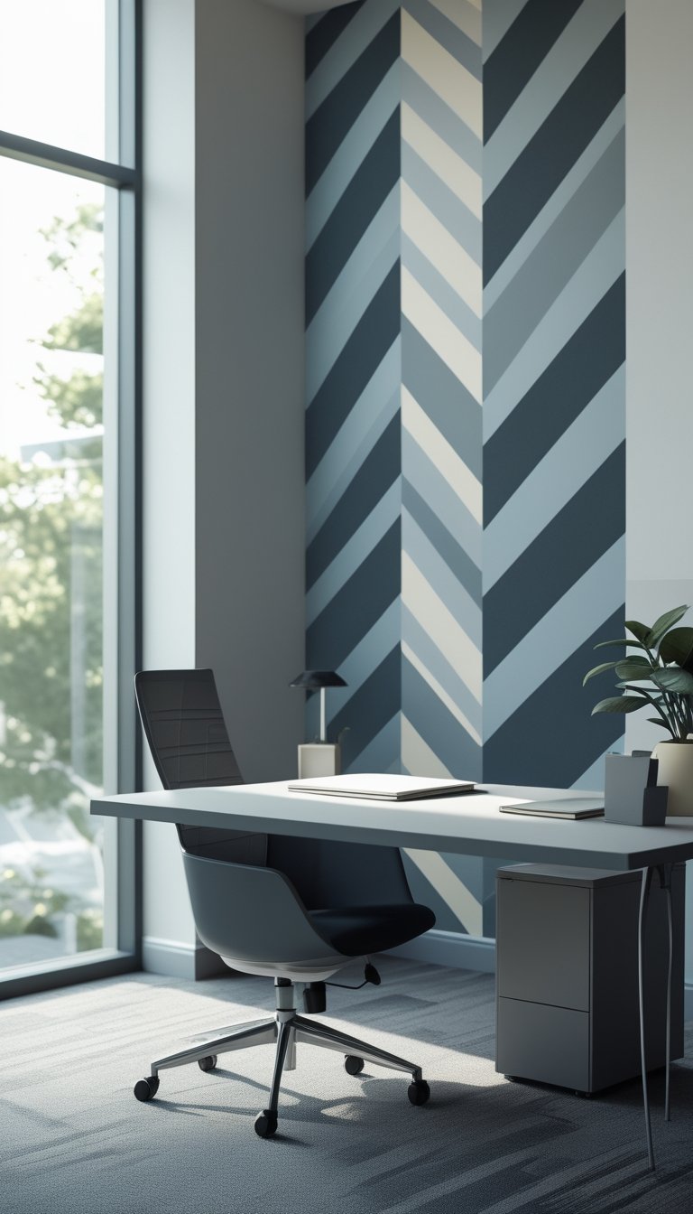
A high-contrast chevron pattern in slate and cream gives your focus zone a clear, modern edge. The sharp angles guide the eye and create a sense of order that helps you stay on task. Use slate for the bold stripes and cream to soften the look.
Keep furniture simple and low-profile so the wallpaper remains the visual anchor. Matte finishes reduce glare and make the pattern feel less busy under office lights. Position desks perpendicular to the chevrons to enhance movement without distracting you.
Choose one wall for the pattern and paint the others in a complementary neutral. Add a few cream textiles to tie the room together and keep your workspace calm. The result feels intentional and helps you protect deep work time.
PRO TIP
When you install a high-contrast chevron, measure carefully and use painter’s tape to keep lines crisp. If you’re applying peel-and-stick panels, align one stripe at a time to prevent pattern drift. Consider a subtle texture on the cream stripes; it hides minor scuffs and looks richer than flat paint. Place task lighting with adjustable heads to avoid casting harsh shadows across the pattern. If you find the chevrons too bold, introduce a thin trim or chair rail to break the wall visually. Finally, test a small sample first so you can live with the effect for a few days before committing to the whole wall.
23) Forest Green Moss-Effect Paneling
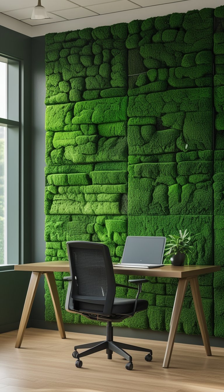
Choose moss-effect panels to bring calm, textured color into your high-focus zone. The deep forest green soothes the eyes and cuts visual glare, helping you concentrate for longer periods.
Panels with a soft, three-dimensional surface also dampen sound. That reduces office noise without adding heavy acoustic treatments you might not want in a clean, modern space.
Install panels behind a desk or on a single accent wall to keep the effect intentional. Too much texture can feel busy, so pair the moss finish with simple, matte furniture and warm lighting.
PRO TIP
When you pick moss-effect paneling, think about maintenance and indoor climate. Real preserved moss looks and feels authentic but can be sensitive to humidity and direct sunlight, so place it away from vents and bright windows. Faux moss offers similar texture with lower upkeep, and many options meet fire and building codes for offices. Measure your wall and order a little extra to cover cuts and mistakes. Use panels sparingly as an accent rather than wrapping the whole room; this keeps your high-focus area calm and prevents overstimulation. Finally, coordinate small metal or wood accents to balance the organic look.
24) Smoke Gray Linen-Textured Wallpaper
Choose smoke gray linen-textured wallpaper to make your high-focus zone calm and professional. The soft gray keeps the room neutral so it won’t distract you. The linen texture adds warmth and subtle depth without loud patterns.
This wallpaper suits private offices, quiet rooms, and meeting nooks. It helps reduce visual clutter while still feeling inviting. Pair it with warm wood furniture or matte black accents for a modern look.
Keep lighting soft and even to highlight the texture. Avoid glossy finishes that fight the linen look. Use it on a single feature wall or across the whole room for a cohesive effect.
PRO TIP
When you install smoke gray linen-textured wallpaper, test a 2×2 foot sample on the wall at different times of day. Natural light can change the gray tone, so check how it looks in morning and afternoon light. If you use artificial lights, try both warm and cool bulbs to see how they shift the texture’s appearance. Match your trim and furniture to the undertone—look for cool or warm gray accents depending on the sample. For a cozier feel, add textiles like a soft rug or fabric panels that echo the linen texture. If you need a stronger visual cue for privacy, place a small, tasteful “Do Not Disturb” sign in a corner of the wall or on the door to keep the space focused.
25) Ink-Drop Abstract in Jet Black and Gray
You can use an ink-drop abstract wallpaper to make a quiet, focused zone feel modern and calm. Dark jet black mixed with soft gray creates a strong contrast that stays bold without being distracting. The flowing shapes mimic ink spreading on paper, which adds subtle movement while keeping the mood serious.
Choose a matte finish to cut glare and help the design read clearly from different angles. Pair the wallpaper with minimal desk clutter and neutral furniture so the pattern becomes a backdrop, not a focal fight for attention. This look fits meeting rooms, private booths, or a focused desk where you need to keep interruptions low.
PRO TIP
When you install an ink-drop abstract wallpaper, consider scale and repeat. Large drops with generous spacing feel more peaceful and less busy than a tight, high-repeat pattern. Test a 3–6 foot sample on the wall at eye level before ordering a full roll to check how light and shadow affect the tones across the day. Use soft lighting and matte surfaces nearby to reduce reflections that can make black areas look harsh. If you need sound control, add fabric panels or a rug to absorb noise without hiding the design. Finally, keep nearby accents in cool grays or muted wood to maintain a focused, professional atmosphere.
26) Navy Wallpaper with Tiny Metallic Speckles
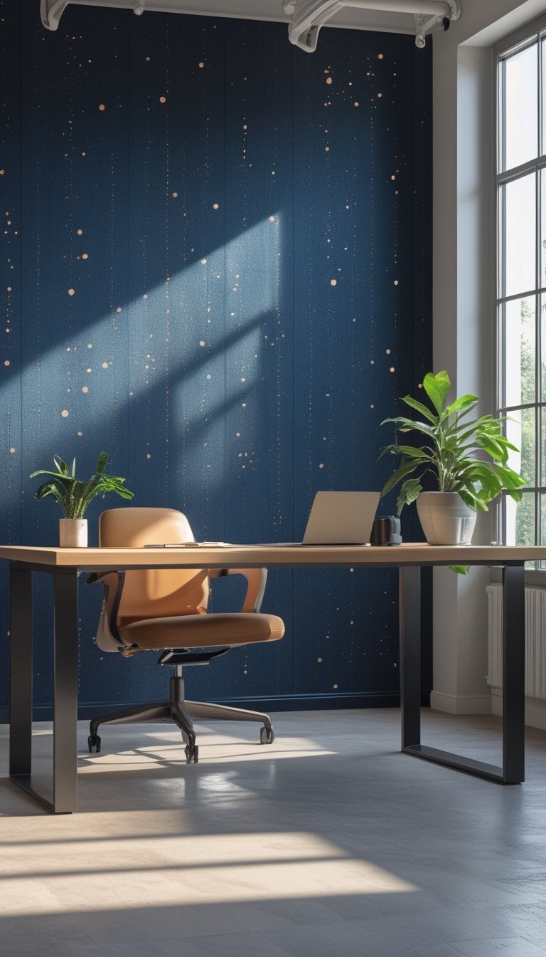
Choose navy wallpaper with tiny metallic speckles when you want a calm, focused backdrop that still feels a bit special. The deep blue soothes your eyes and reduces visual noise, helping you concentrate for long stretches. Small metallic dots catch light subtly without being busy or distracting.
Place this wallpaper on a single accent wall behind your desk to create depth. Pair it with matte furniture and warm task lighting to balance the shimmer and reduce glare. Keep other walls neutral to avoid competing patterns.
PRO TIP
Use matte finishes on desks and shelving to prevent reflections that can fight the tiny metallic highlights. Position your screen so natural light comes from the side, not directly in front of the wall, which lowers eye strain. If you work late, add a dimmable desk lamp with warm light to keep the metallic speckles visible but soft. Test a large sample on the wall before committing; lighting in your room can change how the speckles look. Finally, coordinate small décor pieces—like a bronze pen cup or navy organizer—to tie the space together without cluttering it.
27) Muted Espresso Brick-Texture Wallpaper
A muted espresso brick-texture wallpaper brings warmth without glare. The deep brown tones help hide fingerprints and marks, so your high-focus zones stay neat-looking longer. Textured brick adds subtle depth that keeps the space from feeling flat.
You can pair it with light wood furniture to balance the dark tone. Soft, neutral upholstery and task lighting prevent the wall from making the room feel too heavy. Use the wallpaper on one accent wall to anchor a meeting nook or focus room.
PRO TIP
Choose a matte finish to reduce reflections and prevent distraction during video calls. If your room is small, keep three walls light and use the espresso brick only on the wall behind your desk or seating. Add a slim, warm LED strip at the top or bottom of the accent wall to create soft contrast and highlight texture. When installing, align the brick pattern carefully to avoid visible seams; professional hanging helps if you want perfect matching. Finally, test a 2×2 foot sample on the wall first to see how the color reads with your room’s natural light.
28) Dark Pine Needle Pattern for Calm
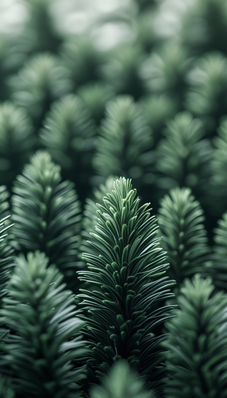
A dark pine needle wallpaper brings a quiet, natural feel to a focus room. The deep green tones reduce visual clutter and help your eyes rest between tasks. Patterns that mimic pine needles create texture without loud shapes, so they keep your attention on work.
Place this wallpaper on a single accent wall behind your desk to anchor the space. Pair it with warm wood furniture and soft lighting for a cozy, grounded look. Keep other walls light to avoid making the room feel too small.
PRO TIP
Use matte or low-sheen finishes to avoid glare that can distract you during long work sessions. If your space is small, limit the pattern to one wall or a framed section so it reads as a feature, not an enclosure. Add a few plants and natural-fiber textiles to echo the pine theme and improve air quality. Choose simple, uncluttered decor and keep desk items to essentials only. This helps maintain calm and supports sustained focus without visual noise.
29) Graphite Grid with Faint Blueprint Lines
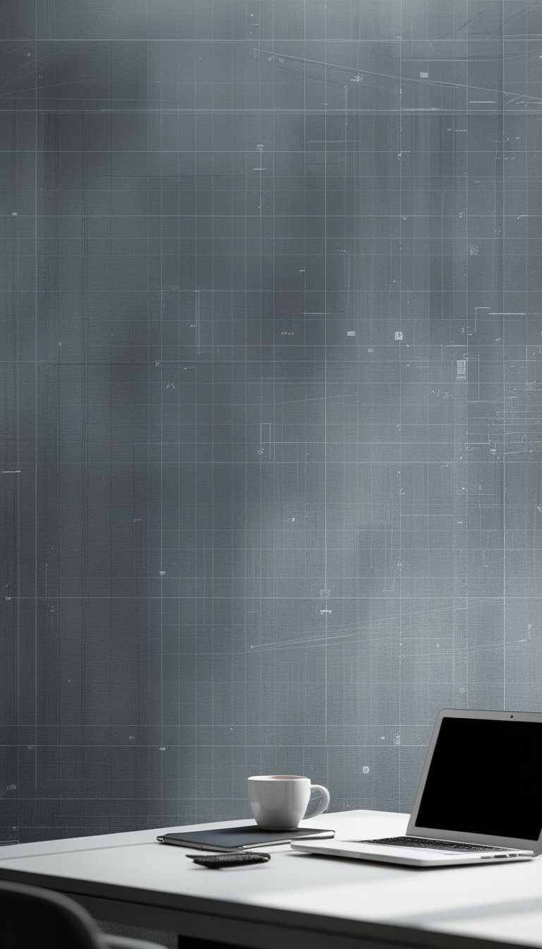
Choose a graphite grid wallpaper to give your office a calm, focused look. The soft gray tones reduce visual noise while the subtle grid keeps your eye guided. This mix helps you concentrate without feeling boxed in.
Add faint blueprint lines for a creative, technical touch. They suggest structure and planning, which can help you think more clearly. Keep the lines light so they don’t compete with notes or whiteboards.
Pair this wallpaper with warm wood furniture and matte black accents. That balance prevents the space from feeling cold. Use task lighting to bring out the texture and avoid glare on screens.
PRO TIP
When installing a graphite grid with faint blueprint lines, place it on the wall behind your main work area so it frames your workspace. Use low-reflective paint on adjacent walls to maintain a soft, focused atmosphere. If you like to pin sketches or sticky notes, mount a slim cork strip over the wallpaper instead of covering the whole sheet with tape. Choose complementary desk accessories in muted tones—charcoal, slate blue, or soft tan—to keep your visual field calm. Swap the wallpaper for a lighter panel behind a monitor if your screen causes eye strain, and test a sample patch for several days to ensure it supports long work sessions.
30) Moody Plum Matte Floral Mural
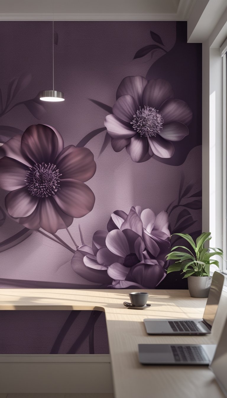
A moody plum matte floral mural gives your focus space calm and depth. The deep plum tones cut glare and reduce visual noise, so you can concentrate on detailed work without bright reflections.
Choose large-scale floral shapes with soft edges to avoid busy patterns that pull your attention. Matte finish keeps the look sophisticated and absorbs light, which helps create a quiet, focused vibe.
Place the mural on the wall behind your desk or on a single accent wall to anchor the room. Pair it with simple furniture and warm task lighting to balance the dark hue and keep the space inviting.
PRO TIP
When installing a plum mural, think about light and contrast. Position your desk so natural light comes from the side rather than directly behind you; this reduces screen glare and keeps the mural from appearing flat. Add a small lamp with warm light near your workspace to prevent the room from feeling too shadowed in the late afternoon. Keep nearby decor minimal and stick to neutral or soft metallic accents to let the mural do the visual work. If the plum feels too heavy, introduce a runner rug or cushions in muted blush or beige to lift the mood without breaking focus.