
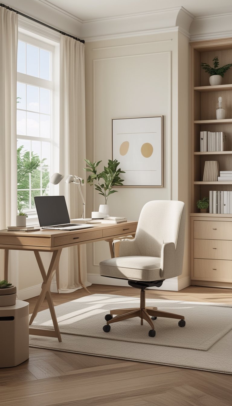
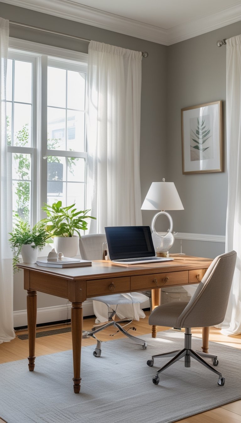
You want an office that feels calm, warm, and effortlessly put together—like a scene from a cozy film. This article shows seven neutral paint colors that give your workspace that soft, timeless look while keeping things simple to update and style.
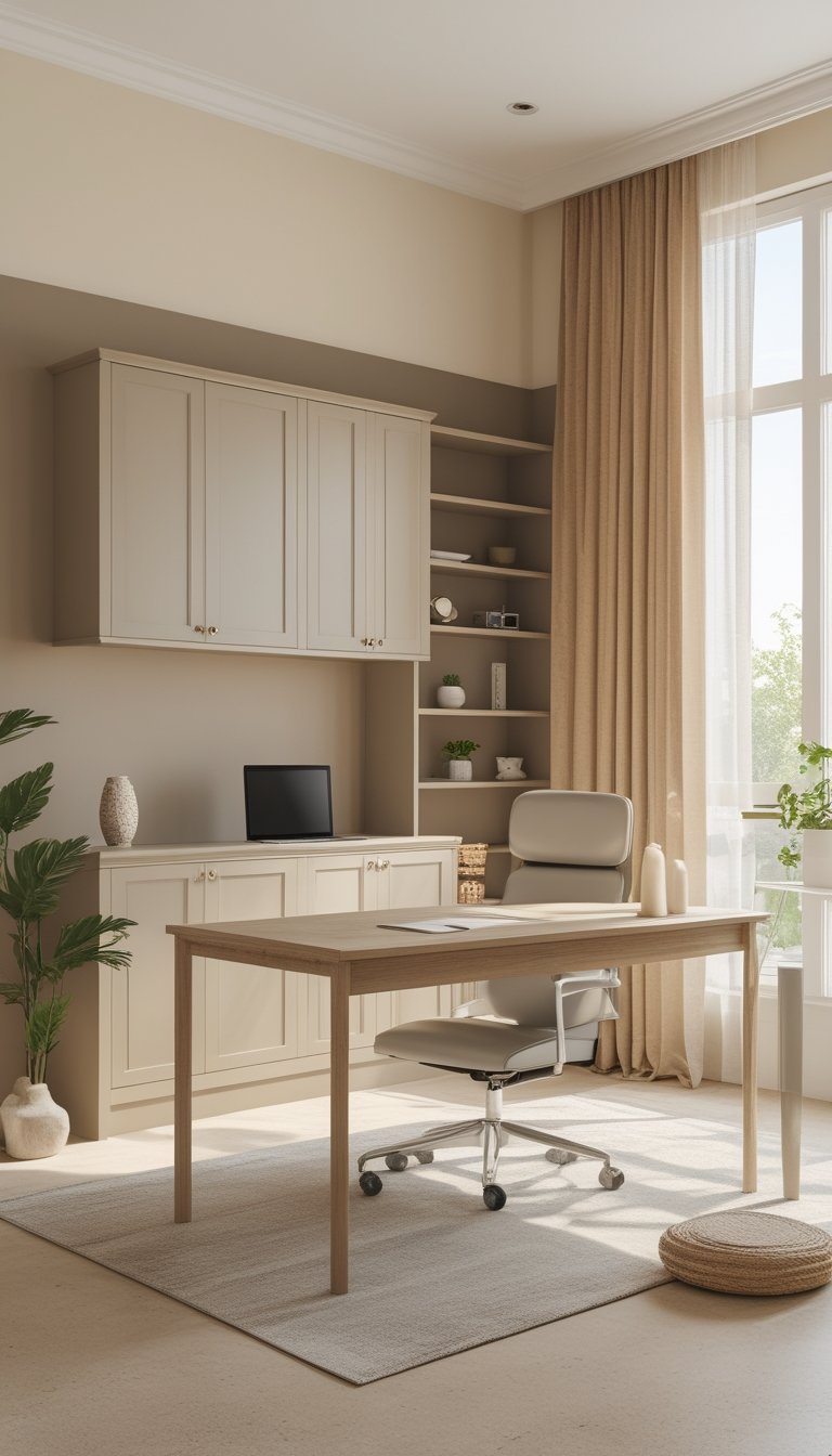
Pick the right neutral and your whole office will feel brighter, more spacious, and more inviting without a big renovation. You’ll get easy-to-use color options and clear ideas for how each tone fits into the Nancy Meyers-inspired aesthetic so you can start planning a refresh that actually feels like home.
PRO TIP
Test paint on your walls in different light before committing to a color. Paint chips look different under morning light, midday sun, and warm evening bulbs, so put large swatches in at least two spots where you work and live. Try samples on both a full wall and a small board you can move around. Live with each swatch for a few days to see how it reads with your furniture, wood tones, and textiles. If you want a softer, warmer feel, lean toward creams and warm beiges. For subtle contrast or a more modern edge, consider soft greys with warm undertones. Keep trims slightly lighter or whiter than your walls to add depth without harsh contrast.
1) Benjamin Moore Simply White (OC-117)
Simply White gives your office a clean, warm backdrop without feeling cold or clinical. It reads bright in natural light but softens under warm lamps, so your room stays inviting all day.
Use it on walls, trim, or cabinets to create a calm, cohesive look. It pairs easily with wood tones, soft grays, and muted blues for that cozy Nancy Meyers vibe you want.
Because it has slight warmth, it won’t fight with brass or cream accents. Paint a sample area to see how it shifts in your space before committing to a whole room.
PRO TIP
Test Simply White on different walls and view it at several times of day before you paint the whole room. Light changes how white looks: south-facing windows will make it feel brighter and cooler, while north-facing rooms can draw out its warm hint. Try pairing it with a warmer wood stain and a soft gray or blue upholstery to keep the palette layered and rich. If you plan to use glossy finishes on trim or cabinets, pick a sheen that matches how much contrast you want; higher sheen reads cleaner but shows more imperfections. Finally, bring fabric swatches and hardware samples into the test area so you can see how all elements work together with the paint.
2) Farrow & Ball Slipper Satin (No. 2004)
Slipper Satin is a soft off-white that reads as a pale, chalky neutral in most light. You’ll notice it leans slightly warm without cool blue undertones, so it avoids feeling stark or clinical.
This shade works well on walls when you want a calm backdrop that still adds depth. Pair it with darker trim or Old White woodwork to create subtle contrast and a sophisticated look.
Light reflects nicely off this color, which can help smaller rooms feel more open. It suits modern farmhouse and classic styles, and it plays well with natural textures like linen and wood.
PRO TIP
When you test Slipper Satin, view it at different times of day to see how warmth shifts with sunlight. Use large peel-and-stick samples or paint full-size swatches on three walls to observe morning, midday, and evening light. Combine Slipper Satin with richer accent colors like deep navy, warm taupe, or soft terracotta to add personality without overpowering the neutral base. For trim, try a slightly darker neutral to frame the walls and add definition. Finally, bring in varied textures—wool, brushed metal, and natural wood—to keep the room layered and inviting while staying true to a Nancy Meyers aesthetic.
3) Sherwin-Williams Alabaster (SW 7008)
Alabaster feels warm and soft, so your office will look cozy without losing light. It sits between pure white and cream, giving walls a gentle glow that works well with wood tones and brass accents.
You can use Alabaster on walls and trim for a calm, unified look. Pair it with muted greens, warm grays, or a deep contrast like Urbane Bronze for focal pieces such as a bookshelf or desk.
This color adapts to different lighting, so test samples in morning and evening light before you commit. Small shifts in light can change its undertone, but it usually reads as welcoming and refined.
PRO TIP
When you choose Alabaster, buy sample pots and paint large swatches on at least two walls in your office. Observe the swatches at different times of day and under your chosen task lighting. If you plan to mix wood furniture and painted pieces, place a sample near each material to see how they interact. Use Alabaster for trim or ceilings to keep the room feeling cohesive, and add one darker accent — a rug, lamp, or cabinet — to give depth. Finally, test how fabrics and art look against the painted walls before you finalize window treatments or upholstery.
4) Benjamin Moore Classic Gray (OC-23)
Benjamin Moore Classic Gray reads as a very light, warm gray that almost looks like an off-white. You can use it to keep your office feeling bright while adding a soft, cozy tone that won’t fight your furniture or decor.
This color works well with white trim, natural wood, and linen textures. It adapts to different light, so north-facing rooms might look cooler and south-facing rooms warmer.
Classic Gray is a good base if you want a calm, timeless backdrop for rich accents like deep greens or warm metals. It helps create a clean, polished Nancy Meyers–inspired look without feeling stark or clinical.
PRO TIP
Pair Classic Gray with crisp white trim and a slightly darker gray or greige on the cabinetry to add subtle depth. Use layered lighting—ambient, task, and accent—to reveal the paint’s warmth at different times of day. Bring in natural materials like a wood desk, woven rug, and linen curtains to keep the palette cozy and tactile. Add a few statement pieces such as brass hardware, velvet cushions, or a green plant to prevent the space from feeling flat. Test a large sample on your wall and view it at morning and evening light before committing, because the undertone shifts with exposure.
5) Farrow & Ball Wimborne White (No. 239)
Wimborne White feels like a warm, soft white that keeps a room bright without looking cold. You get a subtle creaminess that reads neutral in both north- and south-facing rooms.
This color works well on walls, trim, and ceilings when you want a unified, calm look. It reflects a lot of light, so small spaces feel more open while retaining a gentle warmth.
Pair it with soft greys, warm woods, and muted blues to get that classic Nancy Meyers cozy elegance. You can also use it as a backdrop for textured fabrics and brass accents to keep the room layered but understated.
PRO TIP
When you test Wimborne White, try large sample boards and view them at different times of day. Morning light can make the paint look cooler, while evening light brings out its warm undertone. Paint a section of wall and stand back at various angles to catch subtle shifts. If you plan to use the same color on trim and walls, test both finishes—eggshell or matte on walls and a slightly glossier trim—to see how sheen changes the perceived color. Finally, compare it next to your furniture and art to ensure the warmth complements your palette.
6) Sherwin-Williams Repose Gray (SW 7015)
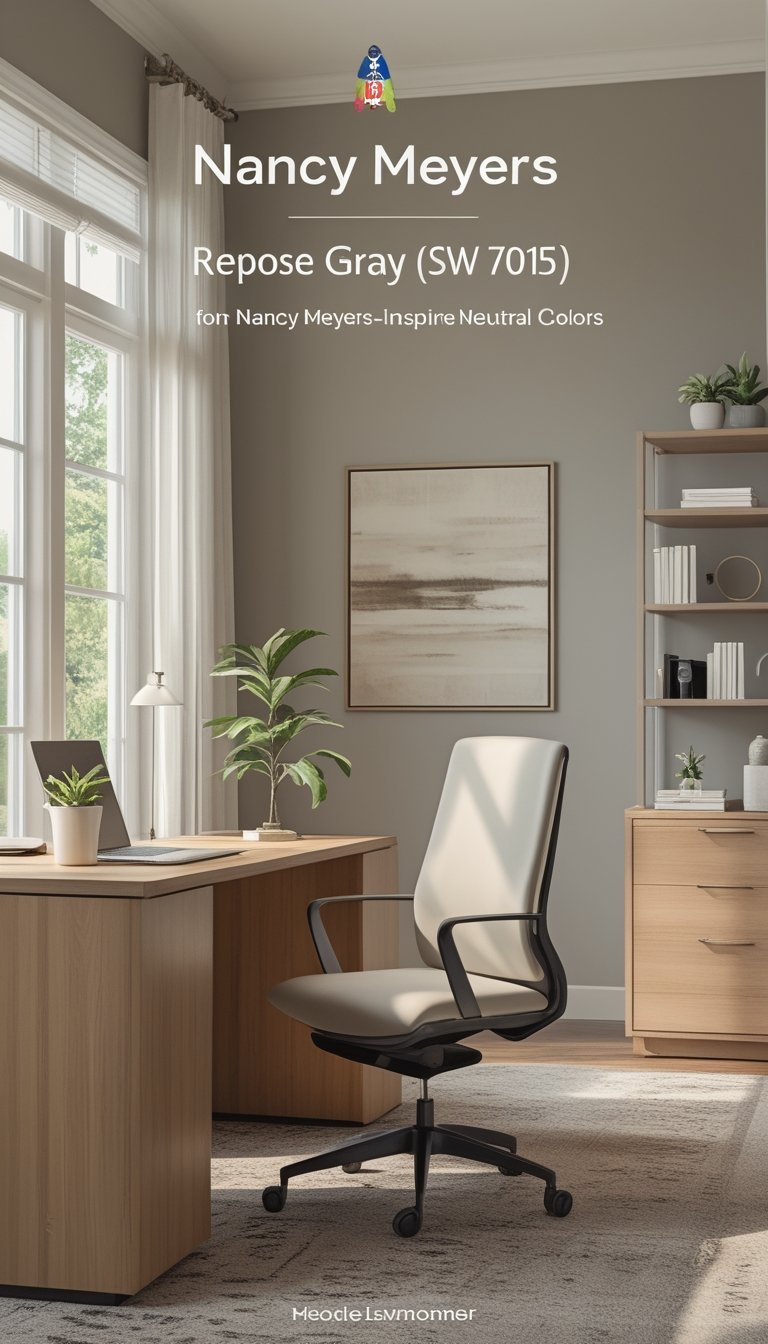
Repose Gray offers a soft greige that feels warm without being yellow. You can use it on walls to create a calm, neutral backdrop that lets furniture and art stand out.
This color adapts to light, so it can read cooler in bright north light and warmer in afternoon sun. Test large swatches in the room before you commit to see how it behaves across the day.
Pair Repose Gray with crisp white trim and warm wood tones for an elegant Nancy Meyers look. Add muted blues or soft greens for subtle color, or brass accents for a cozy, polished feel.
PRO TIP
You should sample Repose Gray on at least three walls and view it at morning, midday, and evening light. Paint 2–3 large swatches rather than small patches so you can see how the color moves across a whole wall. Try different sheens—eggshell on walls and semi-gloss on trim—to balance depth and cleanability. If the room feels too warm, bring in cooler textiles like slate-gray curtains; if it feels too cool, add beige or wood accents. Keep larger pieces neutral and add personality with art and accessories so you can update the room easily.
7) Benjamin Moore Edgecomb Gray (HC-173)
Edgecomb Gray gives you a soft greige that sits between gray and beige. It reads warm in sunlight and stays calm in low light, so your office will feel cozy without looking dated.
You can pair it with crisp white trim for a clean, classic look. Or add warm wood furniture and brass accents to lean into a Nancy Meyers-style, lived-in elegance.
This color works well on walls or cabinets because it adapts to different materials and lighting. Test a large patch on your wall before you commit, since undertones shift with your room’s light and furnishings.
PRO TIP
When you choose Edgecomb Gray, paint large sample panels and check them at morning, afternoon, and evening light. Use satin or eggshell for walls to balance washability and soft sheen, and reserve matte for ceilings. Add textiles in creamy whites and pale blues to keep the palette layered but calm. If you want contrast, bring in deeper grays or navy in small doses like a desk chair or picture frames. Finally, coordinate your baseboards with a warm white rather than a stark white to avoid a harsh line and keep the room feeling gentle and inviting.