You can make your workspace feel intentional and calm by matching your office wallpaper to the small items you use every day. Choosing colors, textures, and simple patterns that echo your desk accessories will pull the whole room together and help you focus.
This article shows easy, practical ways to mix wallpaper styles with lamps, organizers, pen holders, and more so your desk feels balanced and useful. You’ll find ideas that fit both bold and soft tastes, so you can create a space that looks good and helps you work well.
Think about one main color or material you use often, like navy, wood, or brass, and let that guide most of your choices. Start with wallpaper that sets the mood—calm neutrals for focus, cool blues for a professional feel, or subtle patterns for texture without clutter. Then pick two accessory colors or finishes that repeat that mood: a metal organizer and a matching lamp shade, or wooden trays with a plant in a ceramic pot. Keep most items simple and functional so the pattern or color you love can stand out without competing with too many bold pieces. Swap small items seasonally to refresh the look without redoing the whole room.
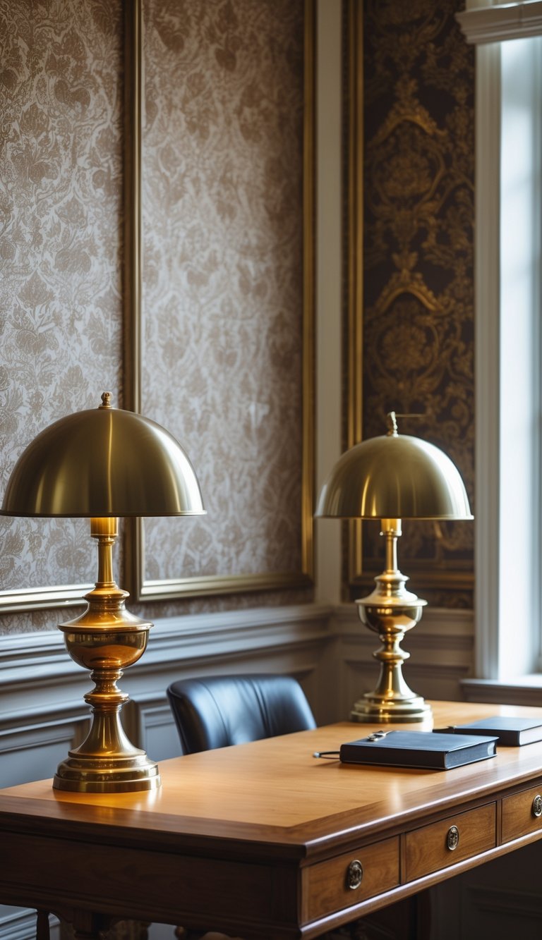
1) Choose wallpaper with colors that match your desk lamp shade
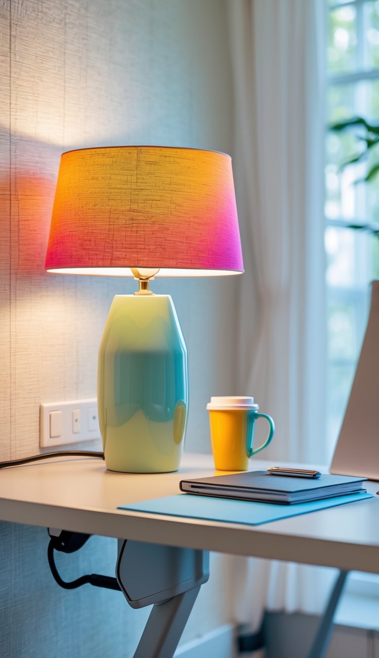
Pick wallpaper that shares at least one color with your lamp shade. This small tie creates a calm, pulled-together look without much effort. You don’t need an exact match; a similar tone or lighter shade works well.
If your lamp shade is bold, use wallpaper with that color as an accent rather than the main hue. That keeps the room balanced and prevents the space from feeling too busy. For neutral shades, look for wallpaper with subtle hints of the same tone to add warmth.
Test swatches in your office light before you commit. Colors look different under warm and cool bulbs, and natural light changes through the day. Hold the lamp near the sample to see how they play together.
PRO TIP
Choose a lamp shade color first if you plan to change lighting often. Lamp shades are easier and cheaper to swap than wallpaper, so this gives you flexibility. When picking wallpaper, bring your lamp or a fabric swatch to the store. Compare them under the same lighting you use at your desk to avoid surprises. If you like patterns, pick wallpaper where the lamp color appears in small amounts; it will connect the pieces without overwhelming the room. For textured wallpaper like grasscloth, match the shade’s undertone rather than its exact color. Finally, consider using other small accessories—like a mouse pad or pen holder—in the same shade to strengthen the color link and make the space feel cohesive.
2) Pick a geometric pattern wallpaper to pair with metal desk organizers
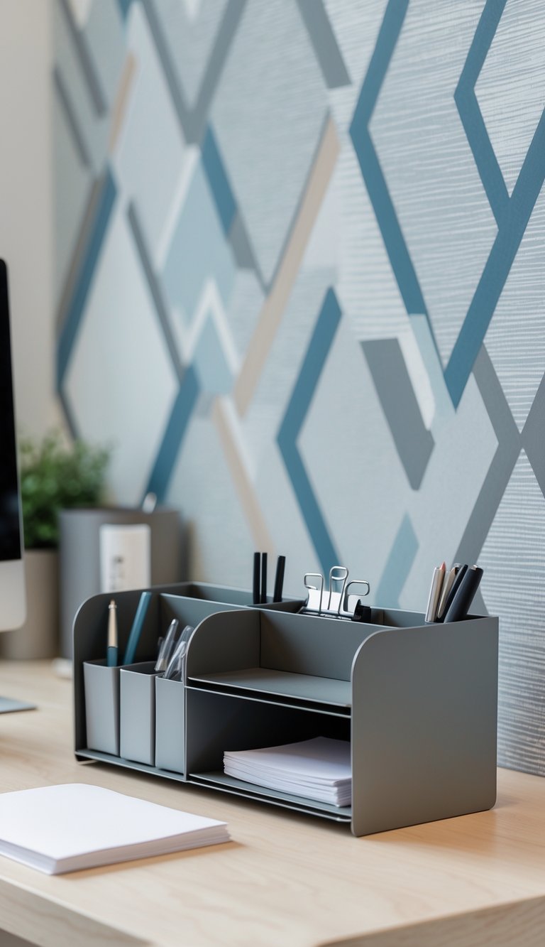
Choose a geometric wallpaper with clear lines and shapes to match metal desk organizers. The clean angles of triangles, hexagons, or grids echo the sharp edges of metal trays and pen holders, making the look feel intentional.
Stick to a limited color palette so the metal pieces stand out. Neutral tones with one accent color work well; brass or chrome organizers pop against charcoal, navy, or muted earth tones.
Vary the scale of the pattern based on desk size. Large patterns suit spacious workstations, while small repeats keep a compact desk from feeling busy.
PRO TIP
Pick a geometric pattern that balances with your metal finishes. If your organizers are shiny chrome, a matte wallpaper with subtle contrast prevents glare and keeps focus on tools, not reflections. For brass or gold organizers, choose warmer wallpaper tones like deep green, muted terracotta, or warm gray to create a cozy, coordinated look. Match one wallpaper color to a small accessory—like a mouse pad or notebook—to tie the space together without overdoing it. Finally, consider peel-and-stick options so you can test different patterns and swap them when your style or metal finishes change.
3) Use floral wallpaper paired with pastel-colored pen holders
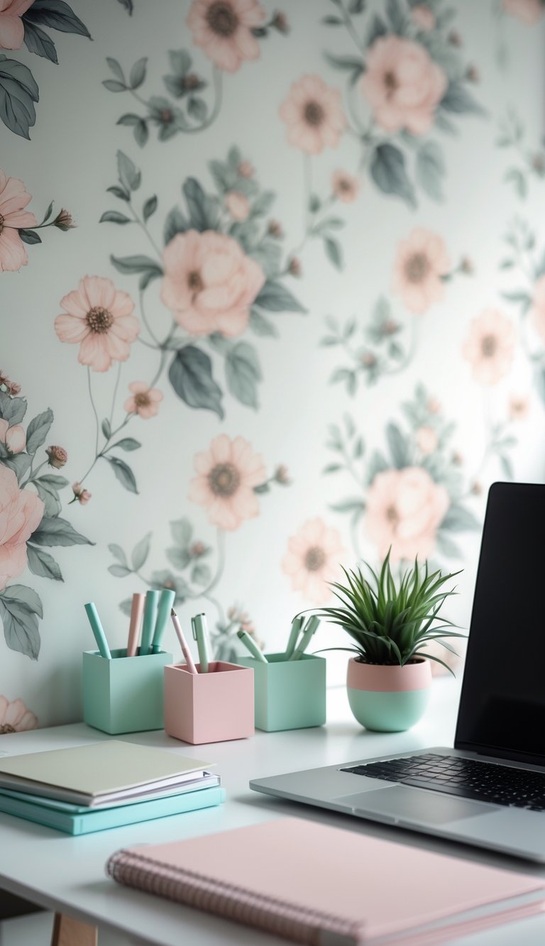
Floral wallpaper brings pattern and life to your office wall. Choose a print with soft blooms so the space feels calm, not busy.
Match that wallpaper with pastel pen holders to build a gentle, cohesive look. Pick one or two pastel tones from the pattern and repeat them in your desk accessories for a tidy, pulled-together feel.
Keep the pen holders simple in shape to avoid clashing with the wallpaper’s detail. Clear or matte finishes work well; they let the flowers stay the focal point while adding subtle texture.
Group a couple of pastel holders together for balance. You can mix sizes—tall for pens, short for clips—so the setup looks intentional and useful.
PRO TIP
Pick pastel pen holders in colors that appear in the wallpaper but slightly lighter. This creates a soft contrast that keeps your desk from feeling crowded. If the floral print includes several colors, limit your accessories to two pastel shades to avoid visual clutter. Use one pastel for writing tools and the other for small supplies like paper clips or sticky notes. Consider rotating seasonal pastels to refresh the room—mint in spring, blush in summer, pale blue in winter. Aim for practical placement: keep frequently used items within reach and decorative ones a little farther back to maintain a clean work surface.
4) Match a nature scene wallpaper with wooden desk accessories
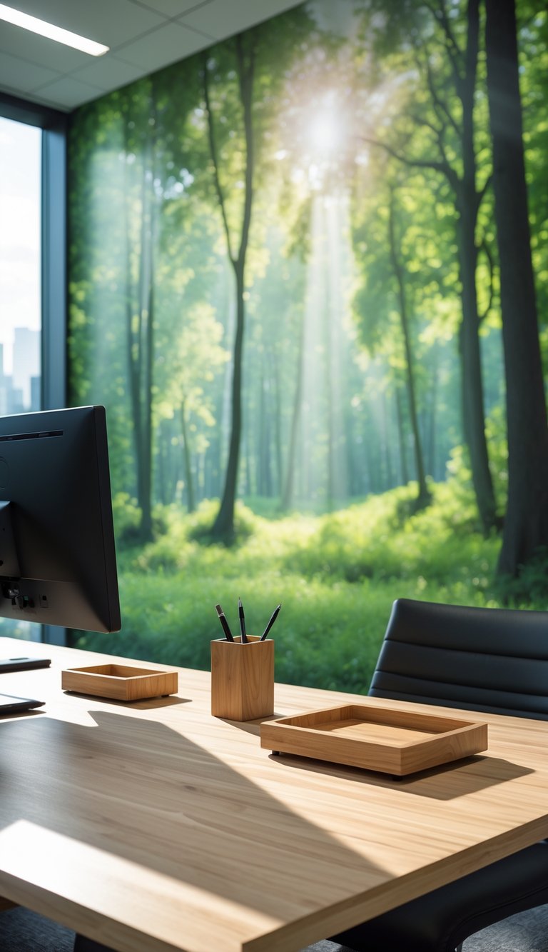
Choose a nature scene wallpaper that uses colors found in wood grain, like warm browns, soft greens, and muted golds. This creates a calm, unified look that feels natural and balanced. Keep patterns simple so the wood details on your desk stand out.
Pick wooden accessories with a finish that echoes your wallpaper’s mood. A matte, raw wood works with rustic forest scenes, while a smooth, polished wood fits leafy, sunlit prints. Mix small items—pen cups, trays, and phone stands—to tie the look together without clutter.
Vary wood tones slightly for depth, but stay within the same color family to avoid visual clash. Add a single plant or moss tray to echo the wallpaper and bring real texture to your workspace.
PRO TIP
When pairing nature wallpaper with wooden accessories, think about scale and texture. Large, bold wallpaper scenes need simpler, smaller wooden pieces so the room doesn’t feel crowded. For detailed or busy prints, choose accessories with clean lines and minimal carving to avoid competing patterns. Match the wood grain direction subtly to the wallpaper flow—horizontal grain can ground landscapes, while vertical grain complements tree trunks or tall plant motifs. Test one or two items first before committing to many pieces. Good lighting helps wood tones read accurately, so check your choices in both daylight and lamp light. Small metal accents, like brass knobs or copper clips, can add contrast but keep them limited to one finish to maintain harmony.
5) Select bold abstract wallpaper and coordinate with colorful mouse pads
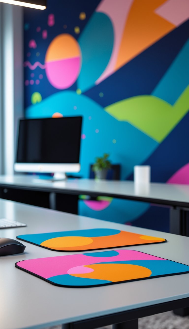
Choose a bold abstract wallpaper to give your office a strong visual focus. The busy pattern will draw the eye, so keep other elements simple to avoid clutter.
Pick a colorful mouse pad that echoes one or two tones from the wallpaper. A matched color tie-in makes the desk feel planned and calm, even if the wallpaper is energetic.
Use different textures to balance the look. A soft fabric mouse pad or stitched-edge desk mat can soften sharp shapes in the wallpaper and add comfort for long work sessions.
PRO TIP
When you choose a bold abstract wallpaper, let your mouse pad act as a deliberate accent rather than a competing pattern. Match one color from the wallpaper to your mouse pad and keep the pad’s design simple—solid color, subtle gradient, or a minimal repeat. If the wallpaper is very busy, pick a larger desk mat in a single color to ground the space and protect the desktop. For smaller desks, a compact mouse pad in a shared hue keeps things cohesive without overwhelming your workspace. Consider non-slip rubber bases and stitched edges for durability and a neater appearance.
6) Use subtle textured wallpaper and silver desk trays

Choose subtle textured wallpaper to add depth without stealing focus. A light linen or soft grasscloth pattern gives a calm backdrop that makes your workspace feel put together.
Pair this wallpaper with silver desk trays to keep items tidy and reflect light. The cool metal contrasts softly with warm textures, so small stacks of paper, notebooks, or mail look neat and intentional.
Keep trays simple and low-profile. Clear edges and shallow depths prevent clutter from looking heavy against the textured wall.
Match the scale of texture and tray size. If the wallpaper texture is fine, go for sleek trays; with more pronounced texture, pick slightly larger trays so both elements balance each other.
PRO TIP
When you pick wallpaper and trays, think about daily flow and visibility. Place trays where you drop items most often—near your keyboard or by the door—to reduce stray piles. Use one tray for active papers and another for long-term items so you always know where things belong. Add a non-slip pad under metal trays to protect the desk surface and stop sliding. If light is limited, choose matte silver finishes to cut glare while still brightening the area. Rotate what you display in trays to keep the look fresh and functional.
7) Pair wallpaper featuring soft neutrals with leather-bound notebooks
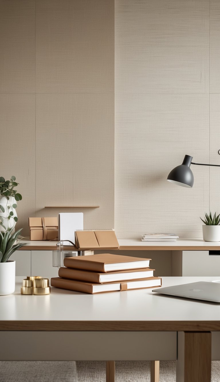
Soft neutral wallpaper—think warm beige, pale gray, or muted taupe—creates a calm backdrop for your desk. Leather-bound notebooks add texture and a sense of craft that plays well against those quiet walls. When you place a rich leather journal on a pale surface, the contrast feels intentional, not flashy.
Choose notebooks in deep browns, tan, or black to ground the space. The natural grain of leather brings warmth and matches wood or metal desk elements. You can line up a stack or leave one open to show its pages; both choices make the area feel lived-in and professional.
Keep other desk accessories simple so the leather stands out. A slim pen, a small lamp, and a tidy tray will let your notebook act as a focal point. This pairing works for both modern and classic office styles.
PRO TIP
Pick leather tones that echo any warm undertones in your wallpaper to create a subtle, cohesive look. If your wallpaper has cool gray undertones, choose charcoal or black leather instead of yellow-brown. Consider mixing notebook sizes—one large planner and one small pocket journal—to add visual interest without clutter. Treat leather with a neutral conditioner to keep it soft and prevent cracking, but test the product on a hidden spot first. For a personal touch, emboss initials or add a small elastic band to keep the notebook closed. These small details make your desk feel curated and help you stay organized.
8) Choose wallpaper with blue tones and match with a navy desk chair
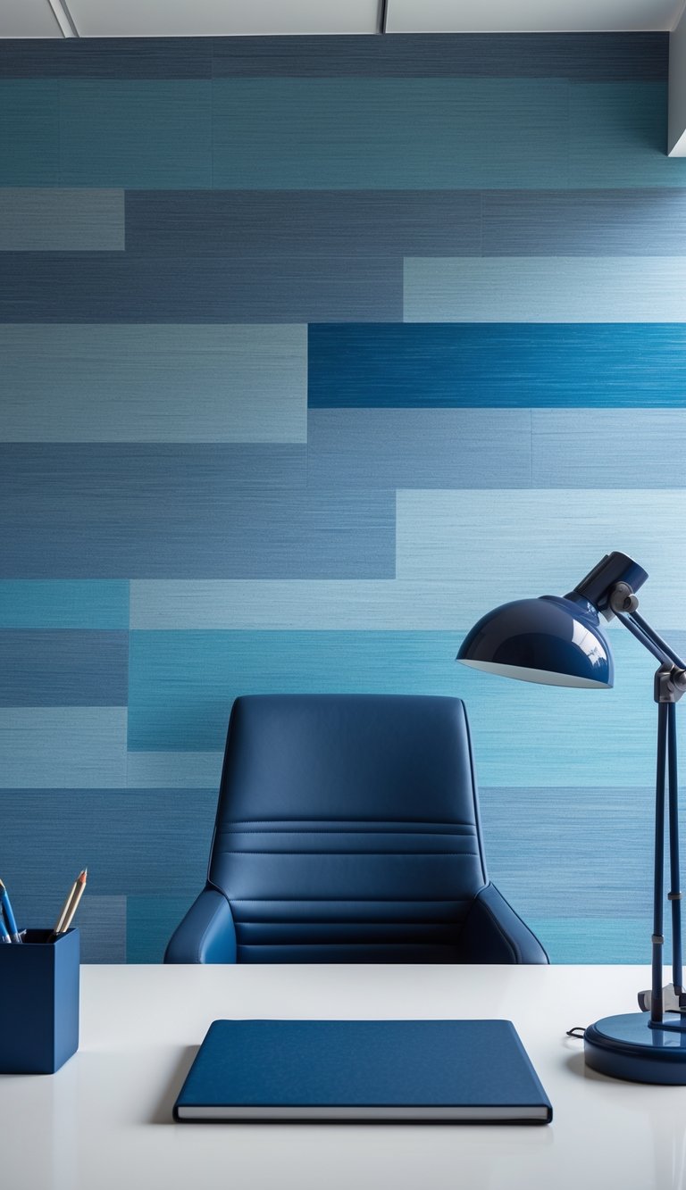
Pick wallpaper that has blue tones you like—soft sky, teal, or deeper navy. Blue brings calm and makes a room feel orderly, so it pairs well with a navy desk chair for a cohesive look.
Match the navy chair to the wallpaper by repeating the shade in small accents like a lamp, pen cup, or a picture frame. This creates balance without making the room too dark.
If your wallpaper is patterned, pull one of the darker blue shades into the chair color. For solid blue walls, choose a navy chair with texture or contrast stitching to add interest.
PRO TIP
Choose accessories that bridge the wallpaper and chair color to make your design feel intentional. For example, use brass or light wood accents to warm up cool blue tones. Add a throw pillow or a small rug that includes navy and a lighter blue to tie layers together. Keep most surfaces simple; limit bold patterns so the blues don’t compete. Test fabric swatches and wallpaper samples together before buying to ensure the navy you pick reads the same under your room’s light.
9) Use striped wallpaper and coordinate with matching striped filing boxes
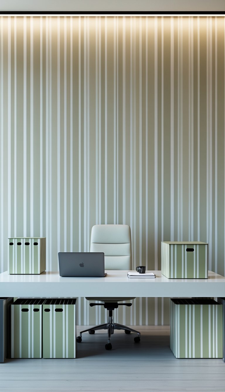
Striped wallpaper adds a clean, organized look to your office. When you match filing boxes to the stripes, the room feels calm and intentional.
Choose filing boxes that repeat one or two colors from your wallpaper. This keeps the pattern from feeling busy and ties the wall to your desk area.
Vary stripe width between the wall and boxes to add interest. For example, pair wide wall stripes with narrower box stripes so each element stands out on its own.
Keep other desk items neutral to avoid visual clutter. A simple lamp or plain tray will let the stripes be the focal point.
PRO TIP
Pick filing boxes with lids or labels that align with the wallpaper lines to maintain a tidy look. If your wallpaper has vertical stripes, store boxes vertically on shelves or stack them so the stripes flow. For horizontal stripes, arrange boxes side by side to keep the banding consistent. Use similar materials—like matte cardboard or woven fabric—to match the texture of the wall finish. If you need contrast, add one solid-color box in a coordinating shade to break the pattern without clashing. Rotate boxes seasonally to refresh the room without repainting.
10) Match botanical wallpaper with enamel planters on your desk
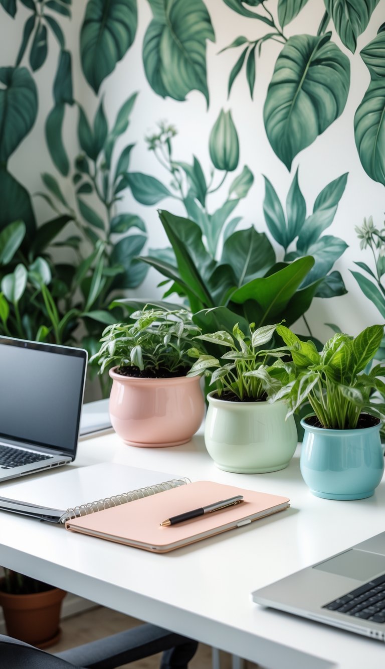
Choose enamel planters that pick up a color from your botanical wallpaper. A soft green or muted cream will echo leaf tones without fighting busy patterns. Small pops of a darker color add depth and keep the look grounded.
Place planters in groups of two or three rather than scattering many singles. Grouping creates a neat focal point and makes your desk feel intentional. Vary heights with stacking books or small risers to avoid a flat line.
Enamel is durable and easy to clean, so it works well near laptops and coffee cups. If your wallpaper is very detailed, use simpler planter shapes to avoid visual clutter. Your plants will bring the wallpaper to life and make your workspace feel fresher.
PRO TIP
Pick one dominant shade from your wallpaper and use it across several enamel planters to create unity. Mix finishes—matte and glossy—to add subtle contrast without adding new colors. Choose plants with different leaf sizes and shapes so each planter shows off the wallpaper differently. Keep one planter plain white or neutral to give your eyes a place to rest. For small desks, use a long narrow planter to mirror the desk’s shape and save space. Rotate plants occasionally so light reaches them evenly and your display stays healthy and balanced.
11) Select minimalist wallpaper and pair with sleek white desk accessories
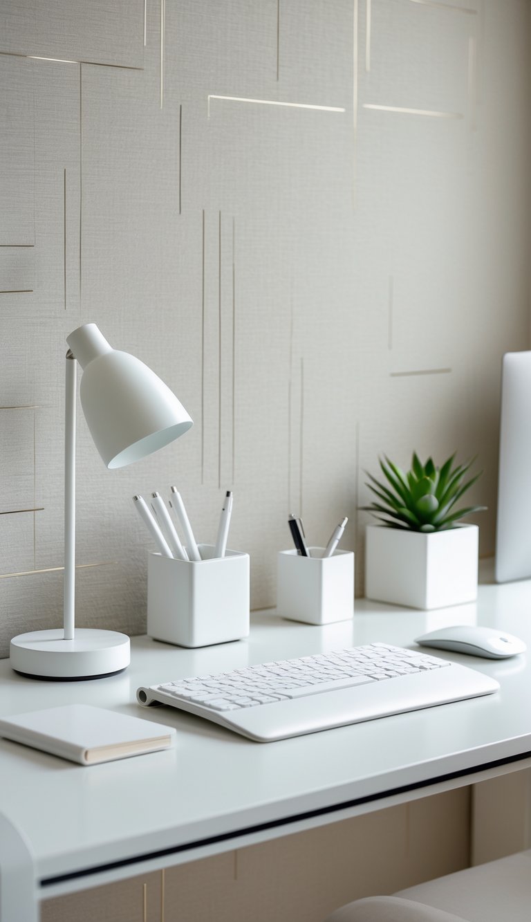
Choose wallpaper with a simple pattern or a single soft color to keep your walls calm. Minimalist designs reduce visual clutter and help your workspace feel open and clear.
Place sleek white accessories on your desk to echo that calm. Think a matte white lamp, a tidy pen cup, and a low-profile monitor stand. These pieces reflect light and make the room feel brighter.
Keep textures subtle to avoid contrast that fights the wallpaper. A white ceramic tray, a slim wireless charger, and a small planter with muted green leaves add interest without noise.
Match scale and balance: if the wallpaper has thin lines, use thin-profile accessories. If it’s a soft wash of color, choose rounded, simple forms to maintain harmony.
PRO TIP
When you buy white desk accessories, check the finish and undertone to match your wallpaper. Whites can lean warm or cool, and mixed tones can clash. Lay samples together before you commit. Also think about materials: matte white hides smudges while glossy finishes reflect more light. Choose pieces that are easy to clean and that fit your daily habits. Keep storage minimal—use one or two closed containers to hide small items. Finally, add one small personal item, like a framed photo or a simple sculpture, to keep the space from feeling too sterile while still staying cohesive.
12) Use vintage-style wallpaper and coordinate with brass desk lamps
Choose vintage-style wallpaper with subtle patterns like faded florals, damask, or small geometrics to create a warm backdrop. You want colors that echo brass tones—soft creams, muted greens, or warm taupes work well.
Place a brass desk lamp as a focal point on your workspace. The lamp adds a classic feel and pairs nicely with textured wallpaper without overwhelming it.
Match the lamp’s finish to other small accessories like picture frames or pen holders. Keeping metal tones consistent helps the room feel intentional and calm.
PRO TIP
When you pick a brass lamp, look for one with an adjustable arm or shade so you can direct light where you need it. Test the lamp against your wallpaper in both daylight and evening light to make sure the colors stay balanced. If the wallpaper has a busy pattern, choose a lamp with a simple shape to avoid visual clutter. Add a small tray in a matching brass or warm wood finish to group items and keep your desk tidy. Finally, consider a soft linen or velvet desk pad in a neutral shade to give your hands a comfortable surface and tie the vintage look together.
13) Match wallpaper with metallic accents and copper pen cups
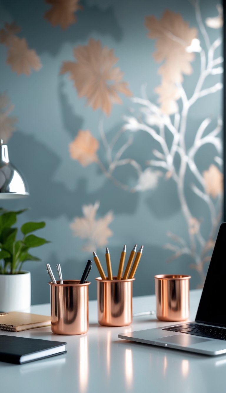
Choose wallpaper that highlights the warm glow of metallic accents. Copper tones work well with earthy wallpapers like sage, terracotta, or warm grays. This makes your desk area feel cohesive without being loud.
Use copper pen cups as small focal points. They catch light and draw the eye, especially against a matte or textured wallpaper. Group them with a matching lamp base or picture frame to create a mini theme.
Keep balance by limiting metallics to a few pieces. Too many shiny items can compete with patterned wallpaper. Let one or two copper items stand out while the rest of your accessories stay neutral.
PRO TIP
Pick a wallpaper with subtle metallic flecks or a soft sheen if you want a refined look. The wallpaper’s finish should complement, not overpower, your copper pen cup. For contrast, place a copper cup on a dark wood or deep-colored desk; the metal will pop. For a softer feel, pair copper with pale walls and woven textures like linen or rattan. Mix scales and textures: a bold patterned wallpaper needs simple metallics, while a quiet wallpaper can handle a more ornate copper cup. Finally, clean and polish copper regularly so it stays warm and inviting.
14) Pick wallpaper featuring cityscapes and pair with modern acrylic organizers
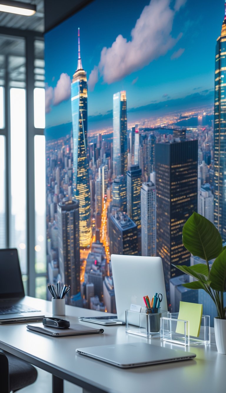
Cityscape wallpaper gives your office a clean, urban vibe. Use skyline or street-scene designs to add depth without cluttering your space.
Pair that wallpaper with clear acrylic organizers. Their transparency keeps the focus on the mural while giving you practical storage for pens, notes, and tech.
Acrylic trays and vertical files echo modern architecture and keep small items visible and easy to find. You can line a shelf with a few organizers to create a neat, gallery-like look.
Match the organizer shapes to elements in the wallpaper. For example, choose geometric acrylic pieces if your cityscape uses strong lines or mirrored tones.
PRO TIP
You can use clear acrylic organizers to balance bold cityscape wallpapers while keeping your desk functional. Place a shallow tray for daily small items, a taller pen cup for writing tools, and a document holder for papers you need at hand. Choose organizers with minimal hardware so they don’t compete with the mural. If your wallpaper is busy, limit the number of desktop pieces to three to avoid visual overload. For night-sky or dark skyline designs, pick organizers with matte bases or soft-edge finishes to reduce glare. Finally, rotate a single accent color—like brass clips or a navy mouse pad—to tie the cityscape and organizers together without adding clutter.
15) Choose wallpaper with pastel hues and match with ceramic cup holders
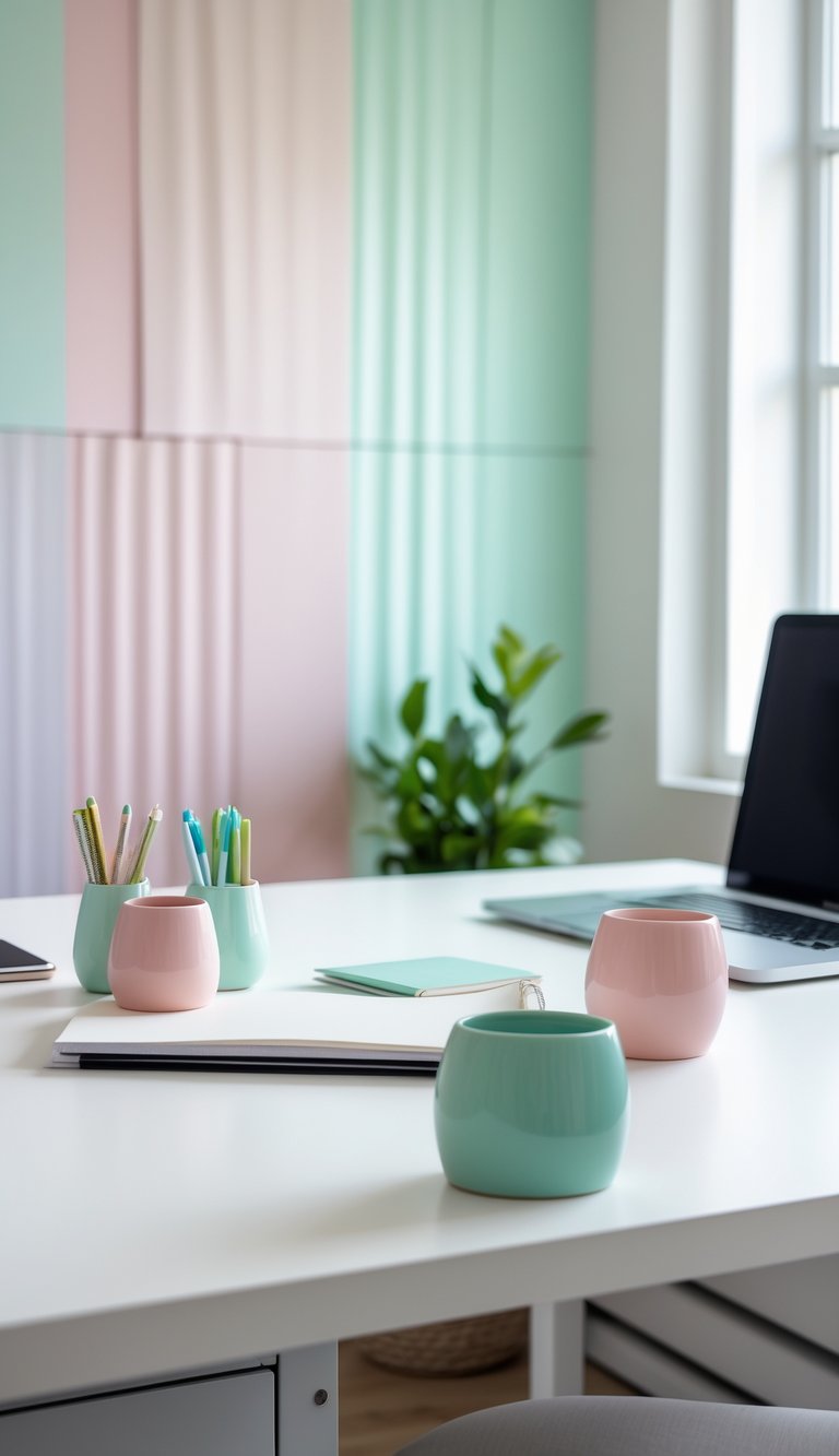
Pick wallpaper in soft pastel tones like mint, blush, or pale blue to keep your office calm and bright. These colors reduce visual stress and make your desk feel lighter.
Match ceramic cup holders to the wallpaper shade or choose a slightly darker tone for contrast. Ceramic adds a clean, tactile feel that pairs well with soft wall colors and simple desk lines.
Place cup holders where you reach easily to keep pens, brushes, or small tools neat. Simple shapes and matte glazes work best; they won’t compete with a patterned wall.
Keep patterns subtle if your pastel wallpaper has design elements. This helps your accessories stand out without making the space look busy.
PRO TIP
Choose ceramic cup holders with a glazed interior to make cleaning quick and easy if you use markers or liquids. Pick two or three accessory finishes—matte ceramic, light wood, or brushed metal—to build a simple, coordinated set that won’t clash. If your wallpaper has tiny motifs, echo one color in the cup holder for a pulled-together look. For bolder wallpaper, go with neutral ceramics in white, cream, or soft gray to balance the space. Test the combo by taping a wallpaper sample behind your desk and placing cup holders on top to see how the colors work in your light.