You spend a lot of time in your workspace, so the colors around you should help, not hurt. This article shows fifteen wallpaper colors that research and design experts link to better focus, mood, and energy so you can pick shades that fit your tasks and team.
You will learn which wallpaper colors tend to boost calm, creativity, focus, or alertness and how to use them in real workspaces. Flip through the palette options and guidance to match colors to the way you and your team work best.
Think about function first. Match calmer tones like soft blue or pale lavender to focus-heavy zones such as desks or private offices. Use warmer, energizing shades like warm yellow or creamy butter in collaboration areas or near meeting tables where conversation and quick thinking matter. For mixed-use spaces, try accent walls or removable wallpaper to test a color before committing. Keep lighting and furnishings in mind—natural light makes pale colors feel brighter, while low light can mute subtle hues. Finally, consider combining a neutral base with one or two accent colors to balance mood and productivity without creating visual clutter.
1) Soft Blue – promotes calm and focus
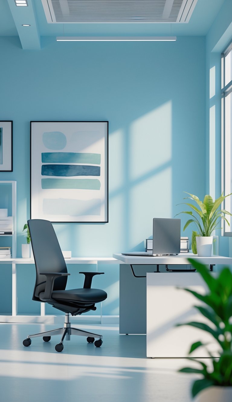
Soft blue walls help you stay calm during long work sessions. The color lowers stress and creates a steady background so your mind can focus on tasks. You might notice fewer distractions when your workspace feels peaceful.
This shade works well with natural light and wood tones. It keeps the room from feeling cold while still supporting concentration. Use muted blue rather than bright cyan to avoid visual fatigue.
Soft blue also pairs nicely with plants and white trim. Those touches add life without stealing attention from your work. Choose a matte finish to reduce glare and keep the tone gentle on your eyes.
PRO TIP
Choose a soft blue with gray or green undertones to match your room’s light. Test paint samples on different walls and view them at morning and evening times to see true color shifts. If your room faces north, pick a warmer blue to avoid a gloomy feel. Add a lighter accent wall behind your desk to create subtle depth without overwhelming the space. Keep furniture neutral and add a single warm accessory, like a wooden shelf or amber lamp, to avoid a cold palette. Finally, use fabric shades or low-reflective finishes to cut glare on screens and maintain a calm, focused environment.
2) Light Green – reduces eye strain and boosts creativity
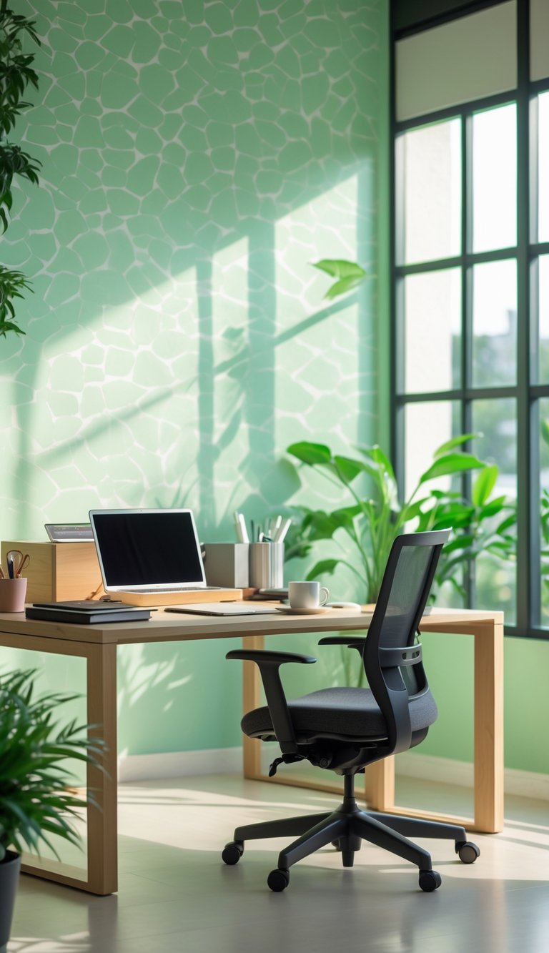
Light green brings a calm, natural feel to your workspace. You may find it easier to focus because green sits mid-spectrum and is gentle on the eyes.
This color links to nature, which can lower stress and help your mind relax. When you feel less tense, creative ideas can flow more freely.
Use light green on an accent wall or behind your monitor to reduce glare and eye fatigue. Pair it with warm wood tones or soft white for balance and a pleasant contrast.
PRO TIP
If you want a subtle lift in comfort and creativity, add small green elements rather than painting the whole room. Plants, a light-green wallpaper panel, or a green desk mat give similar benefits without overwhelming the space. Rotate the placement of these accents to keep your view fresh. Also adjust screen brightness and use an anti-glare filter to further reduce eye strain. Test paint samples on your wall at different times of day to see how natural and artificial light change the shade. Choose a muted light green rather than a bright neon tint for sustained comfort and better focus over long work sessions.
3) Warm Yellow – stimulates optimism and energy
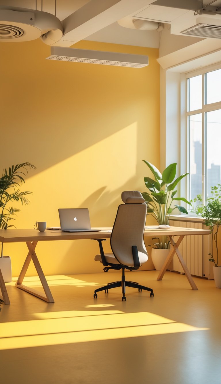
Warm yellow lifts mood and feels sunny without being harsh. When you add warm yellow wallpaper, the room can feel more welcoming and lively. That boost often helps you start tasks with more energy.
Use warm yellow on an accent wall or behind your main work area. Too much yellow can feel overwhelming, so balance it with neutral furniture or cool-toned decor. Small touches like a yellow patterned wallpaper can brighten the space without dominating it.
Pair yellow with natural light for the best effect. In low-light rooms, choose a softer, muted warm yellow to avoid eye strain. Try samples on the wall and live with them for a few days before committing.
PRO TIP
When picking warm yellow wallpaper, test it at different times of day to see how it changes with light. Tape up a large swatch and check it in morning, afternoon, and evening light. Combine yellow with pale gray or soft white trim to calm the palette and keep focus sharp. If you want a creative boost, add small accents in orange or coral, but keep the main surfaces neutral enough to avoid fatigue. For shared spaces, choose a shade that feels balanced and not too intense for long work sessions.
4) Muted Gray – enhances concentration without distraction
Muted gray gives your workspace a calm, steady base. It does not demand attention, so your eyes and mind can stay on tasks for longer.
Gray works well with brighter accents like teal or mustard when you need pops of energy. You can use gray on all walls or just one feature wall to avoid a bland feel.
This color reduces visual clutter and helps you spot important items like notes or screens. It pairs nicely with natural light and wood tones for a warm, balanced look.
PRO TIP
Choose a warm or cool muted gray based on your light. Warm grays add coziness in north-facing rooms. Cool grays feel crisp in bright, sunlit spaces. Test paint samples on different walls and view them at morning and evening to see how the tone shifts. Use matte finishes to cut glare from screens and glossy trims to add subtle contrast. Add texture—like a soft rug or fabric bulletin board—to keep the room from feeling flat. Finally, balance gray with plants or colored accessories to lift mood without adding distraction.
5) Pale Lavender – soothes stress and improves mood
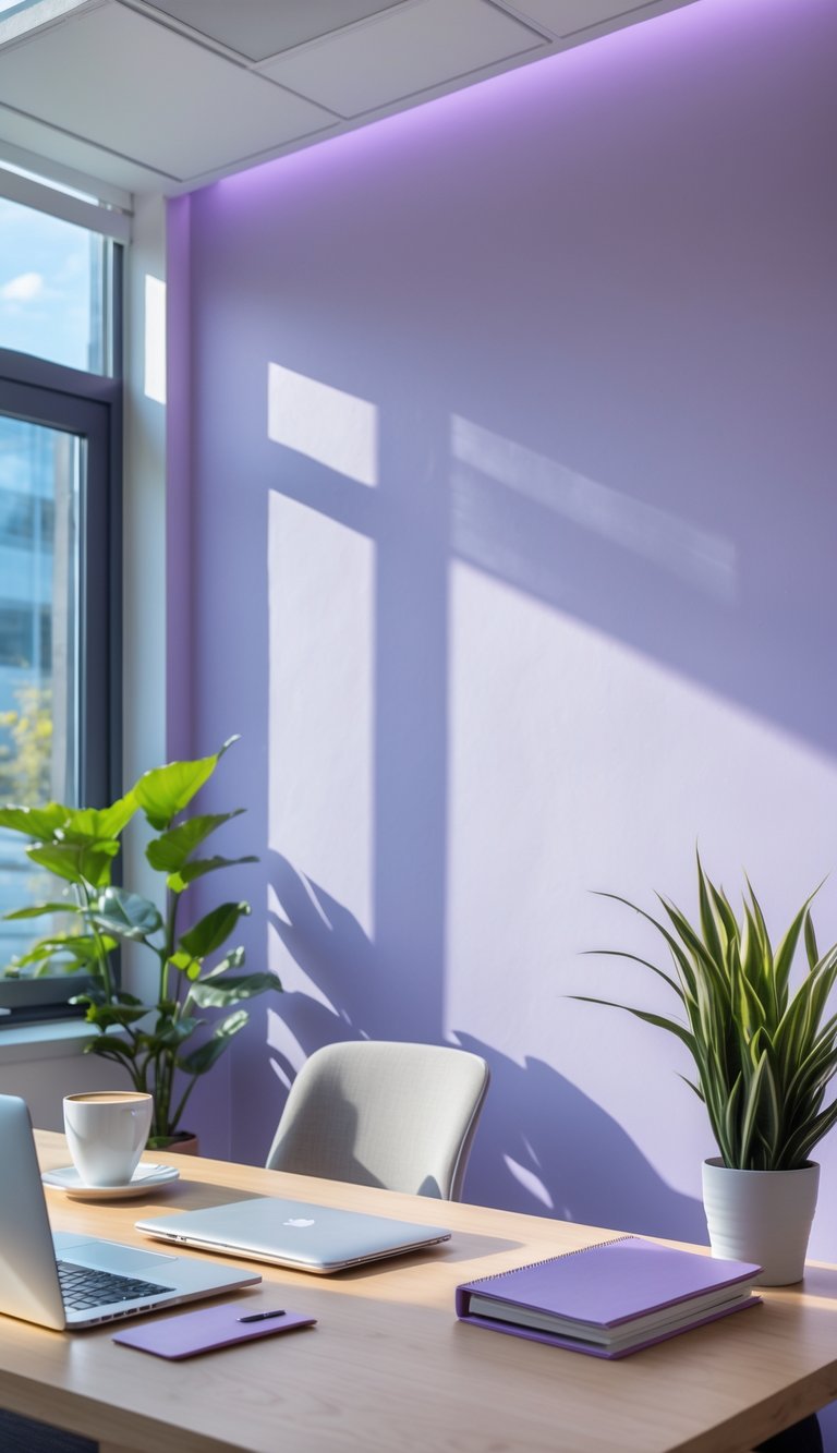
Pale lavender creates a calm backdrop that helps lower stress in busy offices. When you spend time in this soft color, your brain can shift into a quieter mode, which helps you refocus and think more clearly.
This shade lifts mood without being bright or distracting. It pairs well with neutral furniture and soft lighting to keep the space feeling open and gentle.
Use pale lavender on one wall or in small accents so the color supports work without overpowering it. Add plants and warm wood tones to balance the coolness and make the room feel welcoming.
PRO TIP
When you choose pale lavender for your office, aim for tones with a hint of gray to avoid looking too sweet or childlike. You can paint a single feature wall in pale lavender and keep the other walls in soft off-white or light gray. Add task lighting with adjustable warmth to keep color perception steady throughout the day. Use textiles—like curtains, rugs, or chair cushions—in deeper plums or muted greens to give your space contrast and depth. Test samples at different times of day to see how natural light changes the shade before committing to the full room.
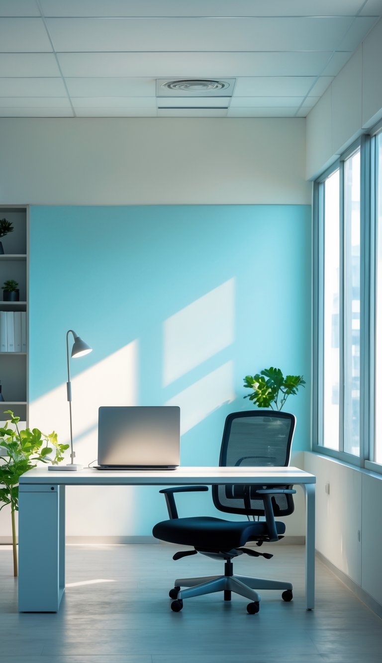
6) Sky Blue Accent Walls – supports clear thinking
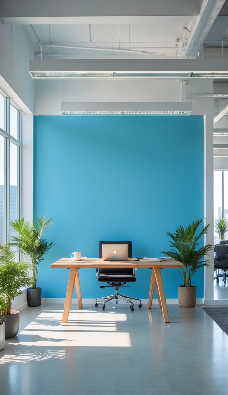
Sky blue walls help you feel calm and focused. Lighter blue tones reduce visual noise and make it easier to sort thoughts during tasks that need attention.
A sky blue accent wall gives your room a sense of openness without being distracting. It works well behind your desk or video call background, where it keeps attention on you and your work.
Pair sky blue with neutral furniture to keep the space balanced. Small touches like blue artwork or a matching rug tie the look together without overwhelming the room.
PRO TIP
Choose a matte sky blue paint for a soft, non-reflective finish that limits glare on screens. If you fear too much color, paint only one wall or use sky blue wallpaper behind your desk. Add warm wood tones or soft white trim to avoid a cold feel. Test a sample patch at different times of day to see how natural light changes the shade. For focus sessions, keep decor minimal and add a few green plants to balance energy and air quality. Keep contrast moderate to maintain a calm visual field.
7) Earthy Taupe – creates a grounded, stable environment
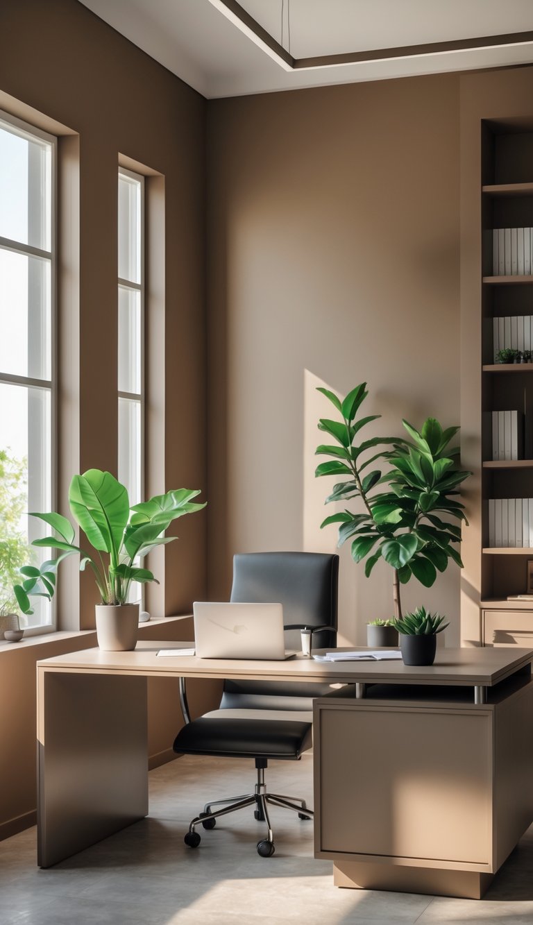
Earthy taupe mixes warm browns and soft grays to make a calm backdrop for work. It feels steady and low-key, so you can focus without distractions.
You can use taupe on a feature wall behind your desk or across the whole room. Pair it with natural wood furniture and plants to keep the space warm and alive.
This color reduces visual noise and helps tasks feel manageable. It does not shout for attention, so you can think clearly and stick to your routine.
PRO TIP
When you choose earthy taupe, test paint samples in different light across a few days before committing. Morning sun can bring out warmer brown tones, while cooler evening light may make the color lean gray. Match your taupe with textured elements like woven rugs, linen curtains, or matte wood to add depth without adding clutter. Keep trim and ceilings a lighter neutral to prevent the room from feeling too heavy. If you want a slight contrast, add muted green or terracotta accents through plants, art, or a single chair; these colors complement taupe and support a balanced, focused workspace.
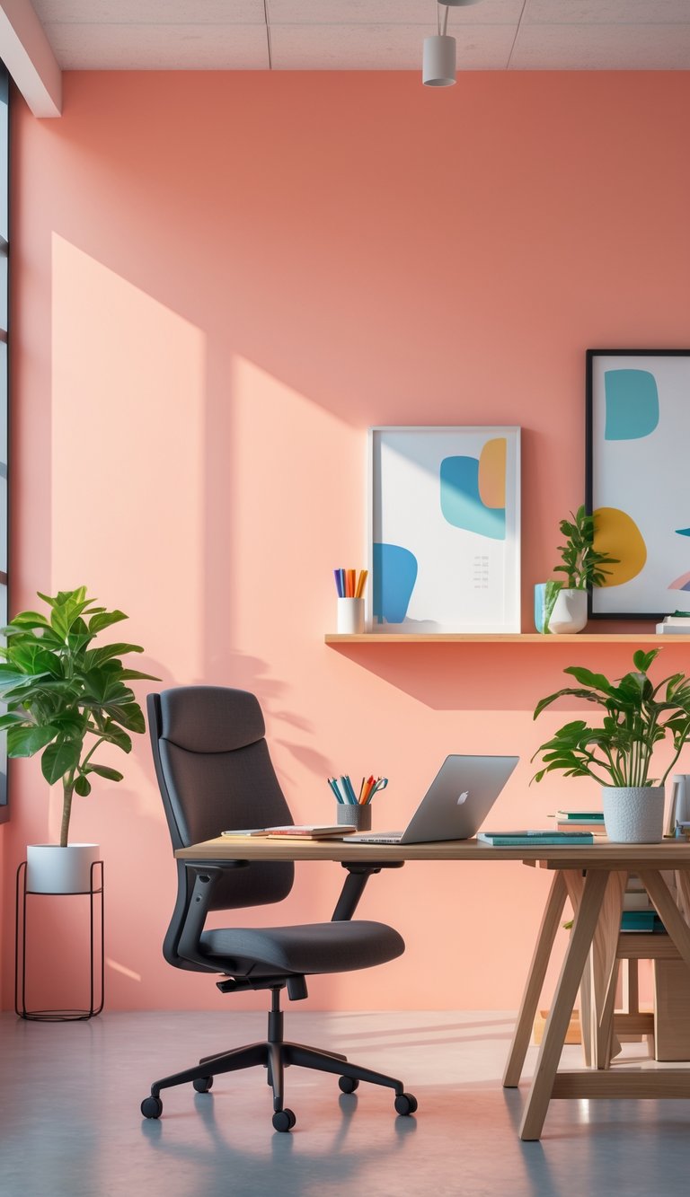
8) Gentle Peach – encourages warmth and approachability
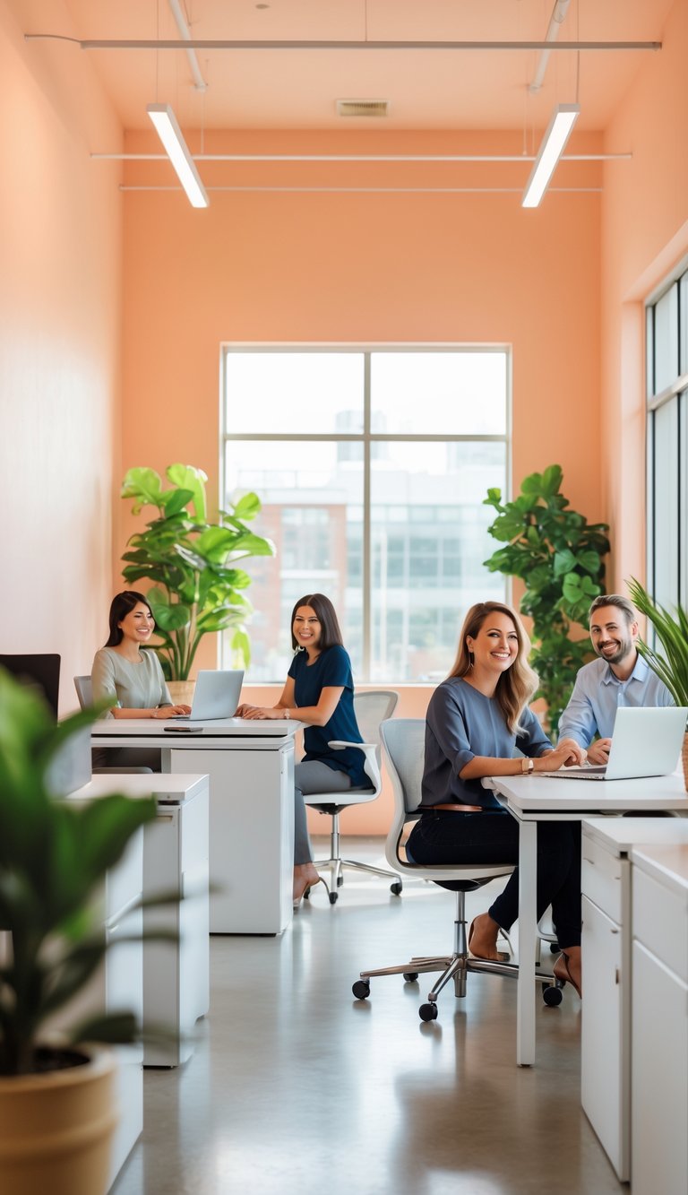
Gentle peach brings a soft, warm feel to your office walls. It mixes the calm of pink with the energy of orange, making spaces feel more welcoming without being loud.
You may find conversations start more easily in peach-toned rooms. The color can lower tension and make people seem more approachable, which helps teamwork and client meetings.
Use peach on one accent wall or in shared areas to keep focus steady. Pair it with neutral furniture and good lighting so the color supports work instead of distracting you.
PRO TIP
You can use gentle peach to make reception areas and small meeting rooms feel friendlier and less formal. When you choose paint, pick a muted peach that leans toward beige to avoid overpowering the space. Test samples on different walls and look at them during the day and under office lights to see how they change. Add plants and wooden accents to balance warmth with natural texture. If you worry about too much softness, combine peach with a cool gray or soft teal on trim, furniture, or accessories. This keeps energy steady and still invites conversation.
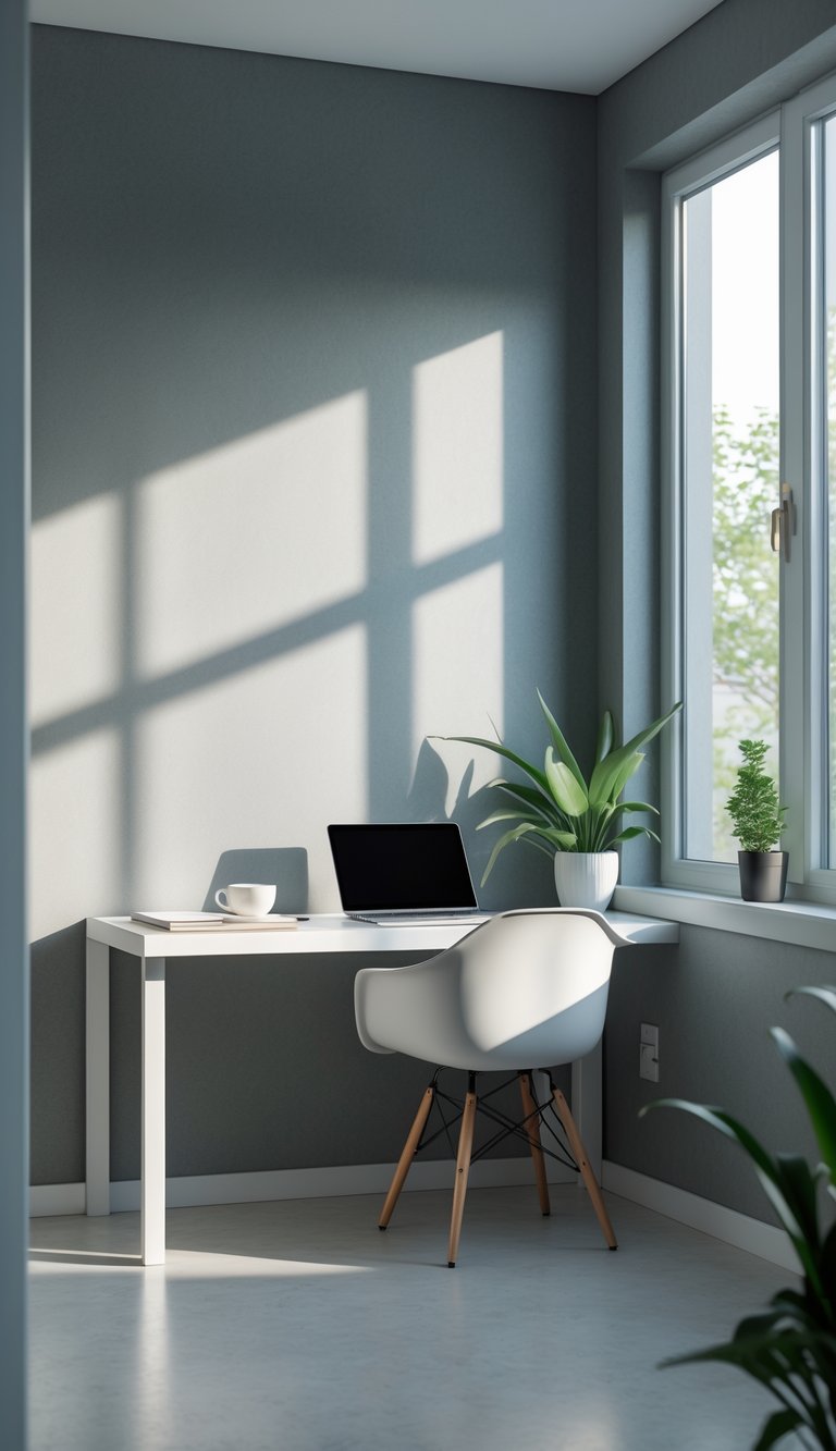
9) Off-White with Blue Tint – keeps workspace bright yet relaxing
Off-white with a blue tint gives your office a soft, clean look without feeling stark. It reflects light well, which keeps the room bright and reduces the need for harsh overhead lighting.
The faint blue undertone soothes your eyes and can lower tension during long work sessions. You still get a neutral backdrop that pairs easily with wood, metal, or colorful accents.
This color helps you focus because it feels calm but not sleepy. It works well in small rooms, where the light bounce makes the space feel larger and more open.
PRO TIP
Choose a shade with just a whisper of blue to avoid making the room feel cold. Test paint samples on different walls and observe them at morning and evening light to see how the hue shifts. Balance the blue-tinted off-white with warmer textiles like a beige rug or wooden desk to keep the space inviting. If you use bright art or plants, the soft blue base will help those accents pop without overwhelming your senses. Consider semi-gloss on trim to add subtle contrast and make the room feel crisp without glare.
10) Soft Mint – refreshes the mind and maintains alertness
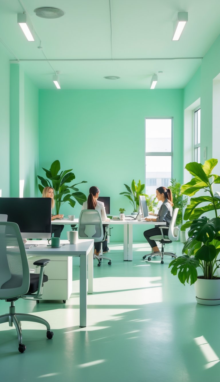
Soft mint combines gentle green and pale blue tones that feel clean and light. You can use it as a main wall color or an accent to brighten a workspace without causing strain.
Research and scent studies suggest mint can boost alertness and reduce mental fatigue. Paint with soft mint to create a calm backdrop that still helps you stay focused during long tasks.
Pair soft mint with warm wood or neutral grays to keep the room grounded. This mix helps you feel refreshed and steady, which supports steady concentration.
PRO TIP
Choose a soft mint with low saturation to avoid a trendy, overly bright look. Test paint samples on different walls and view them at morning and late-afternoon light, because natural light changes how mint reads. If you want added alertness, place small mint-scented items like a jar of dried peppermint or a subtle diffuser near your desk; scent can reinforce the color’s effect without overwhelming the room. For shared offices, use mint on feature walls or glass partitions so the color helps focus without dominating everyone’s personal space.
11) Creamy Butter – subtly energizes without overwhelming
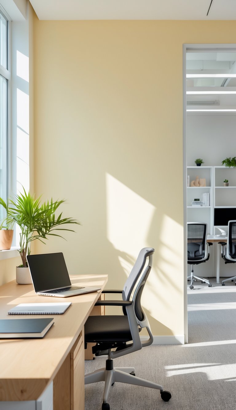
Creamy butter is a warm, pale yellow that feels calm but awake. You can use it to add light and a soft glow to your workspace without loud color contrast.
This shade lifts mood gently, which helps when you need steady focus for long tasks. It works well on an accent wall or behind your desk where light reflects and brightens the room.
Pair creamy butter with cool neutrals like gray or soft white to keep the space balanced. You can add small pops of deeper yellow or green in accessories to bring energy when you want a quick mental boost.
PRO TIP
You can use creamy butter on one wall and keep other walls neutral to avoid visual fatigue. Paint behind your monitor or near your main work surface so the color helps your face and screen look warmer. Add plants or wood tones to ground the hue and prevent it from feeling too sweet. If you need concentration, reduce glossy finishes and choose matte paint to limit reflections. For shared spaces, test a sample patch to see how the color changes with your office light at different times of day.
12) Dusty Rose – nurtures calm and lowers anxiety
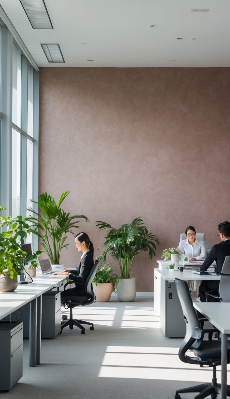
Dusty rose brings soft warmth without over-stimulating your senses. The muted pink with gray undertones feels gentle and steady, which can help reduce stress during busy workdays.
You can use dusty rose as a full-wall treatment or an accent behind your desk. A single dusty rose wall paired with neutral furniture keeps your space calm and focused.
Textiles and wallpaper with slight texture add depth without distraction. Small doses—like a dusty rose pinboard or curtains—work well if you share a bright, busy office.
PRO TIP
You can make dusty rose work for you by balancing it with cool neutrals like gray or soft white. This prevents the space from feeling too warm and keeps visual contrast that helps focus. Add plants or natural wood to introduce fresh green and organic textures that calm your eyes. If you need higher energy, pair dusty rose with small accents in muted teal or navy; these hues boost alertness without overpowering the calm. Test paint or peel-and-stick samples on different walls to check light at morning and afternoon. Keep patterns subtle: small florals or tone-on-tone geometrics add interest while keeping anxiety low.
13) Smooth Beige – neutral backdrop supporting focus
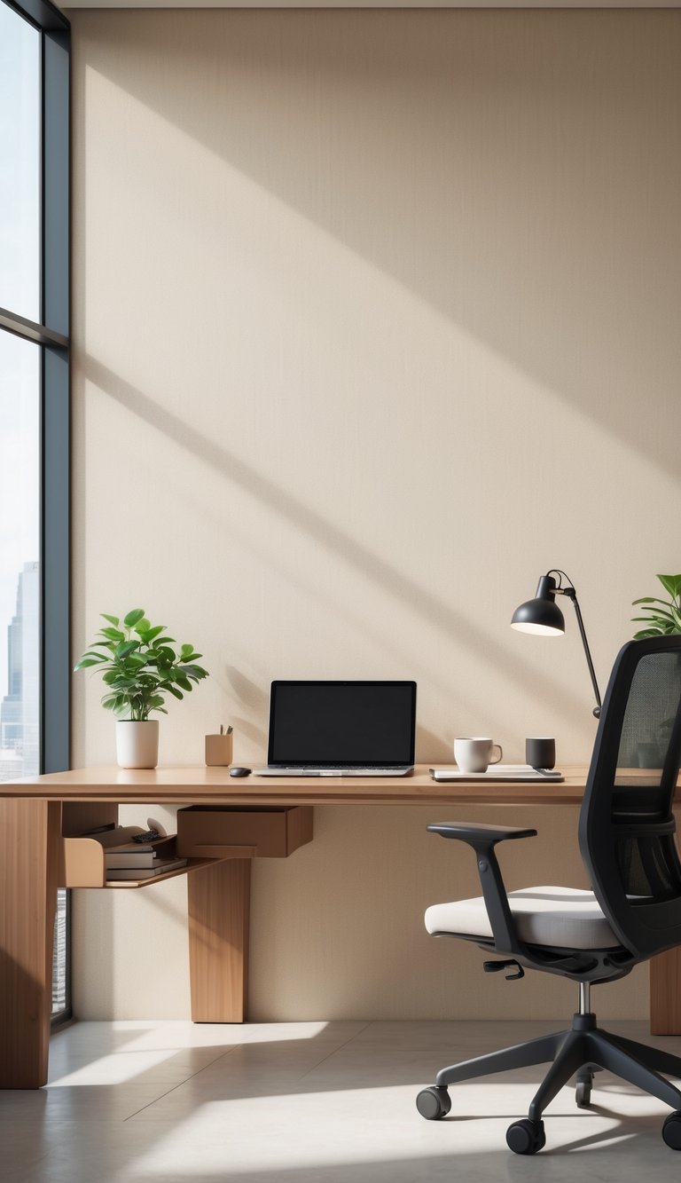
Smooth beige gives your office a calm, steady base that helps reduce visual clutter. It does not demand attention, so your eyes and mind can rest and return to work more easily.
Beige adds warmth without being bold. That gentle warmth can lower stress and make the space feel more comfortable, which helps you stay on task for longer.
Pair smooth beige with crisp white trim or muted wood tones to keep the room from feeling flat. Add a few small accents in a stronger color to guide attention where you need it.
PRO TIP
When you choose smooth beige for your office wallpaper, pick a shade with a slight undertone that matches your lighting. Cool, north-facing rooms suit beiges with a tiny warm undertone to avoid a washed-out look. South- or west-facing rooms can handle richer beiges that keep the room cozy under bright light. Test large samples on different walls and view them at morning and afternoon times to see true color. Keep furniture and textiles in simple, contrasting textures—linen, soft wool, or matte wood—to add depth without distraction. Finally, reserve stronger colors for task areas, like a bulletin board or a desk lamp, so your beige walls stay a calm backdrop that supports focus.
14) Navy Blue Highlights – increases productivity and alertness
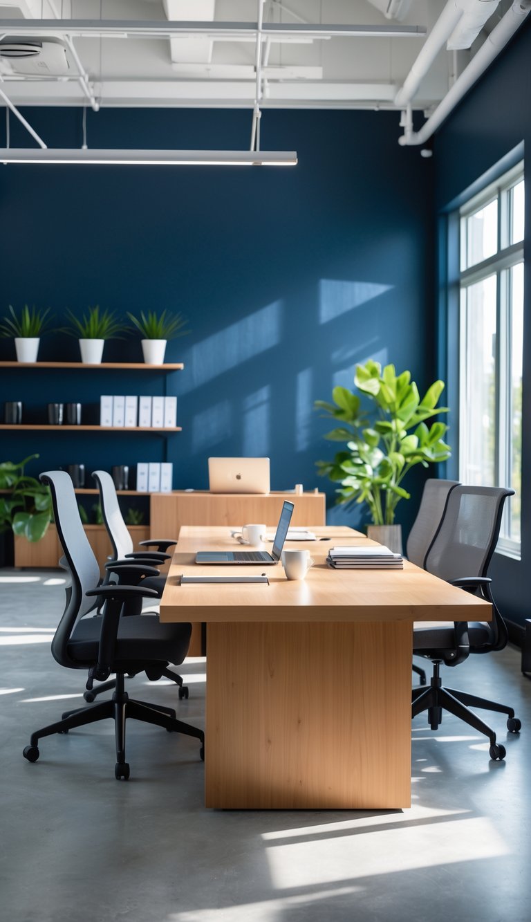
Navy blue on a wall can help you feel steadier and more focused. The color often links to calm, trust, and a clear head, which makes it a good choice for work areas where you need sustained attention.
Use navy as an accent rather than covering every wall to avoid a heavy feel. Pair it with lighter tones, like warm whites or soft grays, to keep the space balanced and bright.
Navy blue also works well behind desks or shelving to draw the eye toward work zones. Small bursts of navy can make tools, screens, or important items stand out without causing visual strain.
PRO TIP
If you want navy blue to boost alertness, pick a shade with a neutral or slightly cool undertone. Test paint samples at different times of day so you can see how daylight and artificial light change the color. Combine navy with textured wallpaper or matte finishes to add depth without glare. Add pops of contrasting color—like mustard, coral, or a warm wood tone—to prevent the room from feeling too formal. Keep a few light-reflecting surfaces nearby, such as a lamp or pale rug, so the space stays lively and not overly dark.
15) Light Coral – adds a subtle boost to creativity
Light coral brings a soft, warm tone that feels friendly and inviting. You may find it helps ideas flow without being distracting.
This color sits between pink and orange, which can lift mood and spark gentle energy. Use it on one wall or in accents so it supports focus rather than overwhelms.
Pair light coral with neutral grays, soft whites, or deep charcoals to keep the room balanced. Small doses on cushions, artwork, or a single wallpapered wall work best for long sessions of work.
PRO TIP
If you want to test light coral without repainting, try wallpaper samples or large fabric swatches you can tape to the wall. Place them where you work and live with the color for a week to judge how it affects your mood and concentration. Use adjustable lighting so you can see the color in morning and evening light; warm bulbs deepen coral, while cool bulbs mute it. Add plants or wooden furniture to make the space feel calmer and more grounded. Keep the rest of your palette simple so coral remains a supportive accent, not a constant source of stimulation.