
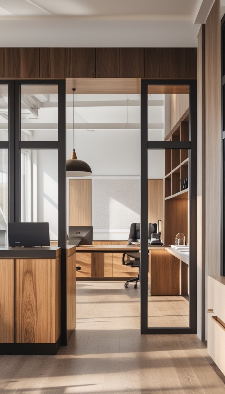
You can make your home office feel warm, lived-in, and film-set polished by mixing five complementary wood tones. This guide shows how to pair warm oak, faded walnut, bleached ash, antique pine, and midnight-stained maple so your space looks balanced, cozy, and effortlessly curated.
Start with a simple plan and place each tone where it shines best — desks, bookcases, countertops, and accents — to build that Nancy Meyers-style comfort without overdoing it. You’ll learn choices that keep the room calm and layered while making everyday work feel a little more special.
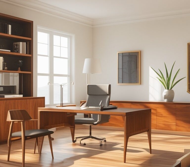
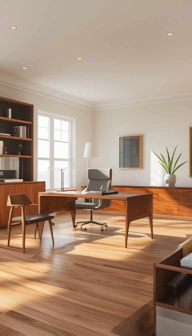
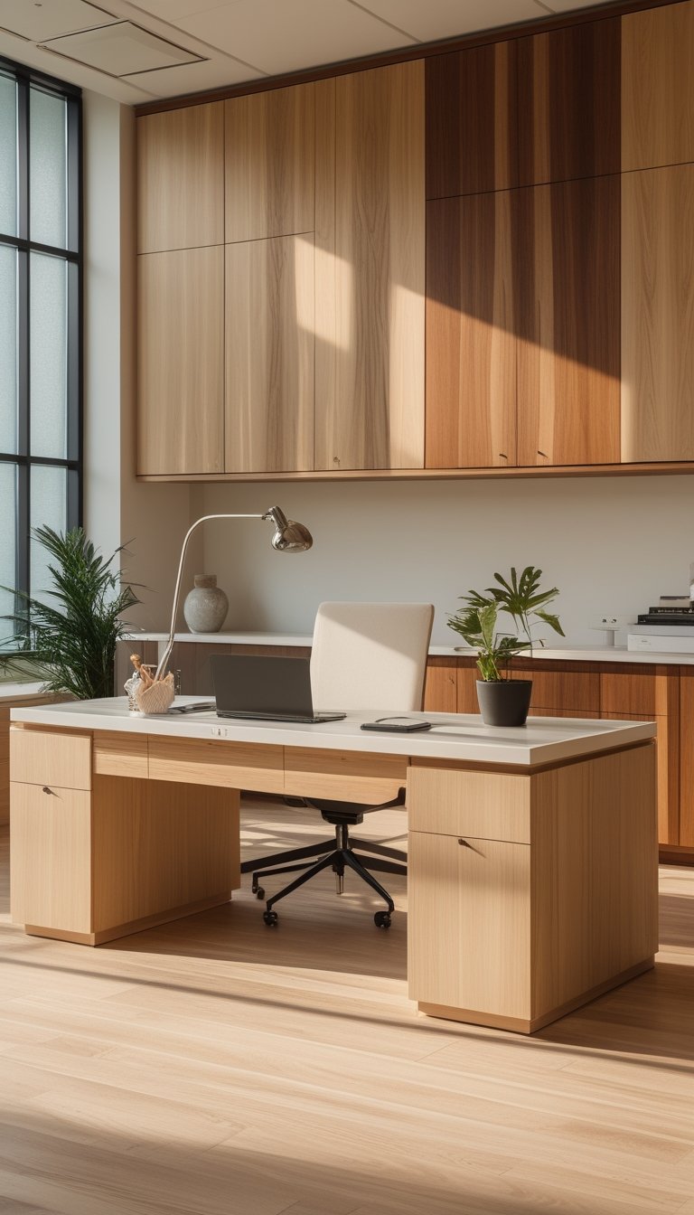
1) Warm Honey Oak for desks and shelving
Pick warm honey oak for your desk and shelving to anchor the room with a cozy, lived-in feel. The golden tones add warmth without stealing focus, so your furniture supports the space rather than competing with it.
Use honey oak for larger pieces like a desk or built-in shelves while keeping smaller items in different woods. This helps the room read as intentional and layered instead of matchy-matchy. Vary finishes slightly—matte for shelves, a soft sheen for the desk—to catch light in pleasing ways.
Balance honey oak with cool accents like white trim or soft gray textiles. Those cooler elements let the wood shine and keep the look fresh and modern.
PRO TIP
When you choose honey oak, think about undertones and scale. Look at undertones in natural light; honey oak usually leans warm with yellow or gold hues, so pair it with woods that share similar warmth. Keep one dominant wood (honey oak for big pieces) and add two supporting woods at most. Use darker accents for contrast—like walnut legs or a deep-stained chair—to ground the room and prevent the palette from feeling flat. Finally, protect your desk with a clear sealer to preserve the tone and make maintenance easy.
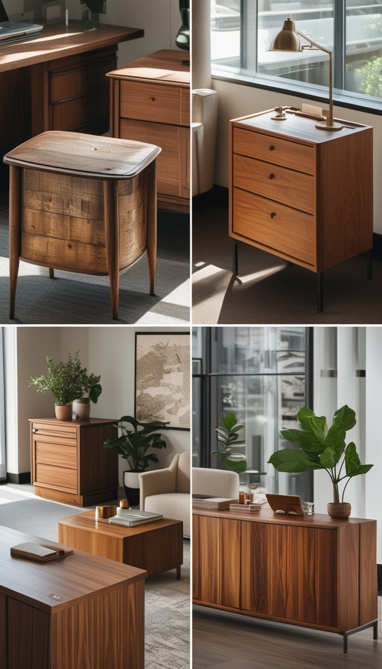
2) Faded Walnut for bookcases and frame accents
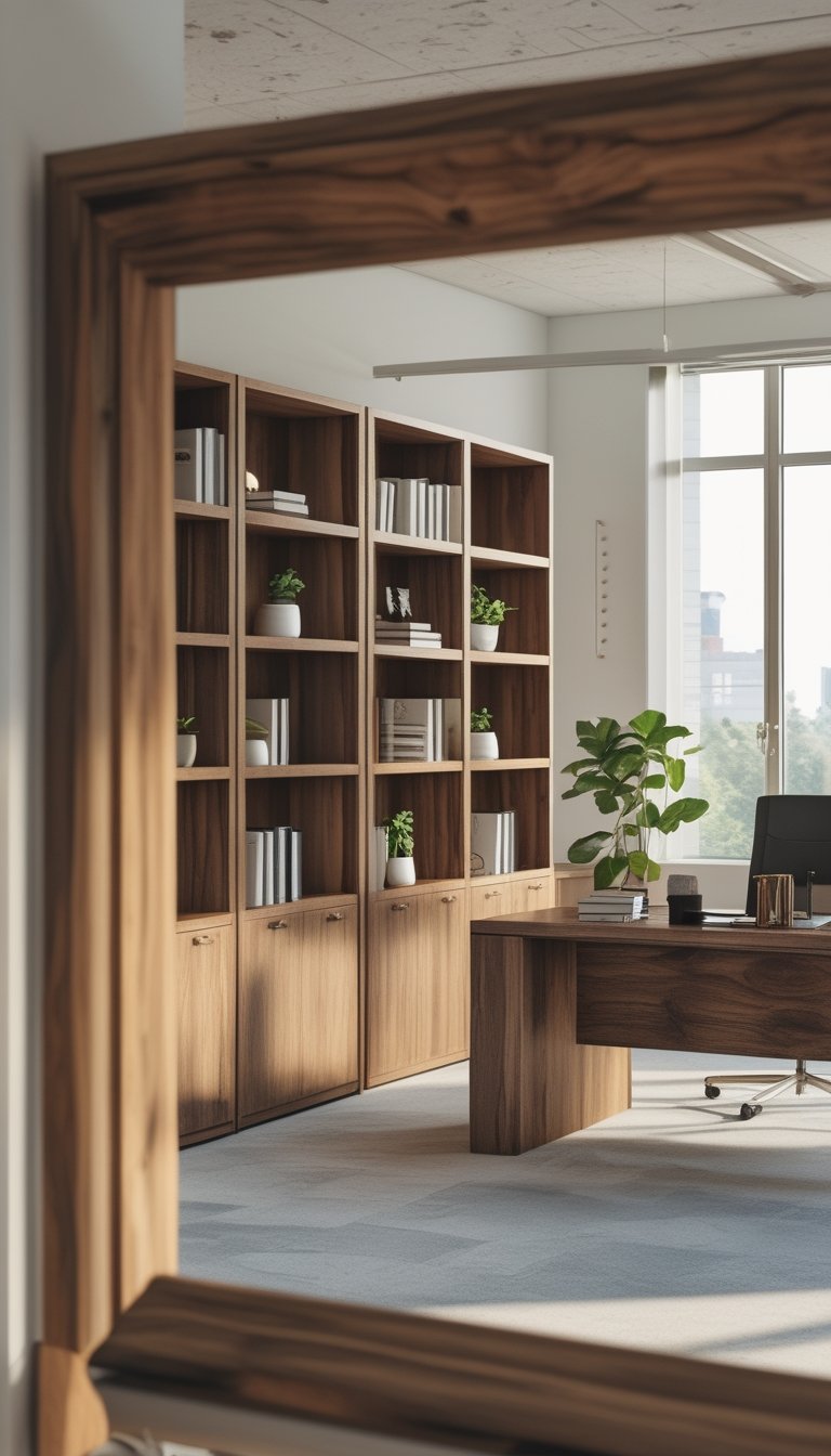
Faded walnut adds a soft, lived-in look that fits a Nancy Meyers–style office. Use it for bookcases to give shelves a warm, gentle backdrop that won’t steal focus from books or art.
Pair faded walnut frames with lighter walls and creamy textiles for a subtle contrast. The finish reads elegant but relaxed, so your office will feel polished without being stiff.
Mix faded walnut with brighter or darker woods by repeating the tone in small accents. For example, match a walnut picture frame with a shelf edge or a small tray to create visual ties across the room.
PRO TIP
Use faded walnut as a neutral anchor in your office and repeat it in at least two places to make the room feel cohesive. Think beyond big furniture: frames, shelf backs, small boxes, and picture ledges all count. Keep undertones consistent—if your walnut leans warm, pair it with similarly warm woods or soft whites. Vary scale to avoid monotony; combine a large bookcase with thin-frame art or narrow trays. Finish matters: a matte or lightly distressed finish looks more natural than high gloss. Finally, test samples in your actual light before buying, because natural and artificial light can change how the walnut reads.
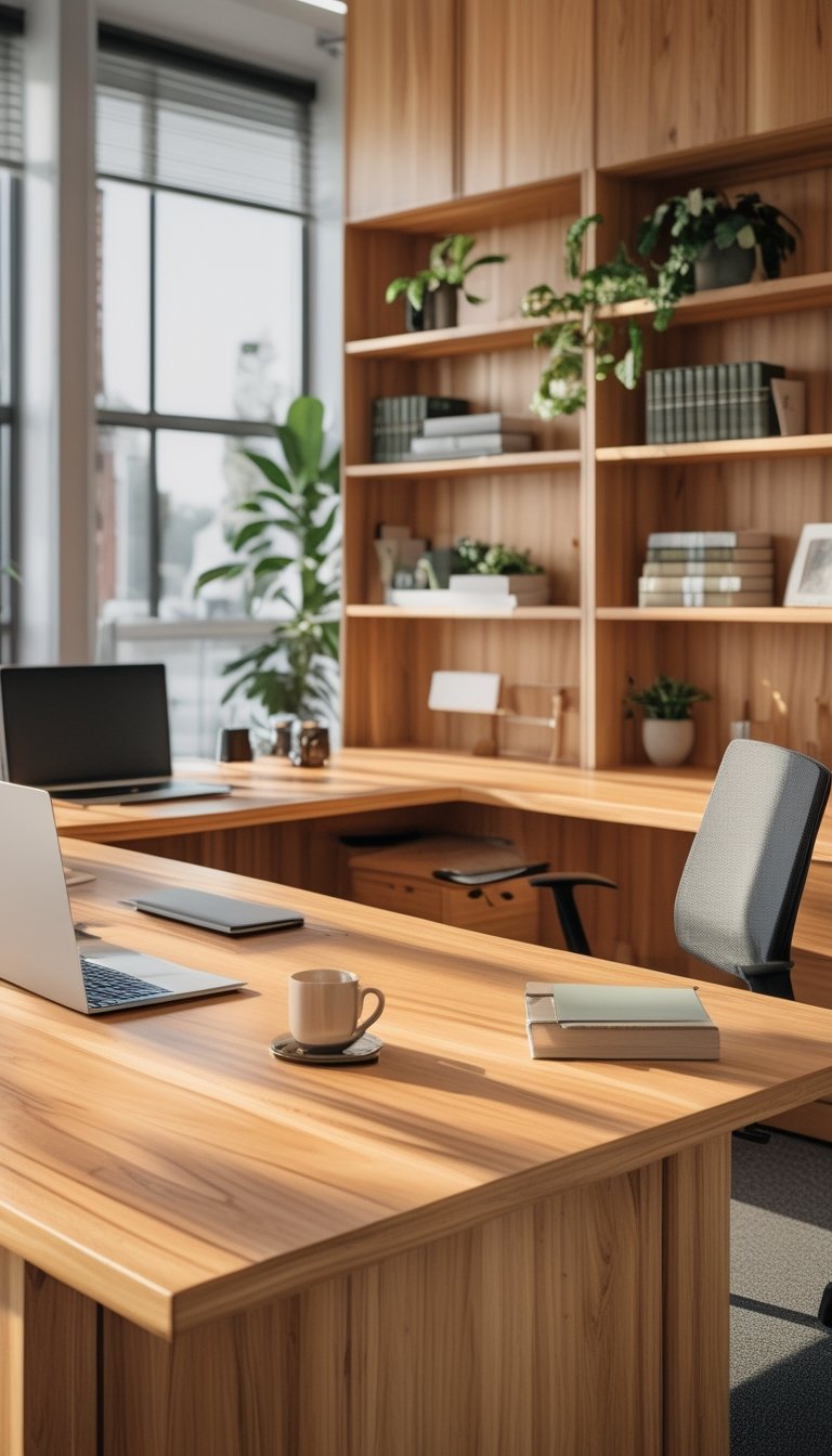
3) Bleached Ash for desk tops and cabinetry
Bleached ash brightens a room without feeling cold. You get a pale, even tone that highlights the grain and keeps the space airy and calm.
Use it on desks and cabinetry to add a soft, modern coastal vibe. The light surface reflects more daylight, which helps small offices feel larger and more open.
Bleached ash pairs well with warm metals and soft neutrals. Keep other wood tones slightly darker so the ash stands out without clashing.
PRO TIP
You can control the level of bleaching to match your style, from a subtle wash to almost-white. Test on scrap wood first because species and grain absorb bleach differently. After bleaching, neutralize and rinse the wood fully, then dry it before finishing. Choose a finish that matches your use: a durable oil for worktops or a clear sealer for cabinets. For a natural look, avoid heavy pigments; a thin matte finish preserves texture. If you want uniform color, sand lightly between coats and inspect under natural light.
4) Antique Pine for vintage side tables and credenzas
Antique pine brings warmth and a lived-in look to your Nancy Meyers–style office. Its soft grain and honeyed tones add vintage charm without overpowering lighter finishes you might already have.
Place a pine side table or small credenza near a window or sofa to anchor the space. You can balance the pine by repeating its tone elsewhere, like in picture frames or a small shelf, so the room feels intentional.
Look for pieces with simple lines and aged patina. Scuffs and knots add character and tell a story without cluttering your clean, cozy aesthetic.
PRO TIP
Use antique pine as a bridge between warm and cool woods in your office. Start by choosing one pine piece as the focal vintage element, such as a side table or low credenza. Then echo that pine tone in two smaller accents—think a picture frame and a wooden bowl—so the color reads as a deliberate choice. Keep larger surfaces like desks or bookcases in a different wood tone or painted finish to avoid visual overload. If the pine feels too rustic, sand lightly and apply a clear, matte finish to soften rough spots while keeping the aged look. This approach gives you the cozy vintage feel Nancy Meyers rooms favor, while keeping the space balanced and layered.
5) Midnight-stained Maple for window trim and island counters
Choose midnight-stained maple to add depth without feeling heavy. The dark, cool stain gives window trim and island counters a clean, tailored look that still feels warm when paired with soft neutrals.
Maple takes stain evenly, so you get a smooth, consistent color across wide surfaces. That makes it a smart pick for long runs of trim or large islands where uniformity matters.
Use the midnight tone to anchor lighter woods and fabrics in the room. Place that dark trim near bright windows to frame views and make sunlight pop against the deep stain.
PRO TIP
When you pick midnight-stained maple, test a large sample in the actual room light before committing. Stain can read different under morning, noon, and evening light, and maple’s grain can reflect the pigment differently than oak or cherry. Sand and seal a test board, mount it near a window and beside the island, and view it at several times of day. If it looks too flat, try a lighter topcoat or a wipe stain to let some maple warmth show through. If it feels too blue, warm the palette with brass hardware or a soft beige wall color.