You spend long hours at your desk, and the walls around you shape how you think and focus. Choose subtle, well‑crafted wallpaper to lower visual noise and help you sink into deep work without feeling distracted.
This article shows quiet, refined patterns that boost calm and clarity while keeping your space stylish. You’ll find ideas that balance texture, color, and scale so your office feels steady and professional without stealing attention.
Pick wallpaper that supports long stretches of focused work by keeping contrast low and patterns small. Soft neutrals, tone‑on‑tone designs, and tiny repeats reduce eye fatigue and make it easier to concentrate for hours. If your room gets strong light, choose a matte finish to cut glare. Match pattern scale to room size: small patterns suit compact areas, while larger rooms can handle bolder—but still subtle—motifs. Layer with simple furnishings and warm task lighting to create depth without clutter. Test a swatch on the wall and live with it for a few days; color and texture can change with daylight and affect mood.
1) Soft Neutral Herringbone Wallpaper
Soft neutral herringbone wallpaper gives your office a calm, ordered look without drawing too much attention. The V-shaped pattern adds gentle movement that keeps your space from feeling flat. Neutral tones like greige, cream, or light taupe help light spread evenly across the room.
This wallpaper works well behind a desk or on a single accent wall to create focus. It pairs easily with wood desks, white shelving, or simple black metal accents. The subtle texture helps hide small scuffs and keeps the room feeling tidy.
PRO TIP
Choose peel-and-stick options if you want an easy update that won’t damage the walls. Match the wallpaper’s undertone to existing furniture—cool greige for gray desks, warm beige for wood finishes—to keep colors balanced. If your office gets little natural light, pick the lightest neutral in the pattern to avoid a gloomy feel. For visual depth, hang full-height wallpaper on one wall rather than half panels; it makes the pattern feel intentional and professional. Finally, keep other patterns minimal: solids and simple textures let the herringbone support focus without competition.
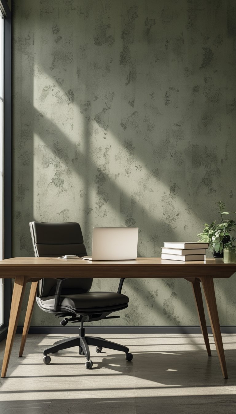
2) Subtle Botanical Mural in Sage
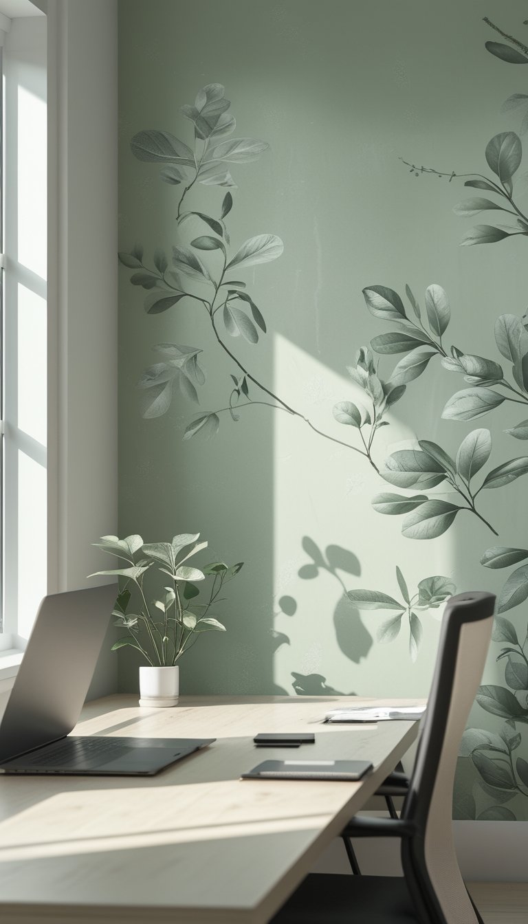
A subtle botanical mural in sage brings calm without stealing focus. The soft green tones help your eyes relax, which supports longer stretches of focused work.
Choose a small-scale leaf pattern or watercolor texture to keep the design gentle. These options add depth and a touch of nature while avoiding busy visuals that pull attention away from tasks.
Place the mural on the wall behind your desk or on a single accent wall to create a peaceful backdrop. Pair it with warm wood furniture and muted textiles for a balanced, uncluttered feel that helps you stay on task.
PRO TIP
When you pick a sage botanical mural, test a few samples on the wall at different times of day. Natural and artificial light change how sage reads, so viewing samples in morning and evening helps you choose the right tone. Use peel-and-stick or removable paper for easy swaps if the color feels off after a week. Keep surrounding décor simple: neutral frames, a single plant, and low-contrast rugs keep visual noise down. Finally, match the mural scale to your room size — small patterns fit compact offices, while larger motifs suit open spaces without overwhelming you.
3) Small-Scale Geometric Mesh Pattern
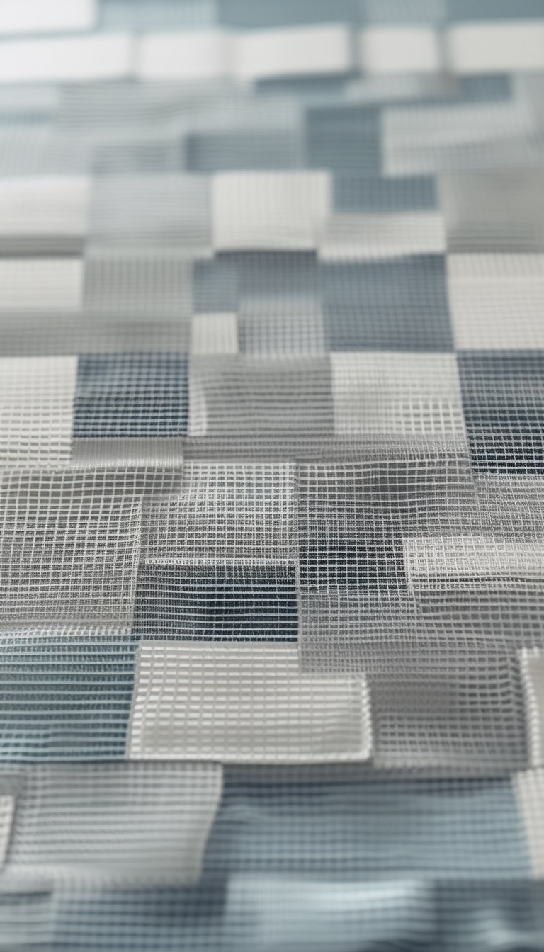
A small-scale geometric mesh gives your office a steady, organized feel without drawing too much attention. The repeated lines and shapes create a calm rhythm that helps you focus on tasks and think clearly.
This pattern works well on a single accent wall behind your desk or on all walls for a subtle backdrop. Pick muted colors like soft gray, beige, or navy to keep the look professional and low-key.
You can pair the mesh with simple furniture and minimal decor to avoid visual clutter. The fine pattern adds texture and depth, making the space feel larger and more intentional.
PRO TIP
Choose a matte finish to reduce glare and keep the pattern gentle on your eyes during long work sessions. Test a sample on your wall to see how light changes the pattern through the day; morning and evening light can make lines look sharper or softer. If you want more warmth, add wooden accents and a few plants to balance the geometric coolness. Keep other patterns small or solid to prevent visual noise, and use the mesh as a steady anchor for your office design.
4) Muted Marble Vein Wallpaper
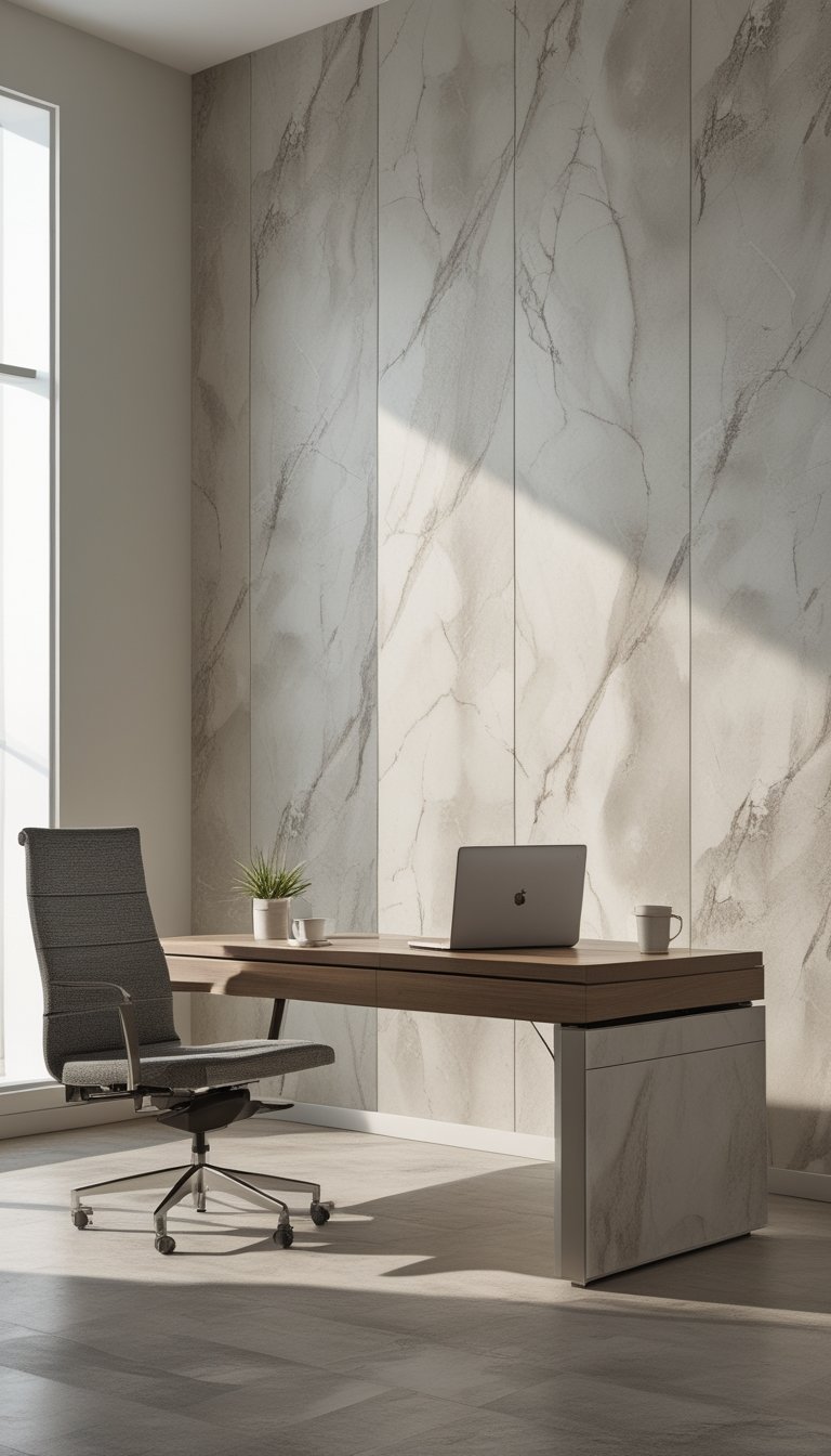
Muted marble vein wallpaper gives your office a calm, elegant backdrop without being loud. The soft lines and pale tones add texture and interest while keeping focus on your work. You can pick cool grays for a modern feel or warm creams for a cozier vibe.
This pattern works well on a single feature wall or across a small room. It reduces visual clutter compared with busy prints, so you can think clearly and stay on task. Pair it with simple furniture and natural light to enhance the quiet, refined look.
PRO TIP
Choose a matte finish to cut glare from screens and overhead lights, which helps reduce eye strain during long work sessions. If your office gets little natural light, select marble with warmer undertones to avoid a cold, sterile feel. For a balanced look, keep other patterns minimal—think solid rugs and plain storage pieces—so the marble vein remains a subtle accent. Test a large sample on the wall before full installation to see how the veins run in real light, and match seams carefully to maintain a natural flow.
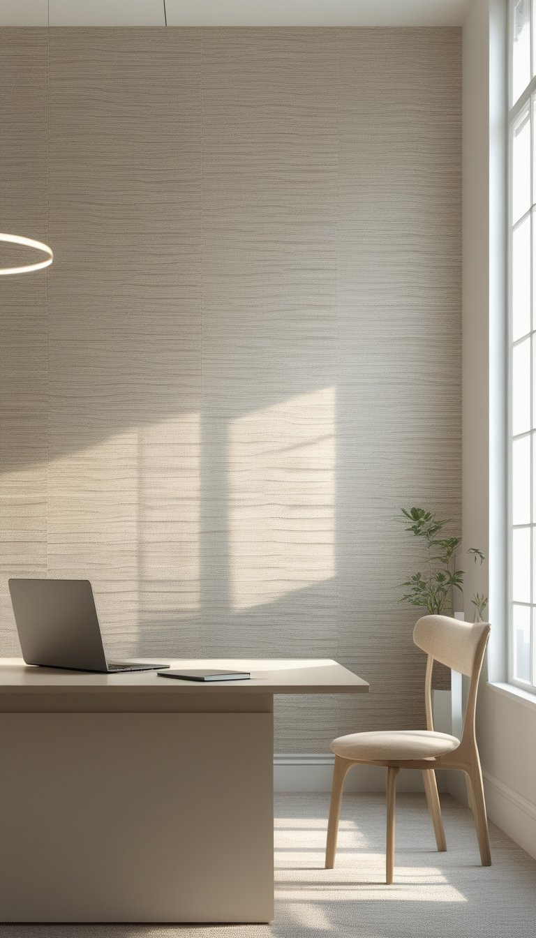
5) Pale Linen Textured Wallpaper
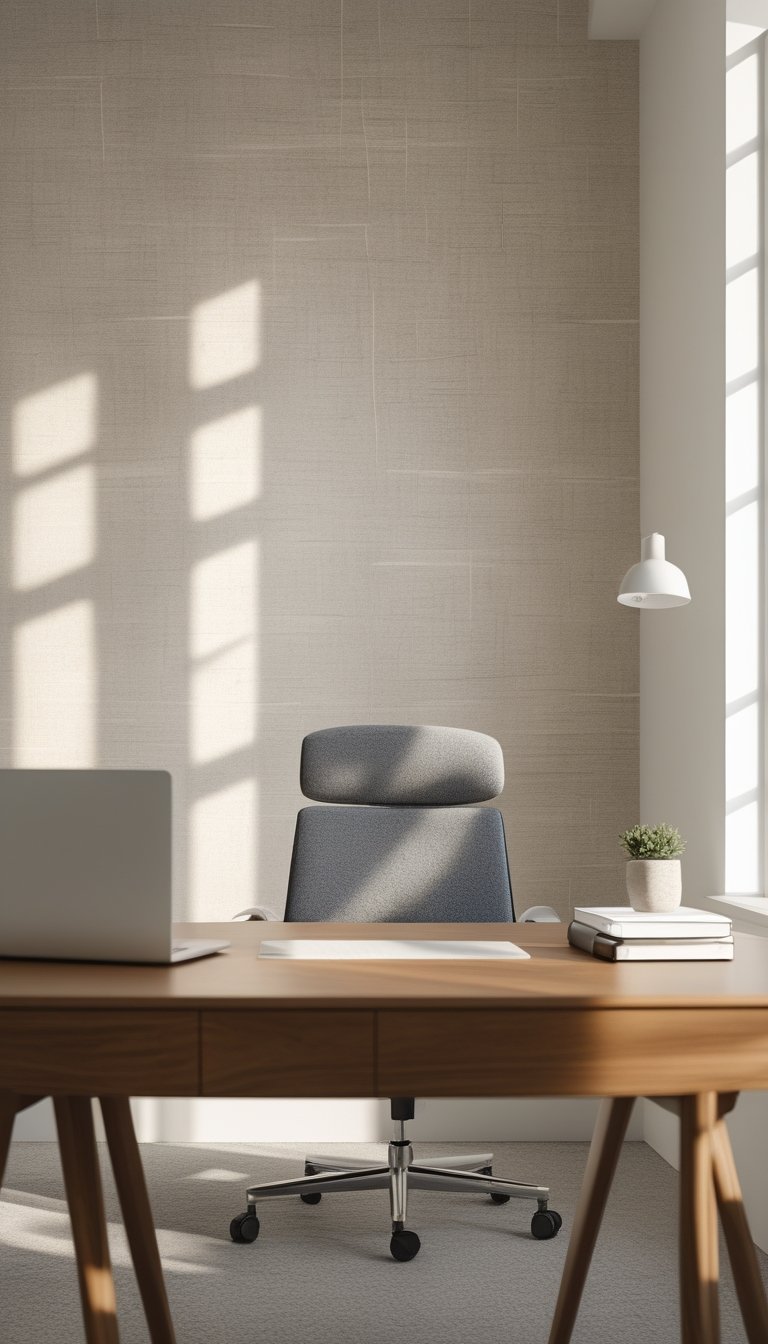
Pale linen textured wallpaper gives your office a soft, calm backdrop without stealing attention from your work. Its woven look adds subtle depth that reads as fabric from across the room and up close it shows a gentle grain that feels natural and refined.
You can pair this wallpaper with warm wood furniture or cool metal accents depending on the mood you want. It works well on a single accent wall behind your desk or across the whole room for a quiet, cohesive effect.
Light sage or pale grey linen tones promote focus by reducing visual clutter. The texture hides small marks, so it stays fresh-looking with minimal upkeep.
PRO TIP
Choose a shade of pale linen that contrasts lightly with your trim and ceiling so edges stay defined and your space feels tidy. If your room lacks natural light, pick a warmer linen tone like a soft cream or pale beige to keep the space inviting. For a modern look, combine pale linen wallpaper with matte-black hardware and a slim-profile desk. If you prefer a calmer, cozier vibe, add textiles like a wool rug and linen curtains that echo the wallpaper’s texture. Order a sample first and view it at different times of day to ensure the color and grain read right in your lighting.
6) Faint Pinstripe Wallpaper in Dove Gray
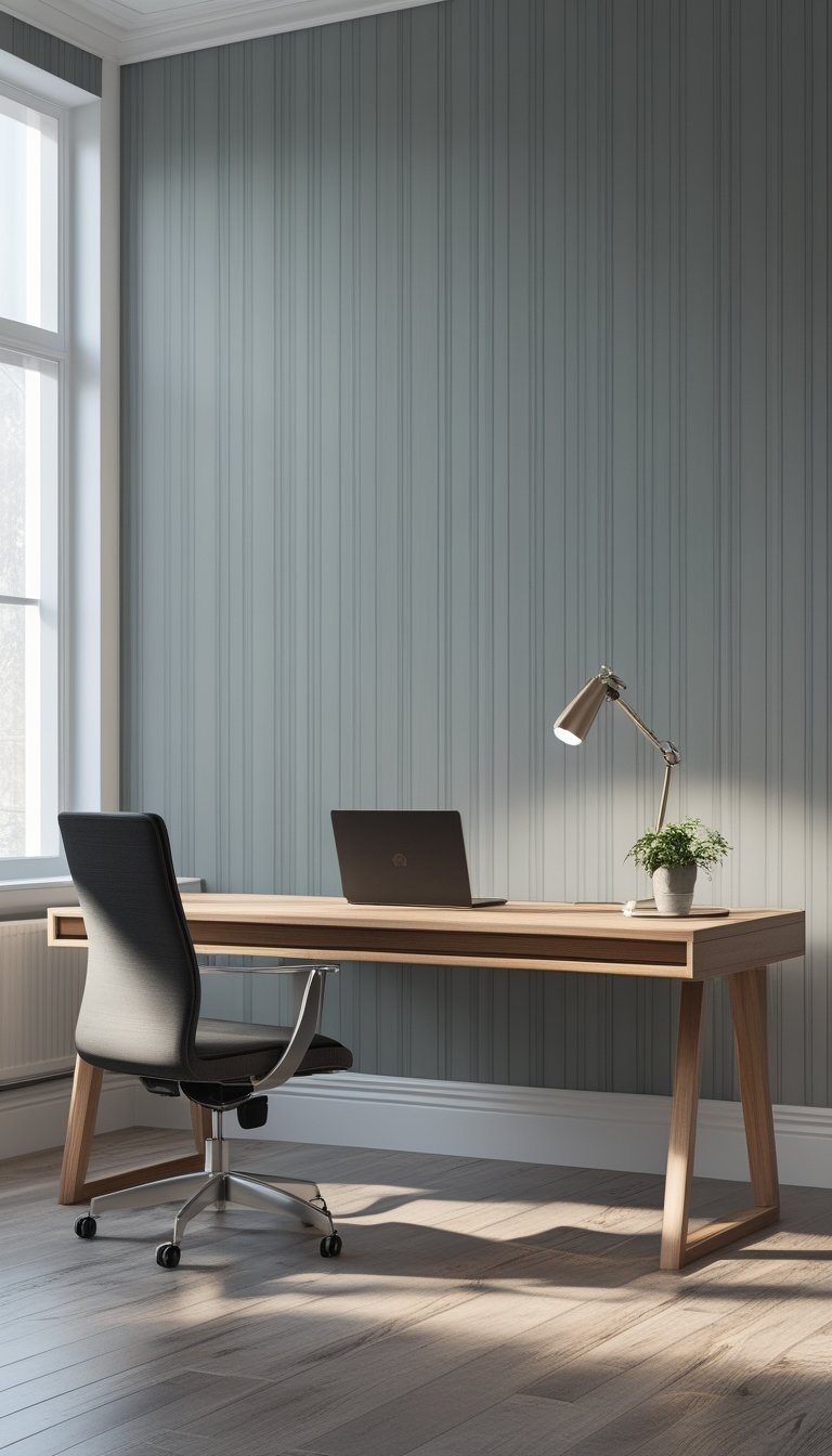
Choose faint pinstripe wallpaper in dove gray to keep your office calm and focused. The thin, subtle stripes add vertical lines that gently lift the eye without stealing attention from your work.
The soft gray tones pair well with warm wood furniture and white trim. You can add a few matte black or brass accents to bring personality while keeping the space professional.
This pattern works great on one feature wall behind your desk or across a small room to create a tailored, cohesive look. Because the stripes are understated, you can layer art, shelves, or a whiteboard without visual clutter.
PRO TIP
If you want a clean, productive space, use faint pinstripe wallpaper as a neutral backdrop that supports concentration. Install it on the wall behind your main work area to give the room a vertical rhythm that subtly guides your gaze upward and reduces visual noise. Pair the wallpaper with soft task lighting and an ergonomic chair to keep comfort and focus high during long work sessions. Choose non-reflective finishes to avoid glare on screens, and add a single color accent—like a deep blue or muted green—to anchor the room without competing with the stripes. For easy updates, consider peel-and-stick options so you can change patterns as your needs or style evolve.
7) Washed Watercolor Wash Mural
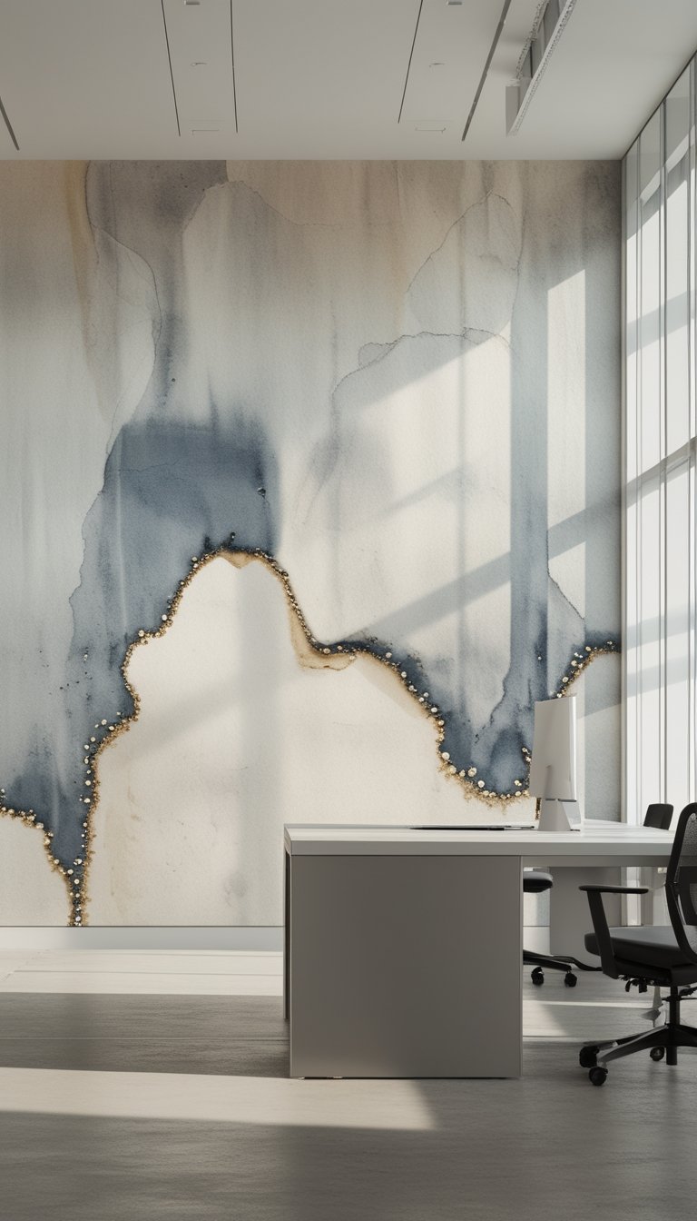
A washed watercolor mural gives your office soft, flowing color that feels calm and fresh. You can pick muted blues, tans, or greys to create a steady background that won’t distract your focus. The subtle brushstrokes add texture without busy patterns.
Place the mural behind your desk or on a single feature wall to anchor the room. It works well with simple furniture and warm wood tones, helping your space feel composed and intentional. You’ll notice it reflects light gently, which can make the room seem larger.
PRO TIP
Choose a custom-sized mural so the color gradation and brushstrokes align with your wall’s height and furniture layout. Order a sample to test how the hues look in your office light at different times of day, since daylight can change the perceived tone. If you want a quieter look, ask for softer pigments and minimal contrast between layers. For more energy, pick slightly deeper tones or add a hint of a complementary color at the edges. Keep other decor simple—solid curtains, a single large plant, and low-key accessories—to let the mural support focus instead of competing with it.
8) Low-Contrast Topographic Lines
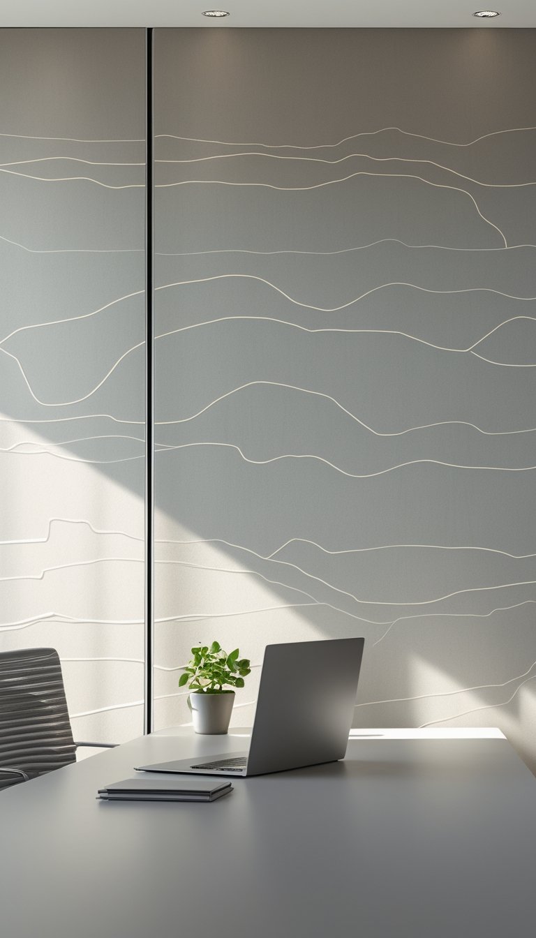
Choose topographic line wallpaper when you want quiet detail that supports focus. The soft, flowing lines mimic natural contours and add depth without shouting for attention. Low-contrast colors keep the pattern subtle so it won’t compete with your work.
These designs work well behind desks or on a single feature wall. You get visual interest at a distance, and texture up close, which helps the room feel composed and layered. Colors like muted greens, greys, or warm beiges pair well with wood and simple metal furniture.
Keep other décor minimal to let the lines breathe. Use matte finishes to reduce glare and maintain a calm surface. The result helps your mind settle and makes your workspace feel intentional and steady.
PRO TIP
When choosing topographic wallpaper, test a large sample on the wall during different times of day to judge how light changes the contrast. You want the lines to stay subtle under both bright and soft light so they don’t become distracting. Match the wallpaper hue with your main furniture tone to create a cohesive look. If your office gets bright sun, prefer a matte or low-sheen paper to cut reflections. For small rooms, pick lighter shades to keep the space feeling open while retaining the map-like pattern. Consider pairing the wallpaper with simple shelving and a few plants to balance texture without adding clutter.
9) Soft Honeycomb Motif in Beige
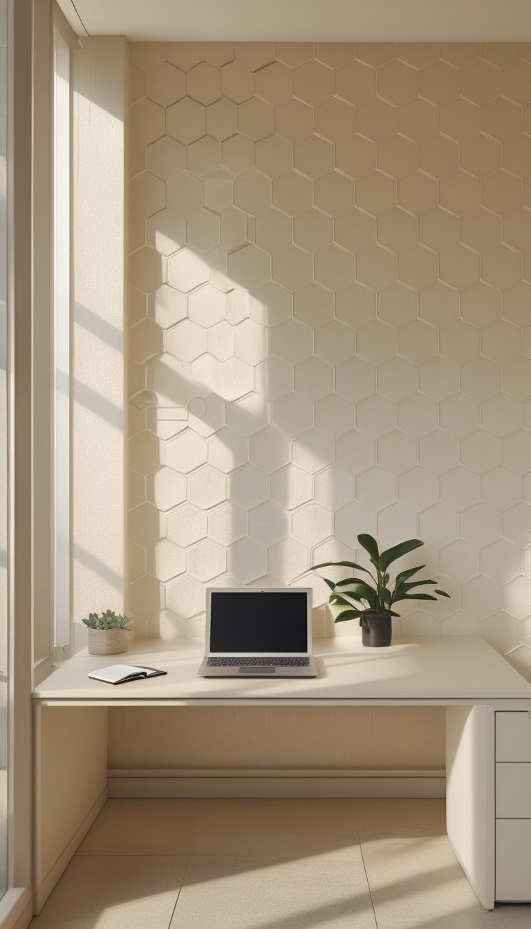
A soft honeycomb motif in beige gives your office a calm, ordered look without drawing too much attention. The repeating hexagons create a subtle rhythm that helps you focus, while the warm beige tones keep the room feeling inviting.
This pattern pairs well with wood desks and neutral textiles. You can add a single accent wall with the motif and keep other walls plain to avoid visual clutter.
Choose a matte finish to reduce glare from monitors and overhead lights. If you like a hint of nature, pick a honeycomb design with small leaf or bee accents, but keep them muted so they don’t distract.
PRO TIP
When you use honeycomb wallpaper, balance is key. Apply the pattern on one wall behind your desk or shelving to create a focal point that guides your attention without overwhelming the room. Match the wallpaper’s beige tone to your larger furniture pieces like cabinets or bookcases to create a cohesive look. Keep artwork and accessories simple—think solid colors or minimal frames—to let the pattern support concentration rather than compete with it. If you work with a lot of screens, choose low-reflective materials and test samples under your office lighting. Finally, consider peel-and-stick options for easy changes as your style or needs evolve.
10) Featherweight Cloud Pattern Wallpaper
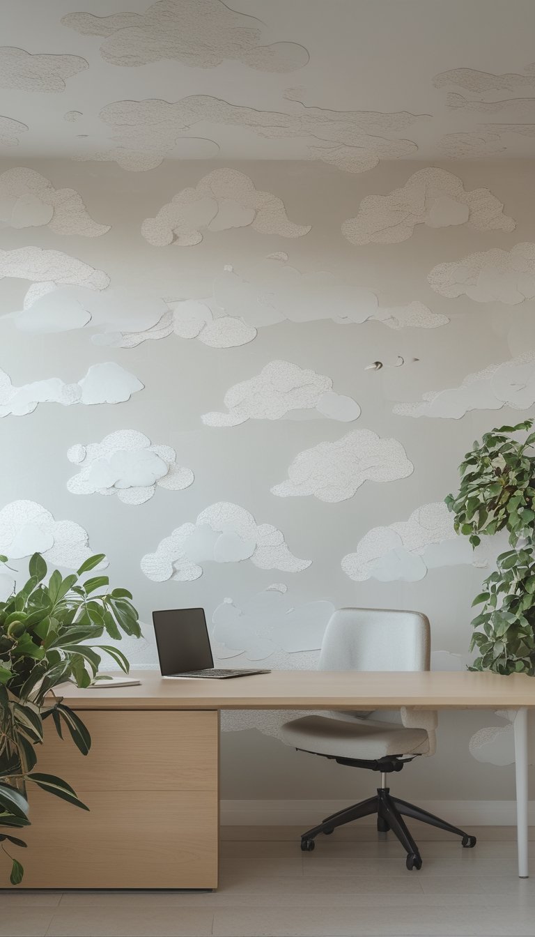
Featherweight cloud pattern wallpaper uses soft shapes and pale tones to keep your office calm. You get a light, airy feel without loud prints that could distract you during focused work. The pattern reads like gentle motion, which helps your eyes rest during long tasks.
Choose a version with matte finish to cut glare from screens and lamps. Subtle contrast between clouds and background keeps the pattern visible but not overpowering. Neutral colors like cream, pale blue, or soft gray fit most decor and make the room feel larger.
Place this wallpaper on an accent wall behind your desk to frame your workspace. It pairs well with wooden desks and simple shelving for a clean, balanced look.
PRO TIP
When you use featherweight cloud wallpaper, think about scale and placement to keep the mood productive. Small, delicate cloud motifs work best in compact rooms; larger, more open patterns read better in spacious offices. Match the wallpaper’s undertone to your main furniture color so the room feels cohesive. Add a few textured items like a wool rug or linen curtains to prevent the space from feeling flat. Use warm task lighting and avoid harsh overhead lights that reveal seams or create shine. If you plan to video call from this spot, test the background on camera to confirm it looks soft and professional.
11) Delicate Dot Grid in Warm White
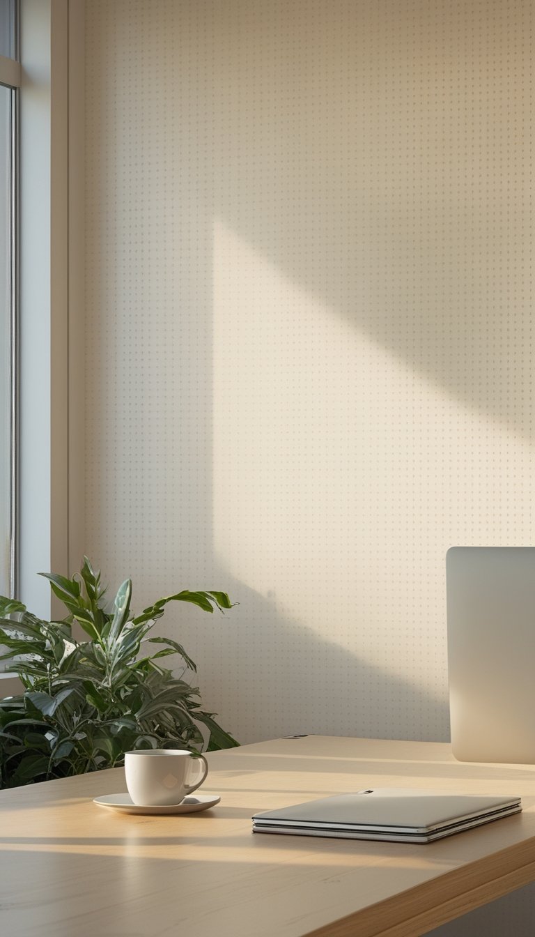
A delicate dot grid in warm white gives your office a calm, tidy backdrop without stealing focus. The soft dots form a subtle rhythm that helps your eyes rest between tasks. You get texture without bold pattern, so the wall supports concentration rather than competing with it.
This pattern works well behind a desk or on an accent wall. Pair it with warm wood tones and matte finishes to keep the mood grounded. It also brightens the room gently, so you avoid a sterile or cold feel.
PRO TIP
Choose a peel-and-stick or washable vinyl version if you expect spills or shifting needs, since you can remove or clean it easily. Place the grid on the wall behind your monitor to reduce visual noise while you work; the gentle repetition can help steady your gaze during long sessions. Keep other decor simple—think one framed print or a single shelf—to let the pattern play a supporting role. Match desk accessories in neutral tones to maintain a cohesive look. If your office is small, use the dot grid on the longest wall to make the space feel wider without adding color.
12) Tone-on-Tone Chevron in Taupe
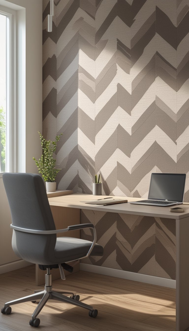
A tone-on-tone chevron in taupe gives your office a calm, focused feel without loud patterns. The chevron shape adds subtle movement that keeps your eyes engaged, which helps during long work sessions.
Taupe sits between brown and gray, so it pairs well with wood desks, leather chairs, and metal accents. The low-contrast pattern won’t distract you, yet it adds texture to plain walls and makes the room feel more finished.
Choose an unpasted, non-woven or peel-and-stick option for easier installation and future updates. Order a sample first to check how the taupe reads in your light; colors can look different online than in your space.
PRO TIP
When you use tone-on-tone chevron in taupe, combine it with clean, simple furniture to keep the look calm and productive. Add one or two accent colors in small doses, like a muted green plant or a soft blue chair, to lift the palette without creating clutter. Position the chevron feature wall behind your desk or along a long wall to draw focus without overwhelming the room. For best results, test samples under your office lighting at different times of day to confirm the warmth and contrast. If you choose peel-and-stick paper, measure carefully and start from the center to keep the chevrons aligned.
13) Understated Bamboo Weave Wallpaper
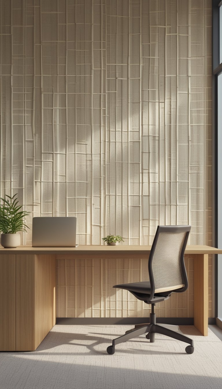
You can use bamboo weave wallpaper to add quiet texture without stealing focus from your work. Its subtle pattern creates visual interest while keeping the space calm and focused. Choose neutral shades like soft beige or charcoal for a professional, soothing backdrop.
The weave pattern adds depth that helps reduce glare and makes large walls feel less flat. It pairs well with wood furniture and simple metal accents, giving your office a balanced, natural look. You can place it on a single accent wall or behind shelving to create a gentle focal point.
PRO TIP
When you pick bamboo weave wallpaper, test a sample on your wall first so you can see it in your room’s light. Lighting changes the look a lot; morning sun will warm the tones while cool office lights can mute them. Match the wallpaper scale to your room size: small weaves suit compact spaces, and larger weaves look better in roomy offices. For easy updates, consider removable or peel-and-stick options that let you change styles without damage. Keep other patterns minimal to keep the space calm and distraction-free.
14) Dusty Olive Moss Pattern
A dusty olive moss pattern brings calm and focus to your office without shouting for attention. The muted green tones feel natural and steady, which helps reduce visual clutter while you work.
This pattern often mixes soft texture with subtle tonal shifts. That adds depth so walls look layered, not flat, and it pairs well with wood and matte black accents.
You can use it on a full wall or as an accent behind a desk. When you choose furniture, aim for simple lines and warm neutrals to keep the room balanced and cozy.
PRO TIP
Choose a dusty olive moss wallpaper when you want a soothing backdrop that still adds character. The color hides minor scuffs and marks better than pale hues, lowering maintenance worries. If your office gets little natural light, pick a version with lighter moss tones so the space feels brighter. Add a single bright accent—like a rust pillow or mustard lamp—to create contrast without breaking the calm. For small rooms, apply the pattern to one wall only; in larger spaces, cover two opposite walls for unity. Test a sample on your wall to see how the shade changes through the day before committing.
15) Very Small-Repeat Ikat in Blush
Choose a very small-repeat ikat in blush when you want soft movement without loud patterns. The tiny, repeated motifs add texture that reads almost like a woven fabric from a distance. This keeps your focus on work while giving the room a gentle visual rhythm.
Blush tones bring warmth and calm without overpowering the space. Pair it with light wood furniture and muted metals to keep the palette coherent. You can also let this pattern sit behind a simple desk setup to create a subtle, refined backdrop.
PRO TIP
When installing very small-repeat ikat, match pattern seams carefully so the repeat stays consistent across the wall. Use good lighting to show the texture without creating glare; soft, diffused light works best. If your office gets a lot of natural light, choose a slightly darker blush to avoid fading and keep contrast steady. For smaller rooms, limit additional patterns to one accent—think a single rug or cushion—to prevent visual clutter. Test a large sample on the wall for a few days so you can see how the color and scale feel at different times of day.
16) Subdued Metallic Thread Wallpaper
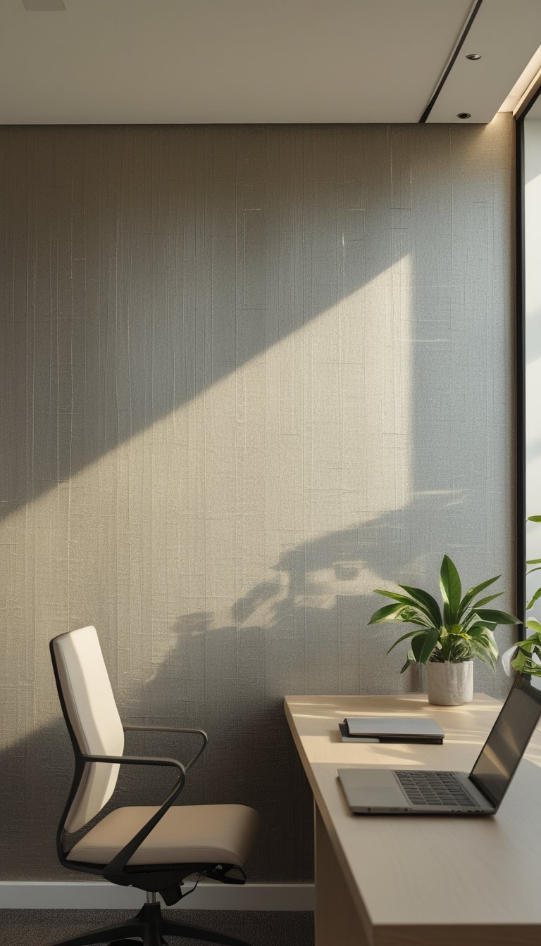
Choose subdued metallic thread wallpaper to add quiet shine without distraction. The fine metallic threads catch light softly, creating a calm, textured backdrop that helps you focus.
This wallpaper works well behind desks or on an accent wall. It pairs with neutral furniture and dark accents to keep the room grounded and professional.
The subtle shimmer lifts the space without feeling flashy. You get a touch of luxury that supports deep work by keeping visual interest low and comfort high.
PRO TIP
When installing metallic thread wallpaper, match the lighting to the finish. Use warm, dimmable lights to prevent glare and to highlight the thread texture gently. Place task lighting where you need clarity, and avoid strong ceiling lights that bounce off metallic fibers. Test a sample on the wall at different times of day to see how natural and artificial light change the effect. Keep other surfaces matte—desks, shelves, and curtains—to balance the sheen. If you prefer a more neutral look, choose silver or brushed gold with a low-reflective finish for minimal flash and steady focus.